What's new

First Photoshoot w/ Le Beautiful Erin

DGMPhotography

Been spending a lot of time on here!
Joined
Mar 23, 2012
Messages
3,160
Reaction score
717
Can others edit my Photos
Photos OK to edit
Hey guys,

So I tried out my studio again. I shot with more light, and extra PP. I’m pretty happy with the results and pretty pleased with the poses! (I used references). Also, I was experimenting with watermark placement. If it looks terrible, please let me know why. And yes, this is a new name/logo I've been considering. Side note: I got some photography books today (The Art of Photography, Photography: Foundations of Art and Design, The Art and Business of Photography, and Making Pictures) so I’m pretty excited about learning more, improving my craft, and showing you guys! Please be patient with me!

Anyway, here’s some of the photos!

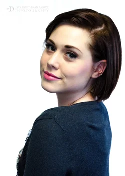
1) Over the shoulder pose! (And I know, neck line :P )
$DSC_0284-2.webp

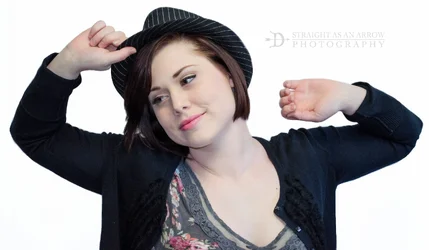
2) Lofty stretch.
$DSC_0310-2.webp

3) I really like this one. Has a professional look to it.

$DSC_0253-2.webp ---> $ErinTimes.webp Heheh, idk :P

4) :)
$DSC_0293-2.webp

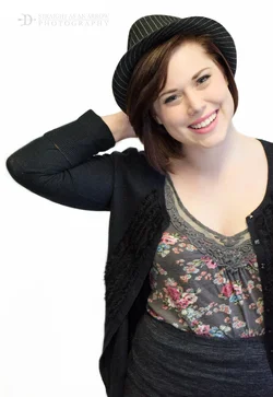
5) By the way... she has an amazing smile! :D
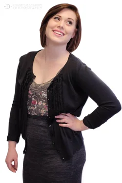
$DSC_0258-2.webp

So what do you think?

Thanks!
 
She's really cute! I think the white background is overly bright, and all the images are framed just a bit too tightly; she needs a bit more room at the top, above her head! On the TIME magazine mock-up....ummm...you need to re-size her image, so that the TIME logo is not overlayed right on top of her head...that is not the way TIME magazine does its overlays!!!! Your logo is good-sized, but it is not overly-offensive, the way some (okay, many) are. She does indeed, have a lovely smile.
 
Love the new photos Daryll :)
 
She's cute, the poses are fun, but the mechanics are terrible.

It's really obvious you knocked her out of the background in post, and you've got a ton of mixed ambient lighting futzing up your skin tones.

Solution:

Create distance between the subject and the background. 10 feet minimum.
Light your white seamless (at least I hope it's seamless) separately from the subject, and flag the background lights off so they don't illuminate her too.
Shoot at whatever the max sync speed of your camera is, and stop your aperture down a bit to kill your ambient light.

If you've got the background and the subject lit separately, it looks good straight out of the can with zero post. Typical lighting like what you're trying to do requires about 3-4 lights, 2 for the background, and at least 1 for the subject.
 
"D Straight As An Arrow Photography" ?

I'll give you one thing: It's cool because the D doubles as a letter and a bow and arrow-- so from a graphic design standpoint you have something. But it also has some possible connotations that you may not be intending or have not fully thought out.

I'm scratching my head trying to figure out why that name? :scratch:
 
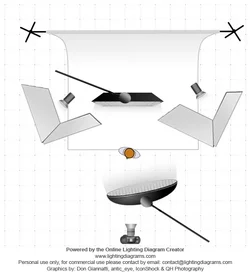
This is what you're going for. Strip with a grid for your hair light, gridded beauty dish for a key light. It's a little edgy light for her structure, but that's how you nuke your backgrounds:
$lighting-diagram-1365055343.webp
 
Ha, the time thing was just being silly. Thanks for the feedback. I actually didn't give her a new background, I just increased the exposure in certain areas. What made it obvious though? And unfortunately, I know exactly what I need to do, I just don't have the time or space to do it.

Thanks!
 
The style is good and you captured your model well aside from the Time gimmick you need to work on your lighting but that takes time to perfect..... keep shooting!
 
Thank you, I'll keep at it! Rotanimod, the D is not really a thing. It's simply "Straight as an Arrow" which is an idiom for honesty. Idk, I thought it sounded cool xD
 
Let's get this thread HOT! Help me out here folks, I really would like some more advice!!
 
Noo... Someone once told me if people don't comment then that means they think your work is good and have nothing to complain about. So that's how I'll take it I suppose! xD
 
overall the shots are not terrible, you are definitly moving in the right direction from some of the other shot i seen you post. I will just give my opinion on the 1st shot and maybe you can apply some of that to the rest of your work. I would have personally made sure her sweater was lint free before shooting to avoid any unnecessary post work. So i would remove all the lint and clone out the wrinkles on the back of the sweater. Also I would either enhance the catch light in her eyes of make better new ones that look natural. the wrinkle in her neck as you said is also in need of some work. And check the white balance on all your shots. I see that it is different in a few. Just a couple things i noticed off the top of my head without actually working on the image and seeing what it feels like it needs.
 
I sorry but she looks bored
 
^ hah, sure. Thanks for the tips, TMC! :)
 

Create an account or login to comment

You must be a member in order to leave a comment

Create account

Create an account on our community. It's easy!

Log in

Already have an account? Log in here.

Back
Top Bottom