First pics, compostion ok?

mwcfarms

No longer a newbie, moving up!
Joined
Mar 16, 2010
Messages
2,655
Reaction score
179
Location
Southern Alberta
Website
www.deannachambers.com
Can others edit my Photos
Photos OK to edit
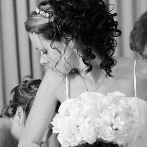
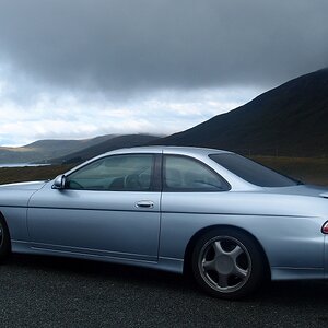
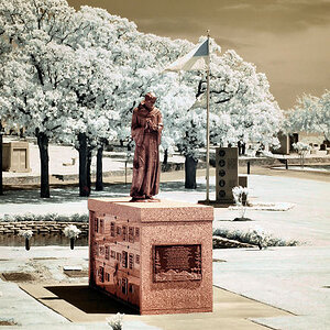
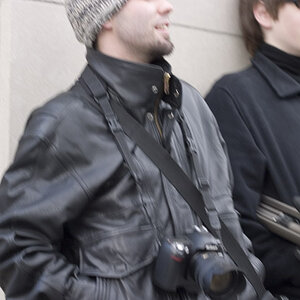
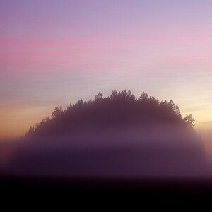
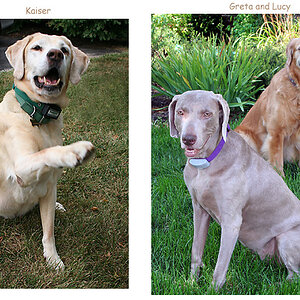
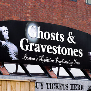
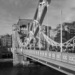
Ok guys, I have been working with my camera trying to get a feel for it. Its been bloody miserable out for the last week but I went out today anyhow and took a couple pics. I know the lighting is crappy but havent got that down pat. These are three that I like. Most all were shot in Aperture priority I cropped a couple and made one b&w did a bit of cloning on one. I have my big girl panties on so any feedback is appreciated. Im mostly concerened about composition but will take any technical feedback you wish to throw at me. Likes or dislikes etc. Thanks.

1.
4584666035_ea95403c1d.jpg


2.
4585304872_f22ea94b87.jpg


3.
4584671279_9b5247a7a1.jpg
 
Hello Dee

#1
It is kind of boring. If you were shooting to practice, I would get closer and shoot from angles.

#2
I really like this shot.
The dof, the color and the composition.

#3
Do you still have snow up there?

I like the shot in b&w, it feels cold.
The curve from the right side of the photo are like pushing into the shot and I like it. I would photshop the tree on the left out of the photo, it is distracting from the rest of the shot.
 
I agree about #1, it's not very interesting, but getting in closer may have improved that.

#2 I really like, maybe a slighly larger aperture, but it's nice.

#3 Is interesting, I like the round rows that draw your eye to the trees.

Anyway I totally understand about the crappy weather, I'm in South Sask, and we got the crap weather after you.
 
Hello Dee

#1
It is kind of boring. If you were shooting to practice, I would get closer and shoot from angles.

#2
I really like this shot.
The dof, the color and the composition.

#3
Do you still have snow up there?

I like the shot in b&w, it feels cold.
The curve from the right side of the photo are like pushing into the shot and I like it. I would photshop the tree on the left out of the photo, it is distracting from the rest of the shot.

Thanks Pierre,

Yes we do have snow still. Snowed for the last two days and was minus 4 this morning. Before the snow we had three days of rain so the fields are all wet and boggy. I will do an edit on the b&W and see how that looks. Thanks for the feeback. The windmill picture I want to get and try a siloutte but its too wet out atm so we'll see later. Thanks for the feedback.
 
#1 is kinda meh for me. Doesn't instill much.

#2 is great. Color contrasts are sharp the the water droplets on the feather look great.

#3 looks cold. Which I imagine was the intention :p
 
I like them all actually

1) Feels kind of dark, tells a story to me. Would be better if the clouds were blacker
2) Just beautiful DoF Im my opinion nice contrast as well
3) I can almost feel the snow here in Southern Cali!
 
I think you did pretty well overall. I personally think that #3 is a very strong composition,with excellent placement of all the elements. #2 of the feather is not too bad, but the slightly shallow depth of field and the way that lens renders out of focus things is a bit harsh; I like what you "saw" in the water droplets on the feather, but the out of focus rocks behind the feather demonstrate what I call "nervous bokeh". The shot of the old, decrepit tower is nothing remarkable, but yet the way you've framed it is pretty good...you've put the horizon low, which makes the tower appear quite tall, and you included ample green grass at the bottom so that there's a lead-in to the tower. You've managed to take two rather mundane scenes, the feather and the tower, and do pretty well by them, so that says something!
 
Regarding composition I would've tried a little closer to the structure in picture 1 and experimented more with angles of shot but still retaining the context of the landscape and sky. I like the sky in it and that you haven't tried to push the PP/contrast at all. That's something I like a lot.

Picture 2 - The composition for me is good. though i'm starting to pay attention when doing something similar to move anything out of view which may distract or break up the rythm - often its just a twig or something tiny that when i'm sitting at a monitor i wish i had looked more closely and tidyed away. I'm not really a cloner of imperfections these days! I love the detail of the feather and the droplets!

Picture 3 I like the inclusion of the curved ploughed field that s a nice shape. I'm not sure either way about the trees. the picture has something but i'm unsure whether I like it or not. Makes a change to have to meter for something so bright on the ground, throwing the sky nicely into a midrange of tones. Maybe if the trees just happened to be different shapes than these and there was something else growing in the snow lower left, it would be really a nice scene.
 
Composition is decent in all of them. It is clear that you put some thought into it because the pictures are simplified to place emphasis on the subject. I think the way you improve now is to familiarize yourself with as many composition techniques as possible and try to incorporate 2 or 3 in every picture. That is why I think #3 is the best: the very subtle leading line of gray, the curves in the field and how they repeat and contrast with each other, and the "subject" -- the two trees. Was it your intention to emphasize how one tree is full of branches and the other is bare, like a stick? It's an interesting contrast. I don't like the gray sky, though -- a white sky would have really made those trees pop.

Isn't it great when you start looking for composition possibilities? They're everywhere.
 
Im not well versed in photoshop yet but I like the idea of the white sky. It has been seriously overcast here so the lighting was awful and in color the photo was ok but I liked it so much more in B&W. I knew why I liked the picture but it wasnt until people pointed out about the lines etc that the light bulb went off. Thanks so much for your opinions guys. I guess its time for me to study some different composition techniques. Thankfully the weather is supposed to get better next week so hopefully it will give me better lighting to work with.
 
I think the composition in 2 and 3 are great.

No. 2 my eye rests pleasingly on the feather with no other distractions. The nice color contrast help this one too (for me).

No. 3, wow. I like the curve leading to the trees which have interesting characteristics.

No. 1, I might like this cropped in tighter. The lighting makes this less pleasing, maybe another day with blue sky and puffy white clouds would change that.
 
1- too many details in the subject to be that far away. Just a flat picture. Get closer and yes, it has been said... angles!

2- love it! The colors of the feaf against the background are sweet.

3- by far the best as in comp!

post more but bigger...

thanks!
 
Thanks, sorry I picked the medium size when posting them. I couldnt remember what image size was required. I will definetly try some angles of the windmill later this week when the sun is supposed to shine. In Alberta sunny weather= no rain or snow. :thumbup:
 

Most reactions

Back
Top