First portrait. C&C please.

Photos_Cantik

TPF Noob!
Joined
Jan 30, 2010
Messages
2
Reaction score
0
Can others edit my Photos
Photos OK to edit
Newbie here, just wanted to say Hi and let you guys know how happy i am to discover this forum. I really think ''The Tutorial Thread!'' is awesome!! Every newbie like me should start by reading it.
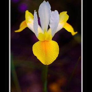
Anyhoo, after reading for sometime (& taking millions of pics) i am now brave enough to post one portrait, i really appreciate if anyone would care to give c&c. Thanks.

Photo is cropped & vignette (paint.net)
 
I think the exposure was ample and correct, but that a layer has been created and some type of blurring effect has been applied. This is one type of soft-focus approach that Dwayne Oaks uses quite often in his landscapes. I am not a big fan of this type of soft-focus type effect on pictures of people: I prefer to see a layer created, a Gaussian blur applied, and then a Screen effect applied, so that the diffusion is mostly in the highlight areas. THe way this shot has been processed, there is a lot of diffusion in the low tonal values: the effect is similar to the old days of darkroom work and film shooting: using a diffuser on the LENS, the highlights can be diffused, while using a diffuser under the enlarging lens, the SHADOW values get diffused; the two looks are very different from one another.

Maybe this wasn't post processed the way I think it was, but the result looks a lot like it. I think the vignetting is too pronounced, causing too much shifting of the colors.
 
As mentioned it is a tad underesxposed and I am not a fan of vignetting: to me it looks like a defect. However I think you have a very nice portrait. The light is soft and natural, very flattering, nice expression, pretty eyes. I wonder if it could be tilted a bit so the lines in the bricks were more horizontal, and is there enough room in the original to alow a little more room at the top of her head?
 
I sure am taking notes on what you guys think.
Really appreciate the c&c. Thank you!
 
I don't think the exposure was that much off. I'd have compensated that in post with an increase in luminance.

I'm not a great fan of vignetting either but I do think that in this shot it's not making the image look "worse". The crop is a bit too tight for my taste so the vignette is somewhat strangling the model making it look too confined. A bigger crop could give her "some air". Then the vignette would work fine (although a bit reduced in strength).

She is a good model but the red/pink hood is not working with the rest of the scene. I don't know if you want to go back and change the hue of that hood to make it more subtle and complement her complexion.

Colors look good to me.

Catchlight is too much in the center. Try a 45 degree off center angle and a bit higher so you can see the pupil. It will make a big difference. In a portrait it's ALL about the eyes!

Great start!
 
THe way this shot has been processed, there is a lot of diffusion in the low tonal values: the effect is similar to the old days of darkroom work and film shooting: using a diffuser on the LENS, the highlights can be diffused, while using a diffuser under the enlarging lens, the SHADOW values get diffused; the two looks are very different from one another.

Derrel, I don't mean to derail the thread but would you mind explaining this further?

My first impression is that I like the exposure. The skin has a natural tone to it and it is set apart from the darker background.
 
needs some contrast....
 

Most reactions

New Topics

Back
Top