First Portrait Session (x10)

Trenton Romulox

TPF Noob!
Joined
Mar 10, 2007
Messages
2,392
Reaction score
0
Location
Maine
Website
www.jeremygrayphotography.com
Can others edit my Photos
Photos OK to edit
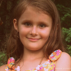
Well, today was the big day; my first paid portrait session. These are for senior portraits. I want hardcore critique on any aspect, big or small.

One:
350675945_eSrt6-L.jpg


Two:
350676025_VsZRV-L.jpg


Three:
350676115_kgvpN-L.jpg


Four:
350676243_iy9bX-L.jpg


Five:
350676344_UjNH4-L.jpg


Six:
350676461_diVSH-L.jpg


Seven:
350676590_hhXpK-L.jpg


Eight:
350676734_DqUbK-L.jpg


Nine:
350676817_oM4BT-L.jpg


Ten:
350676899_GtkN2-L.jpg


Thanks for looking.

And remember, critiques, please. I've gotta learn what to do differently next time, and what I can still do to improve these shots in post-processing. I'm not at all experienced with portraiture, so you might have to put a little extra detail into your critiques, if that's cool. Again, thanks for looking!
 
Last edited:
Posing looks good (the two times I have ever done fellows I kind of just get stuck in the cross the arms and manly 'squat' pose so you have a good variety going on here).

Can you post one or two SOOC? His skin tones look off (too dark, greenish)
 
I have fixed the images. I think. I mean, they are now the ones that aren't as green on my screen. But, I might still be off. I'm not sure when the last time my monitor was calibrated was. And even then, it might be calibrated wrong, I don't really know, haha.

Anyways, other than colors (although, I would like to know if they're fixed), what else is good, or bad about these shots?
 
Last edited:
The poses are good, as are the settings, but all of the images appear warm and over-saturated. Additionally, I think in may there is excess DoF causing the eye to wander away from the subject.
 
Yes i agree, they look very orange right now. I think the closest is number 5 although he is still a little 'salmony pink'.
 
First they are green, and now too warm? Haha. I barely added any warmth to the originals. Where the hell is the perfect temperature? :p

Since these are posted in the professional gallery, I'm assuming this was a commercial shoot. Make sure when you're doing this kind of work that you use either a grey or white card in your images to allow you to calibrate your white balance. Were these shot RAW, .jpg, or ?
 
yea, i think a few of these have potential, but imo your processing is way off for these type of portraits.
Some of the more dreamy effect ones, make them look blurry rather than dreamy and i think what also adds to that is the harsh over saturation, which in some images like #2 (for example) is causing 'saturation blow out'.

The skin tones are different in each, but the majority have too much red.

I think tho with a different approach, the images are still sellable as long as you shot them in RAW or your jpeg exposures are good and can be re-processed.
 
I agree with most of the previous comments - the photos are a little warm, too red/orange. Also, they seem a little soft - but that could just be because I like sharp photos - I think a softened effect has it's place, but not in every photo ( again just my opinion.) Overall I think you did a nice job for your first paid shoot - that can be tricky! Especially with guys! :)
 
Okay, seriously, I can't get these skin tones. When they look true to me, I post them, and they are off. I don't want to start passing the blame around, but I mean, I guess that would come back to me: do you think my monitor is off? Because this isn't the first time that my colors have been off, even when it hasn't come to skin tones. How do I go about properly calibrating my screen?

P.S. I have researched this, but I haven't really gotten any good results other than for me to buy software. Are there color profiles that are better for photos than others? I think I'm using a Nikon RGB Apple profile right now.
 
Hardcore critique? ok... well, just remember you did ask for it.

1. Not bad... rather dark, some sort of hairlight would have been nice as his hair does blend into the background. his left arm looks really soft. Also, I find the fall off of light from left to right to be rather distracting, but that may just be me. In addition there is a noticeable orange/red warm tint. On the bright side, the eyes look to be relatively sharp which is always important.

2. Decent shot, relatively sharp. Seems to be a serious problem with white balance as his arms are really red and his face is quite yellow. Also, straight on shots don't usually look incredibly flattering. For a guy though this works somewhat. He does look quite uncomfortable. Hard to control, but something to watch for and try to work with.

3. In my opinion this is probably the best shot of the set. Looks the sharpest, catchlights in the eyes. Still has the reddish tint though (unless he just has a really bad sunburn). also, what aperture did you use? On this photo I think it's a little sharp because the necklace thing he is wearing being rather blurry is distracting to me.

4. This one is a little rough. I think it's quite soft, not sure if you did this in post or not. My guess is you did in order to soften things up. The problem is that the parts of him that I want to be in focus (I.E. the eyes ears etc.) are not in focus. Instead the only things that I can find in focus are the tree, his fingers and his shorts. Because the tree and his fingers are in different planes I'm guessing you did this in post, and I would definitely reprocess it. Also, the tree in the background has a line around it, there it looks like you were masking around it or trying to select around it to brighten up the grass or something. In any event that is quite distracting (the brightness of the grass is also distracting in my opinion).

The last thing for this photo, and it goes for most of the rest of the photos, is that you don't really want to smooth and fix the faces of guys very much in photos. The reason being is that this causes them to look a little more girly. In my opinion you want to go with more sharpness on the guy, making him look a little more masculine to go with those huge shoulders he has.

5. On the positive side, this is relatively creative though ultimately slightly feminine posing. When my wife first looked at the photo, and I tend to agree, her first reaction was that the framing of it through the leaves (in portraiture) is something that should only be done in photos of women or engagements. It looks a little red, a little soft on him (the softness almost looks like a glow which is not really desirable for a guy usually), and there's that nagging line around the tree.

6. looks like an almost identical pose to #5, I'm a little confused about this photo as his left arm has almost no detail because of how orange it is, and his right arm still looks extremely red but shows his freckles. His eyes also look really odd, kind of dark and shadowy which is different from all of the other photos. There is still the line around the tree. The other adjustments I would make would be to tone down the greens a bit, and also to perhaps clone out the house in the background.

7. probably one of the best shots out of the set. The background is clear and sharp. He is relatively shap, the pose is more masculine. still looks yellowish/orangish but is much more bearable in this photo. You might consider cloning out the quarter or whatever it is on the bottom right that is really bright.

8. Hmm, this photo is extremely bright. I do like the background and if you change the colors around a bit it may be helpful. I went ahead and messed with the colors etc. a bit because of the "my photos are ok to edit" I'll post it at the bottom of this post. He seems to be tinted green as well.

9. I think this one would be really nice if you fix the coloring. He's quite red. If you make him more normal in color the photo should turn out nicely. I like the background, it's pretty nice. One thing is that you almost never want to have anybody put their hands entirely into their pockets. Maybe cupping a thumb in, but not much more than that.

10. Pretty nice shot. The coloring of the grass is much more pleasant here. He still looks quite red though. Also, for the posing, the legs like this is a common feminine pose.

2760491260_ecd131f9fc.jpg


Again, I wanted to say that I hope you don't take my critiques too hard. I tried to share my opinion honestly and not to sugar coat it too much. Take it as you would like. these are my .02 your mileage may vary.

oh, I just noticed, my edit still has him looking a little green around the chin, I could probably fix it if I tried, but this was done in five minutes so... too bad.
 
in response to your questions...

your monitor might be off, but I don't know. The problem is that the various different photos all have different tones. Thus, even on your monitor you should be able to see a difference between the guys face on 8 & 9. in eight it should look greener, and in nine it looks much more red. try looking through all of the photos and rather than looking at the background or anything just look at his face and arms in each photo and then skip to the next.

For the colors on your screen that is something you can google to come relatively close. There is a gamma scale and there are also color charts you can use to make sure all the colors are showing up close to accurate. If you want something more pinpoint you'll probably want to use something like a spyder (which you can find on amazon for 60-70 dollars) these you will put in front of your screen and they will look at it, and automatically set it up accurately.

In my opinion, one of the things you'll want to do (I'm still working on this myself a fair amount) is once you get your monitor calibrated you should look at tons of different photos. Doing this and looking at the skin tones and colors over and over help train your eyes to see what you might normally miss.
 
Thanks, Nate. Very in-depth critique, and it is exactly what I was looking for. Don't worry, anyone, you're not going to offend me unless you unleash some hardcore anti-constructive critique. Which, you definitely did not, Nate. Very constructive, informative, and detailed, much appreciated critique. I'm still trying to re-work these shots, for colors and whatnot. I'll get it eventually, I hope.
 
First of all, I'm glad to hear you take the critique as it was intended. Secondly, I am sure you will get it with a little bit of practice. and Thirdly I do want to say, I shouldn't have posted the touch up of the photo because, the colors are still screwed up (particularly he looks reddish and greenish on his face.
 

Most reactions

New Topics

Back
Top