First Portrait

OrbitalJosh

TPF Noob!
Joined
Feb 26, 2012
Messages
41
Reaction score
1
Location
Newcastle Upon Tyne
Can others edit my Photos
Photos NOT OK to edit
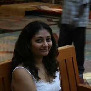
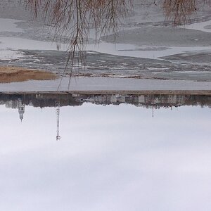
Here is my first portrait I've taken using my newly bought Canon EOS 1100d with a 18mm - 55mm lens. What do you think? Also what do you think of the person in the frame?


$IMG_0640.JPG
 
i am going to go on a limb and say this is a self Portrait?
 
Im going to say it's white balance is off. the background/wall fades from white to yellowish. There is too much dead space above the head. Lighting seems okay, no shadows.
 
Im going to say it's white balance is off. the background/wall fades from white to yellowish.

I attempted to duplicate that side of the frame onto the other side so I could get this nice, almost sepia like vignette. I wasn't able to work out how though :/
 
They get better with time and practice. I'm an advocate of camera orientation should follow suit with the subject.

Thanks for sharing.
 
Too much empty space. Crop this yo!
 
1. Please don't post full resolution images to the forum. 800px on the longest edge is adequate.

2. The white balance is severely off. Giving the subject a very yellow appearance.

3. I'm not going to hate on the dead space, but what's the reason? I have negative space in some of my photographs, but not like this.
 
^^^ but its literally dead space. Nothing is there. No pretty blurry background or anything. The extra space brings nothing to the table here.
 
DiskoJoe said:
^^^ but its literally dead space. Nothing is there. No pretty blurry background or anything. The extra space brings nothing to the table here.

You don't think that might have been why I posed the question in the first place, do you?
 
1. Please don't post full resolution images to the forum. 800px on the longest edge is adequate.

2. The white balance is severely off. Giving the subject a very yellow appearance.

3. I'm not going to hate on the dead space, but what's the reason? I have negative space in some of my photographs, but not like this.

The dead space was literally give a sense of emptiness and to show how smallness of the character (metaphorically, not physically). Sometimes a lot of dead space brings attention to the subject, in this case, the person, especially when the dead space literally has nothing.
 
How did you light this... it almost looks like mixed light.

Incandescent subject right, and sunshine / incandescent mix subject left maybe? Subject right is extremely yellow... subject right has some natural color to it. Impossible to correct simply...
 
The dead space was literally give a sense of emptiness and to show how smallness of the character (metaphorically, not physically). Sometimes a lot of dead space brings attention to the subject, in this case, the person, especially when the dead space literally has nothing.

Smells like an excuse to me. You stated it was your first portrait and asked the commuity what we thought. If we were to give credence to this response, then context should reign supreme. You have a swing and a miss. Take the lumps and move forward. The subject's eyes are dead center. Read that as boring from an impartial, but schooled, observer's point of view. Have you read anything pertaining to the Rule of Thirds (RoT)? If not, I suggest you do so. Don't read it so much as a "rule", but more as a guideline. There is a reason for this. Figure it out and come back with a better reason for abandoning the convention. No harm in standing your ground as long as it is on a solid foundation. It seems you are standing on shale at the moment.
 

Most reactions

New Topics

Back
Top