First Post Ever CC please.

lushpetal

TPF Noob!
Joined
Aug 30, 2008
Messages
3
Reaction score
0
Location
Jersey Shore
Can others edit my Photos
Photos OK to edit
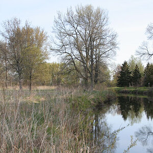
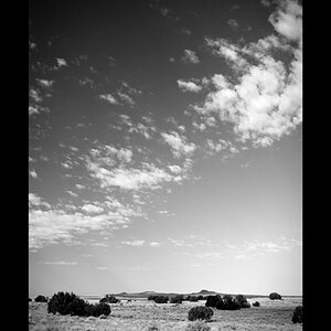
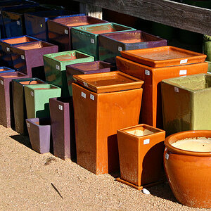
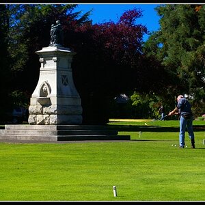
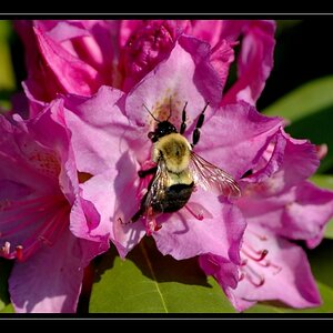
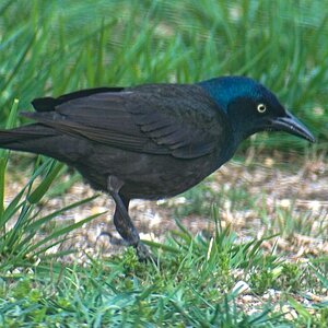
I am brand new on the site and would like some CC on the following photos and my post processing. Thanks! I have a Nikon D80 and do PP in CS3.

DSC_0354rawedit1copy.jpg
DSC_0336rawedit1copy2.jpg
DSC_0358rawedit1.jpg
 
Welcome to the forum!

For future reference, and ease of critique, please post images vertically and number them.

1. (Girl on bench): Nice image but slightly over-exposed. The face has the appearance of over-processing, and the sky is a bit week. I think the use of a circular polarizer would have improved this image greatly. The pose is good, and the exrpression cut, but perhaps a little too centered (remember the 'rule' of thirds).
2. (Infant) Focus appears slightly soft in this one, and with a slightly cool caste (although that may be my monitor).

3. Good use of selective focus to isolate the main subject, but again, over-exposed, with blown highlights in the hair. While it's not necessary to have the subject stare right down the lens, it's a good idea to have them at least looking toward the camera. This might be all right as a B&W, but I'm not fond of the weak sepia treatment, and would prefer a slightly wider crop to include more of her left shoulder and top of her head.

Overall, nice work, with a few suggestins for future improvement; looking forward to seeing more.

Just my $00.02 worth - your milage may vary.

~John
 
Welcome to the forum!

For future reference, and ease of critique, please post images vertically and number them.

1. (Girl on bench): Nice image but slightly over-exposed. The face has the appearance of over-processing, and the sky is a bit week. I think the use of a circular polarizer would have improved this image greatly. The pose is good, and the exrpression cut, but perhaps a little too centered (remember the 'rule' of thirds).

I agree with tirediron on #1 + the pose is nice but her smile seems too deliberate but when doing a vertical shot you sometimes forget about the thirds rule and to me it seems that if you did follow the rule the background wouldn't of been the same (IMO). I'm liking the background alot it is just that it is overpowering your subject a little to much for my comfort (bluring it a little would of been nice
#2 The right side was overexposed but I felt it added to the photo and took away, it made the curves of his face look as though thy were added to the background
#3 Pesonally I am no lover of sepia so I wouldn't be able to fairly access the one

Overall they are really good pictures
 
Thanks a lot for the critique.:) I am really trying to develop my "eye". For color especially. So no one likes Sepia huh? For some reason I have always liked it. And two tone images.

As for posting my pictures vertically I am not sure I understand... I should post them vertically even if it makes my subject sideways?

Sorry for taking so long to respond. Today was errand day and I just returned home.

-Shanna.
 
Shanna, what was ment was to post one picture above the other (with a space in between) & it helps to number them.

For some reason I only see two pics, not the sepia of discussion.
 
I think the "over exposure" is perfect with the fist photo. In fact, I wouldn't call it overexposed at all. It's subtle, but appropriate for a shot of a child in this situation. Nothing's blown out; all the detail's there. Overexposure usually conveys a light, comforting feeling, which matches the subject in this shot. I think the exposure is exactly as it should be.
 
#1 - I actually really liked the composition. Agree that a polarizer would have made this a little zestier. Also I would like some fill flash to make her eyes "pop" more.

#2 - Looks good to my eyes

#3 - I like the candid feel of this shot but I feel that it could be even more closely cropped.
 
Thanks for all the positive feedback and also for the tips for improvement. I was hesitant to post but I am very glad I did.
 
Thanks a lot for the critique.:) I am really trying to develop my "eye". For color especially. So no one likes Sepia huh? For some reason I have always liked it. And two tone images.
I very much like sepia images; I think in this case however, it's more that the subject doesn't really suit sepia. If you'd had her dressed up in turn-of-the-century clothing, or posed in front of the bat-wing doors of an old saloon, sure, but as the image is, it doesn't really seem appropriate, IMO.

As for posting my pictures vertically I am not sure I understand... I should post them vertically even if it makes my subject sideways?

D'oh, just realized what you were asking. By vertically, I meant 'stack' the images so that in the forum they show one on top of the other. When you embed them in the post, ensure you insert a hard carriage return (Enter) after each one.
 

Most reactions

Back
Top