kassad
TPF Noob!
- Joined
- Mar 7, 2010
- Messages
- 280
- Reaction score
- 16
- Location
- NE Wisconsin USA
- Can others edit my Photos
- Photos NOT OK to edit
I had a great opportunity a couple of weeks ago to shoot some models at a local photography club.
Here are the four shots I liked the most. I'll make another post with some of the shots I think have potential.
What do you think?
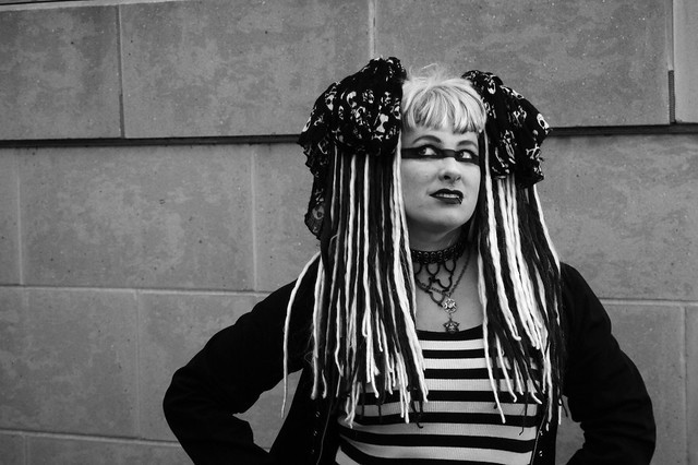
#1
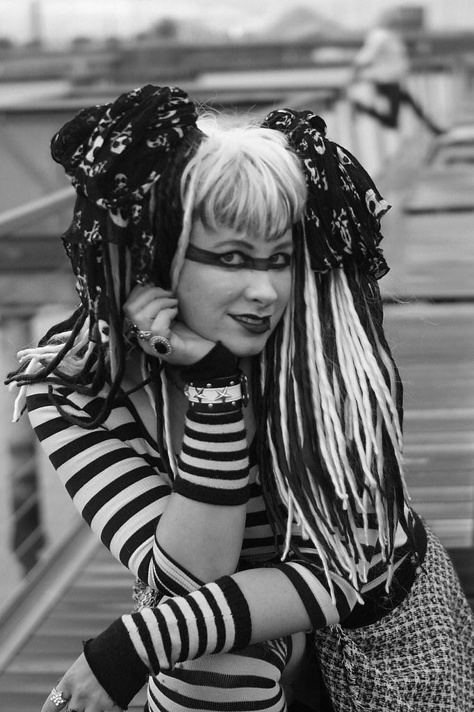
#2
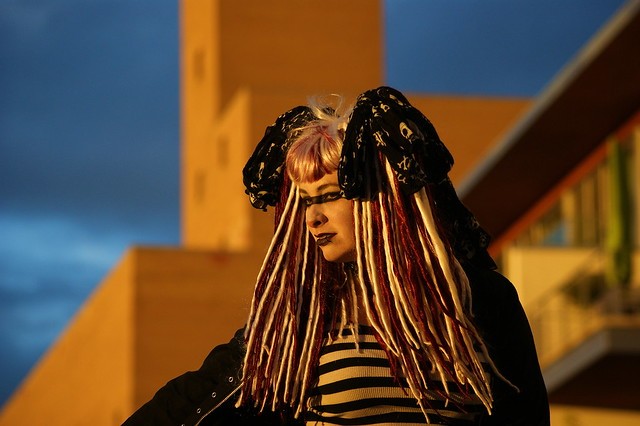
#3
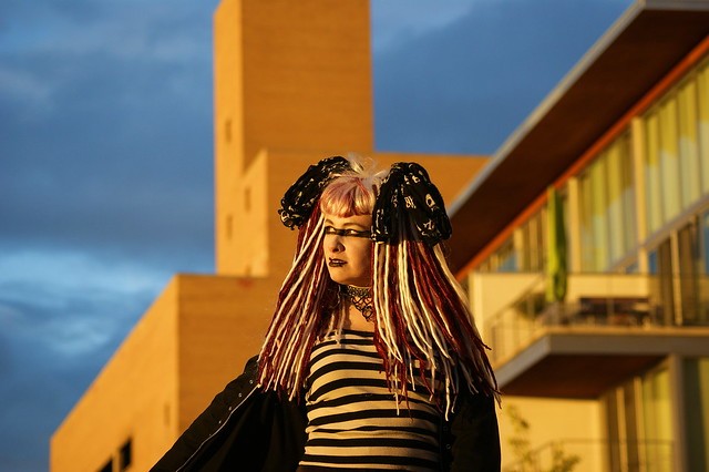
#4
I personaly like numers 1 and 3 the best. I think focus is a little soft on number 2.
Any input?
--Kassad
Here are the four shots I liked the most. I'll make another post with some of the shots I think have potential.
What do you think?
#1
#2
#3
#4
I personaly like numers 1 and 3 the best. I think focus is a little soft on number 2.
Any input?
--Kassad


![[No title]](/data/xfmg/thumbnail/42/42397-30faa170de7ed9be38adf00b9b26a220.jpg?1734176928)


![[No title]](/data/xfmg/thumbnail/33/33422-d1097b04586502aba932c8d5409d8026.jpg?1734163437)


