First thread: First shoot

MPhotoUK

TPF Noob!
Joined
Jan 16, 2013
Messages
9
Reaction score
2
Location
London, UK
Can others edit my Photos
Photos NOT OK to edit
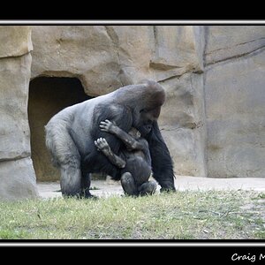
It's a bit of an old photo, but as this is my first post here, I figured it would be fitting to post a photo from my first shoot in it. I'm here because the forums I usually frequent have either tanked in the quality of content or have fallen off a bit in activity. I'll hang around here a bit and see how I like it :) This was about 9 months ago, if I remember correctly. All CC welcome :)

WNktJ.jpg
 
Start with a pretty young woman...shoot photos...always a good strategy!

And I just want to say to the various TPF posters who see your photo: "People, THIS photo is a great example of the creation and use of negative space. THIS photo shows negative space in action! Take a good,long,careful look at this photograph."
 
very nice shot.
and, if your looking for quantity over quality, you've come to the right place. :mrgreen:
 
Thanks Derrel, she goes to my school so I /think/ she was 16/17 in that photo, we're both 17/18 now though. I definitely know what you're talking about with the negative space point - When shooting I realised she wasn't on the ever-holy rule of thirds intersection, and kept trying to visualise it on the corners, and in post I tried cropping it, but without the space around her the photo doesn't feel like it gives her enough room to breathe, so I actually really like this composition :)
 
I like it just as it is, any further towards the centre and it wouldn't have worked so well in my opinion.
 
I don't see this as a violation of editing Mphotouk's image perse, more as a re-emphasis on Derrel's suggestion as to how the negative space works in this composition. I did boost the contrast a bit but only for comparison's sake.

The Rule of Thirds, Golden Triangle, Golden Spiral, etc are more like interpretations of space than steadfast rules. Sort of like a slow to 35mph sign in the mountains and coming into said curve in a tricked out Mini. Rules shouldn't necessarily be broken and if they are, they can't be broken without some compensation - another use of a compositional element or principal has to come into play. In this case, whether by design or "it looked right," the use of negative space works grandly.

$8388662301_8e12f381f8_o.jpg
 
Last edited:
Rules shouldn't necessarily be broken and if they are, they can't be broken without some compensation - another use of a compositional element or principal has to come into play. In this case, whether by design or "it looked right," the use of negative space works grandly.

:heart:

That's always been my feelings as well. Just because you broke a rule you know, and it works, doesn't mean that it's not following another rule or element of design and composition that you may not even know about.
 
In general I agree that a "rule" should not be broken without a compensating element, I usually phrase it like this:

A "rule" is either a canned solution to a problem, or simply a tradition. When you choose to break a rule you have a couple of options:

- solve the problem by other means.
- elect to NOT solve the problem at all or to NOT comply with traditions, and make that failure important.

You might ignore the "rule of thirds" because you are creating balance in the frame through pure symmetry instead.

You might ignore the "rule of thirds" and leave the frame unbalanced, because the aim to to create an uncomfortable sensation, of unease and unbalance.

You might render the snow-covered mountain in a palette of muted greys, violating the tradition passed down from Saint Ansel, because you create the drama by your point of view looking dramatically up the face of the wall.

You might render the mountain in greys because the idea of the image is to show the drab ordinariness of the landscape.
 

Most reactions

Back
Top