What's new

Flowers - which edit?

jowensphoto

Been spending a lot of time on here!
Joined
Feb 28, 2011
Messages
2,983
Reaction score
906
Location
Northern Viriginia, US
Can others edit my Photos
Photos NOT OK to edit
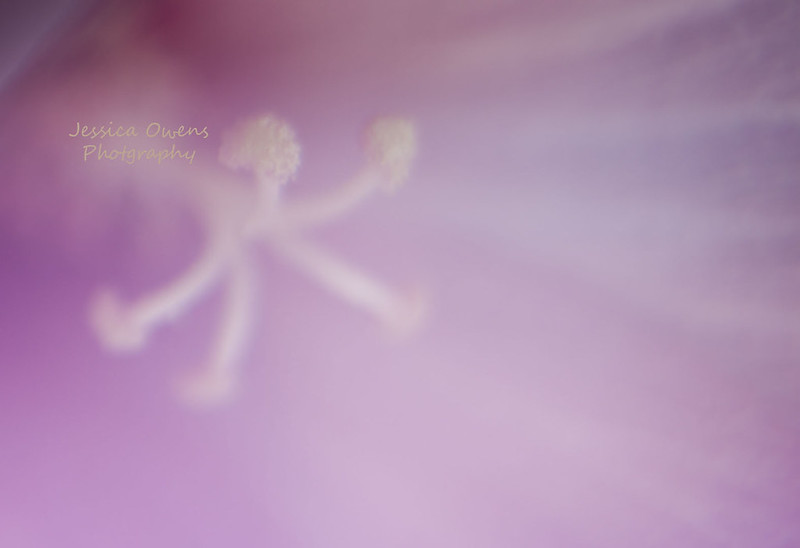
Which edit do you prefer of these first two?
7780800528_09ec9eb760_c.jpg


7780800686_723b9f714e_c.jpg


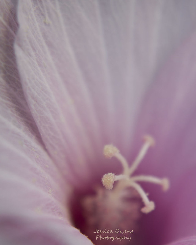
And a different shot for number three:


7780951336_54b1ca1d6f_c.jpg
 
Very pretty! I like the first edit, the second looks like the colours are just on the verge of being muddy (on my iPod )
 
Thanks, I wasn't sure if the difference was too subtle to see. I even had to do a second look after I uploaded. Big difference when loaded in PS and toggle between tabs. The only difference is one has a gradient layer.
 
Very nice! I like the first edit the best as well; imo, it could even stand to be a little brighter.

I also like the third one quite a bit, but the darker, almost muddy, color in the upper left is a bit distracting. IMO.
 
The second just looks a hair sharper and maybe a bit higher in contrast, at least that's all I can tell on my work monitor.

My suggestion for this has nothing to do with any differences, though. I would crop just enough on the left and bottom to remove the dark background in the corner. I don't see what it adds to the image. Otherwise, a very nice selective-focus flower shot.
 
Thanks, Ken.

I went back and forth about cropping that part out, but I feel like it gave the photo a place to end. If that makes sense. Here's a 4x5 vertical of the same image with background cropped out. I do like this!
7781153954_f8f0dbed12_c.jpg
 
Looking at the vertical crop, I wish I'd gotten more of the side toward the bottom. I don't like how the middle just ends flatly along the line of the photo. Next time!
 
Personally, I like your re-edits. A lot.
However, I don't care for that last cropped version. In theory, I agree with the reasoning behind cropping it, and couldn't quite decide, initially, why I don't like the result.
As best I can explain, in my completely uneducated opinion:
The anthers in the center are leaning towards the top right corner of the photo (in the original)--that tends to lead my eye up and right out of the picture.
The little bit of green background down at the bottom left, though, pulls my eye back down towards it, so it "balances out" more and my eye tends to stay in the frame better. In the cropped version, there's nothing to balance out those leaning anthers, and I just find myself following the line out of the photo instead of into it.

That is *definitely* just my opinion, and it may not even hold water. But it's MY story, and I'm sticking to it. :D
 
I like the vertical for some reason, but I know what you're saying about the balance aspect. I also like that there is a definitive end to the photo, but also like the infinite feel of the vertical crop.

Oh, decisions, decisions.

Thank you for the feedback, everyone! Thank you for helping me look at my photos differently and helping me see what I couldn't :)
 

Create an account or login to comment

You must be a member in order to leave a comment

Create account

Create an account on our community. It's easy!

Log in

Already have an account? Log in here.

New Topics

Back
Top Bottom