From freshman year....

molested_cow

TPF Supporters
Supporting Member
Joined
Jul 3, 2004
Messages
3,714
Reaction score
531
Location
Here N There
Website
img24.photobucket.com
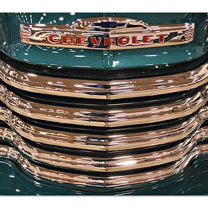
I did these for 2D design in freshman year, 2 years ago.

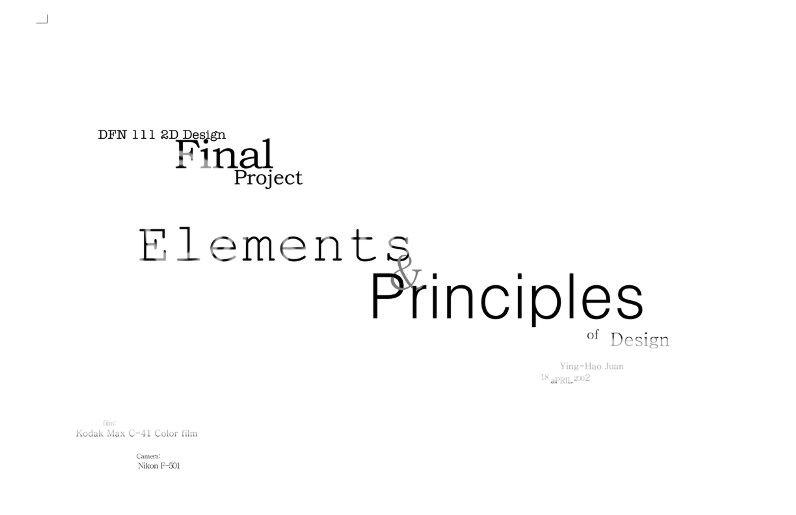
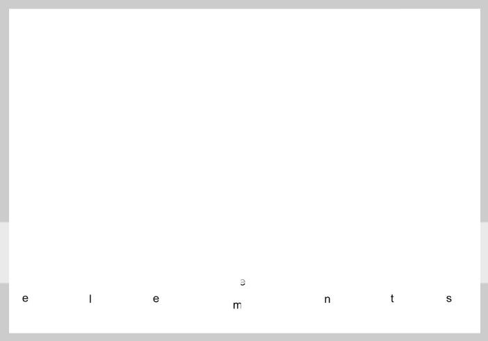
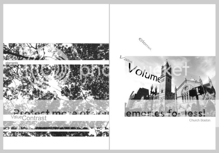
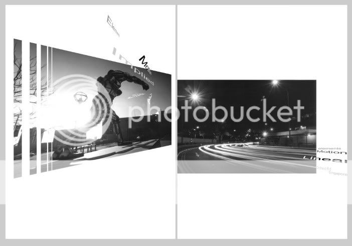
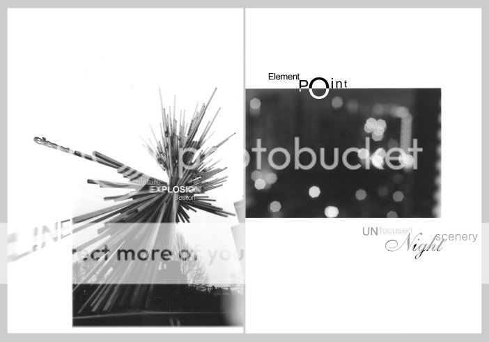
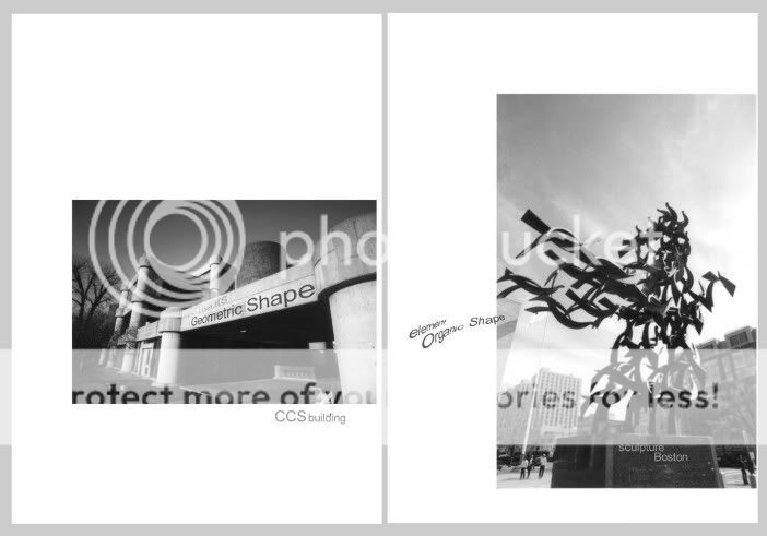
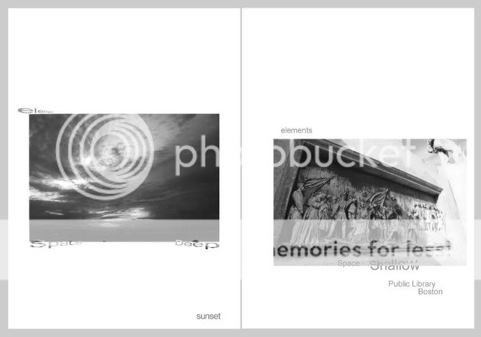
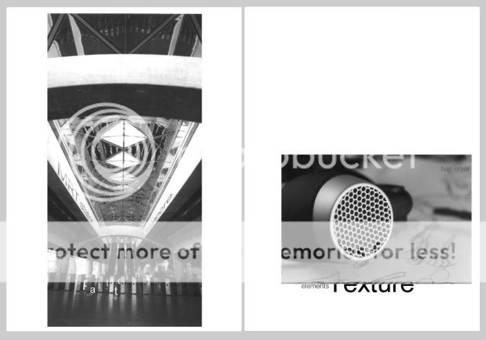
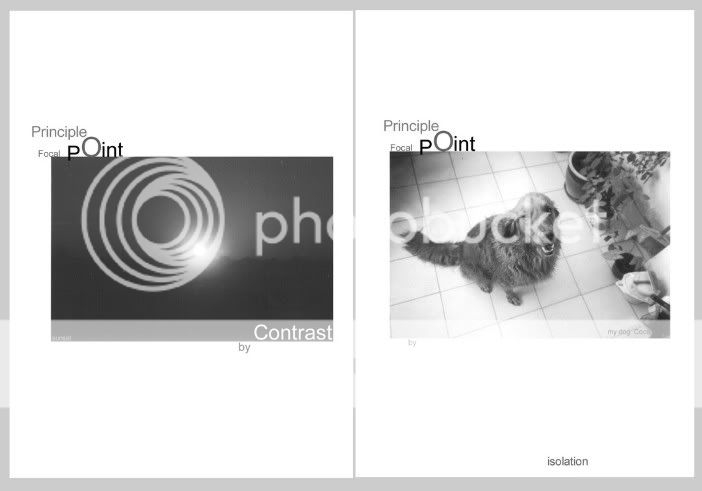
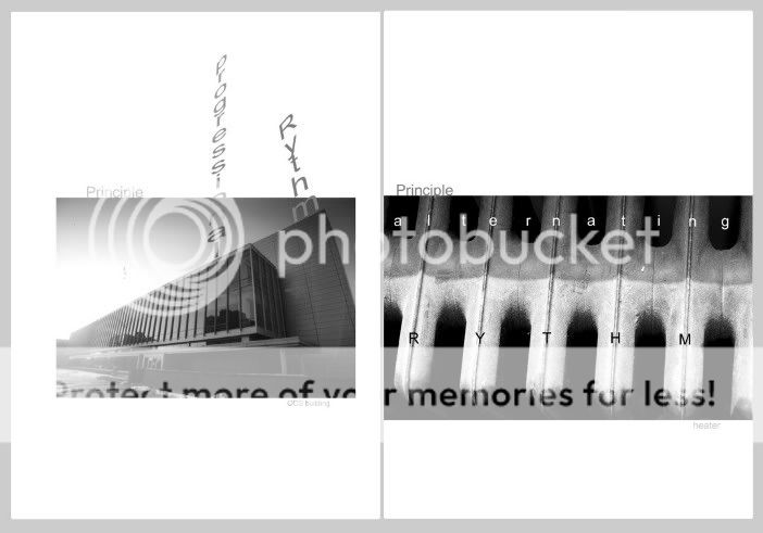
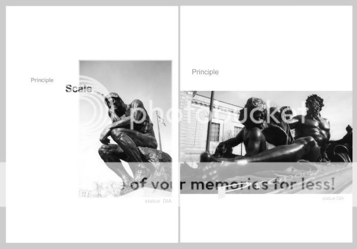
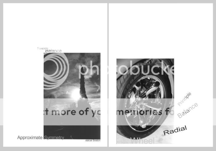
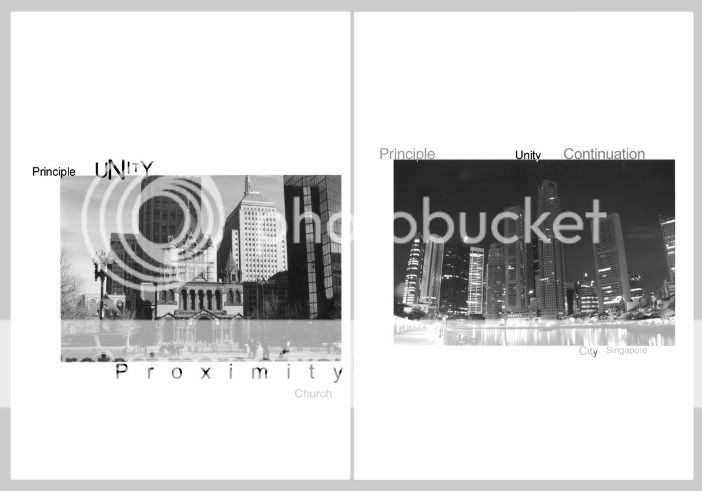
It was a book, using photography to illustrate the elements and principles of design. First is the cover. The pages are to be flipped from the middle.

The actual book has a zinc plated sheet metal cover. It's been long and destroyed, but I kept the electronic version.

1.jpg


2.jpg


3.jpg


5.jpg


6.jpg


9.jpg


10.jpg


12.jpg


2_1.jpg


4.jpg


7.jpg


8.jpg


11.jpg


13.jpg
 
the beginning is too flashy and "abstract"

it calms down later though, which is good. many of the photos are good, and the technical skills stuff (rendering, etc.) is right on. i don't really like graphic design work that has a small amount of text that goes along with a simple object-based photo, generally it's too heavy-handed. i think i would like it more if the photos were much larger, so that i could spend more time looking into their depths (which is what i assume the original book was, nice large photos). i don't understand the relationship of each page to the rest, except at the end where there are pairs. there's no story to it. most of the titles (church, statue dia, sunset) are unneeded.

in general, i think you tended to live inside the photos, and build signs around them; i think you skipped over the 2-d impression that one gets when viewing the pages for the first time, the gestalt. especially in the beginning, when it is not quite yet established to the observer that each page is mostly white space which contains a small photo... a person will look at the page and not immediately know to differentiate the photo-object from the white space around it (especially the skewed big-arm statue). with the bigarm statue, the high contrast lighting, large formal gesture of the arm, along with the shape of the edge of white space above the arm all kind of work together to create a very powerful gesture that exists on the entirety of the page, not merely confined to the photo. it is a very powerful gesture... but doesn't take the observer anywhere, which is kind of disappointing. i'm saying that i'm not sure you accounted for the possibility that the white space may be viewed as an undifferentiated part of the photo.

i know that's pretty harsh, but honestly, for a freshman project it's good. you really nailed the technical photoshop stuff. the overall-scale presentation is good. many of the individual photos are really spectacular.
 
Actually I just picked up photography a couple of months before that. I was still experimenting lots of things. The class isn't about photography, and teachers expected students to go take pictures based on the instructions. However since I already have so many photos, I could just pick the ones that fit.

The titles and text were requirements.

Regarding the white space.... hmmm... I don't really know what to say. It was sometime ago. I think I can do better now, but I was satisfied at that time.

thx for your replies!
 
I enjoyed your presentation. I thought the text was needed and offered enough explaination to be very informative. I liked the overall presentation. While viewing it, I felt as though I was being given a minature demonstration of composition and some of the various standardized compositional procedures. This would be a great wall paper to hang behind my monitor so I could use it as a constant referrence from which to apply to my own creations.

I honestly must admit that from some of your previous comments I never would have suspected your training in composition.

I gotta go back and review some of your postings--I obviously wasn't connecting the first time around
 
canonrebel said:
I honestly must admit that from some of your previous comments I never would have suspected your training in composition.

Well thanx for your appreciation.

The funny thing is I learnt about composition when I was in secondary school, that's between grade 7 to 10. We did still-life drawing and graphics design. My teacher was a MA grad from Pratt in Fine Arts, and we always thought that still life was just about drawing what you see.

Not quite right. We had a room full of setup of random objects painted in matt white with spot lights all over the place. It makes still-life drawing a lot easier to learn. One big thing that he stressed was composition, and adding dynamism into your drawing.

You are still drawing what you see, but you are also drawing what you want people to see. And that was where I learnt about composition. No he did not put it down in black & white like the class in my freshman year. It was really up to us to explore. We also learnt from others, seeing how they find out new things that we can apply.

I think it's just about moving your frame more before you hit the trigger. You may find things that you have never expected. I personally like more dynamism in my photos, and my wide angle lens has helped me do that a lot. Some people like the static feeling.... so it's really up to the personal style.
 

Most reactions

Back
Top