manny212
No longer a newbie, moving up!
- Joined
- Aug 18, 2010
- Messages
- 998
- Reaction score
- 700
- Location
- Miami, Fl.
- Can others edit my Photos
- Photos OK to edit
Follow along with the video below to see how to install our site as a web app on your home screen.

Note: This feature currently requires accessing the site using the built-in Safari browser.
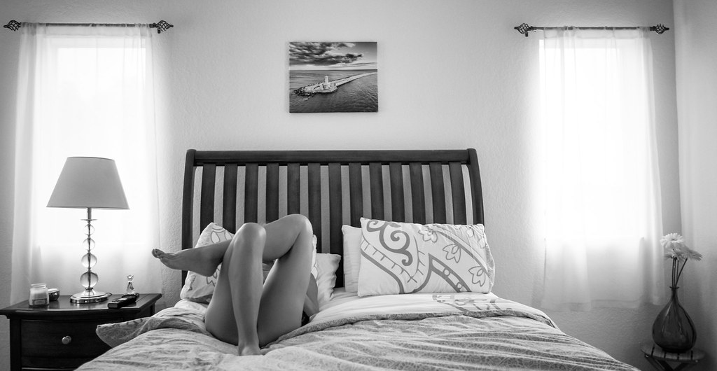
Lovely shot. I'd like a closer crop...otherwise the photo is a bit busy for my taste. But one that focuses on form (curves and lines) would be better and that's what a crop would do....eliminate the windows (with the light that draws our eyes) and the picture over the bed. Make this about the woman, the bed frame, and the pillow.
Actually I like that it shows the whole scene.
Sent from my iPad using Tapatalk
Nice gams...err tones.

Me too[emoji23]Actually I like that it shows the whole scene.
Sent from my iPad using Tapatalk
If you're trying to tell a story with this shot, I agree that the wide, inclusive perspective works. As an image on its own (story aside), I do think a crop would make it stronger, for a few reasons.
Admittedly it's a personal bias, but one of my pet peeves is images which are this close to symmetric but don't quite get there. In some ways I find them more off-putting than images which are nowhere near symmetric. For example, there is more space to the right of the right window than to the left of the left one. Unfortunately you can't crop from the right to make that equal without cutting awkwardly through the vase. Also, the bed itself isn't centered between the windows. (Hey, I understand space constraints, my bed isn't centered either.)
I agree with JoeW that the bright windows draw my eyes away from the bed. They're brought back somewhat by the contrast between the headboard and the wall, but my eye tends to stay at that height (headboard/center of the windows) rather than drifting down to take in the bed's occupant.
My solution is also to crop in from the sides, though I like the space above the bed. I think the "dead space" of the wall is vital to balance the business of the headboard slats/bedding patterns/body position, and the artwork looks nicely centered above the headboard. I'd probably crop in from the left to a point that doesn't crowd her toes against the left side of the frame (at least enough to remove the light), then crop from the right so that the headboard is centered in the frame. You'll end up with a sliver of the left window remaining, but I don't think it'll be enough to pull the eye (and if motivated I may even try to clone it out).
Overall a nice capture, and a nice monotone treatment. Thanks for sharing!
I'd crop it. The woman on the bed kept drawing my eye away from the lighthouse in the photo on the wall.
 But seriously . . . I really like this image! I think there is another photo in there, if you kept the width and cropped down to a little above the bed, but that would be another photo. I think I got the story you were telling with my first look, and it needs all the context you provided.
")
 Morning


![[No title]](/data/xfmg/thumbnail/33/33450-b94d8a06a911e01c39df688c57b4745e.jpg?1619735974)


![[No title]](/data/xfmg/thumbnail/39/39533-c2c39d37e833a4689533c897ace8c348.jpg?1619739073)