Grey Reflections

Goldeeno

TPF Noob!
Joined
Jun 6, 2006
Messages
309
Reaction score
0
Location
UK
Website
goldeeno.zoto.com
Can others edit my Photos
Photos OK to edit
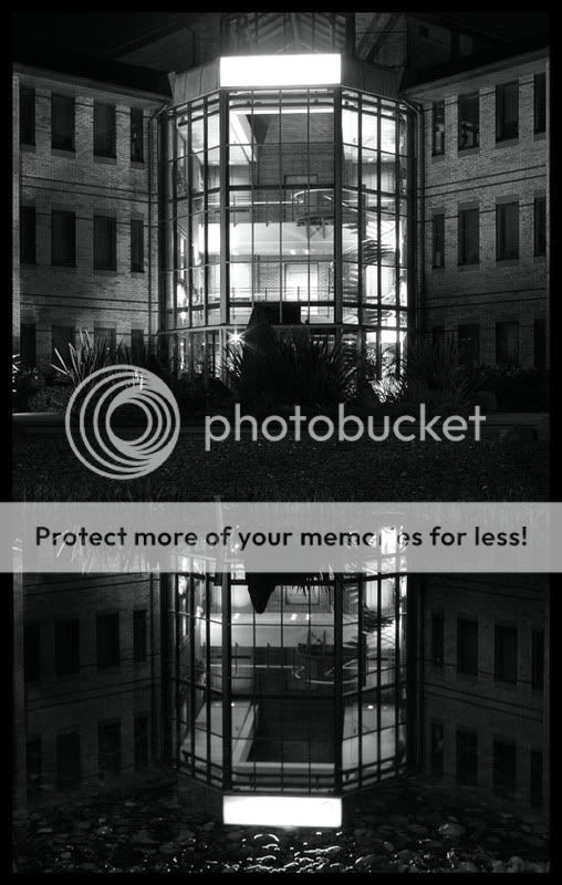
Just happened to be out last night and drove past this place, building cool with the glass front and then with the pond infront, wanted to try a reflections shot.
So let me know what you think, C&C please, any help appreciated.
Colour version is here.. http://www.flickr.com/photos/goldeeno/
Cheers
IMG_0352BWe.jpg
 
Looks pretty effective. The conversion looks good, though it looks like a little sharpening might make it look a fraction crisper. I think if it was mine, I might look to increase the contrast in a couple of areas, particularly round the lower part of the reflection - as an alternative, you may look to dodge the stones at the edge of the water, just to raise the level of visible detail in them.

Lastly, the central band of planting and its reflection do look rather flatter than the rest - again, see what you can do with the contract in that area.
 
I agree with the above assessment. Also, if it were mine, I would not have placed the horizontal point in the middle. I would also have shot at a slight angle to give it a bit of dimension. Just my 2 cents worth.
 
Ok, never got my head around the dodge and burn tool, always seems to go wrong, by all means have a go to show me, if you can include tips and hints on how to, would be appreciated.
I could probably sort the contrast issues, to be honest i havent spent much time in CS3 with it.
 
I agree, the dodge & burn needs to be used with some care. If you don't mind, I'll download the colour original from your flickr page and do my own conversion on it. Might be a day or two though as I want to get the Wacom installed beforehand - selecting stuff with a mouse is a right old PITA...
 

Most reactions

New Topics

Back
Top