What's new

harvest time! cc pleez

barleymalt

TPF Noob!
Joined
Jul 2, 2010
Messages
142
Reaction score
2
Can others edit my Photos
Photos OK to edit
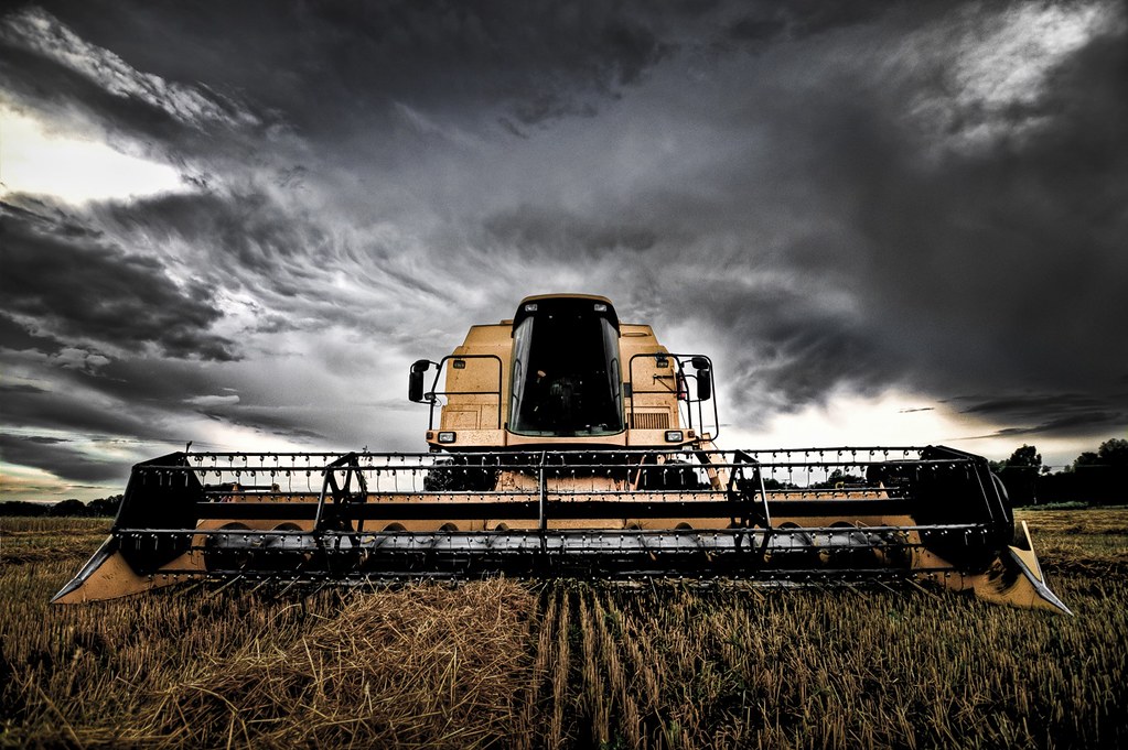
would be thankful for comments on composition, processing etc.

6028827523_769e4442e7_b.jpg

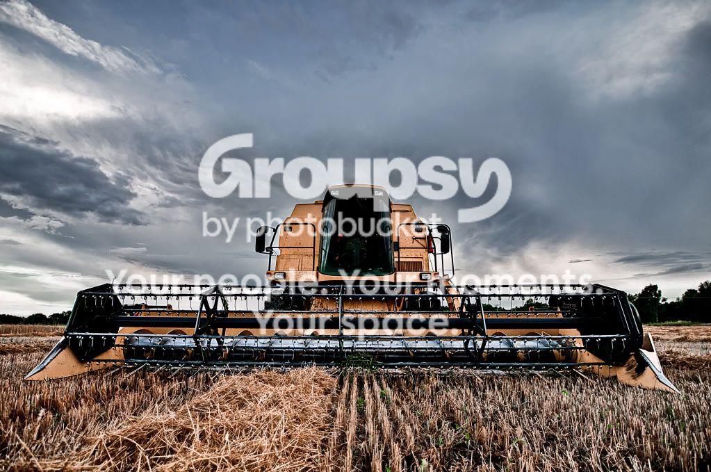
6028714093_e2bebc40f7_b.jpg
 
i like them, maybe get some shot with some bokeh blur in the background? changing the lense's depth of field i think the blades on the combine harvester in the foreground with the bokeh background would look pretty amazing.
 
These are nice shots. The second is nice, but i hate the "selective coloring." Could you post the original? I wanna take a stab at editing it.
 
knock yourself out buddy. please share the results!
6030122628_aa5f307ffc_b.jpg
 
My apologies. I had practice--it'll be up in a little.
 
Really nice shots. I'm going to shock myself and say this is one time the selective coloring doesn't bother me. I would be careful about the cyan in the sky in the first one. Looks a bit unnatural. Love harvest shots but we still have a couple weeks to go here.
 
Here it is. Took into lightroom 3 and converted into 5 exposures. Then tone mapped in photomatix. Then edited in lightroom and photoshop cs5.

EditFinished.jpg
 
nicely done..very real looking sky.i see now that desaturating the sky was a bad idea.
 
Really like that first one :thumbup:
 
nicely done..very real looking sky.i see now that desaturating the sky was a bad idea.

I did boost it a little by creating a new layer, painting the sky blue, using the overlay blend mode, then using an add layer mask to cut out the machine (as the blend mode made it look awful), and then flattened the two layers.
 
Here it is. Took into lightroom 3 and converted into 5 exposures. Then tone mapped in photomatix. Then edited in lightroom and photoshop cs5.

EditFinished.jpg

Not that this is a bad image but it is totally different and I don't find it very interesting at all. Compared to the OP's.

OP = Your two photos have a very distinctive and different look. Even though they were not PPed quite the same, they go together very well and I can easily imagine a whole series in that vein, like in a gallery show. Very nicely done.

 
Here it is. Took into lightroom 3 and converted into 5 exposures. Then tone mapped in photomatix. Then edited in lightroom and photoshop cs5.

EditFinished.jpg

Not that this is a bad image but it is totally different and I don't find it very interesting at all. Compared to the OP's.

OP = Your two photos have a very distinctive and different look. Even though they were not PPed quite the same, they go together very well and I can easily imagine a whole series in that vein, like in a gallery show. Very nicely done.

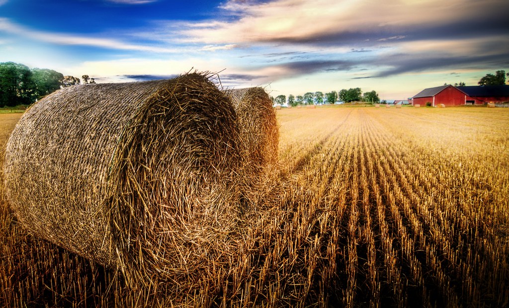
To each his own.
 
i like the original selective color... my 2¢
 

Create an account or login to comment

You must be a member in order to leave a comment

Create account

Create an account on our community. It's easy!

Log in

Already have an account? Log in here.

New Topics

Back
Top Bottom