Gary A.
Been spending a lot of time on here!
- Joined
- Sep 17, 2014
- Messages
- 22,357
- Reaction score
- 7,540
- Location
- Southern California
- Website
- www.garyayala.com
My take:


Follow along with the video below to see how to install our site as a web app on your home screen.

Note: This feature currently requires accessing the site using the built-in Safari browser.
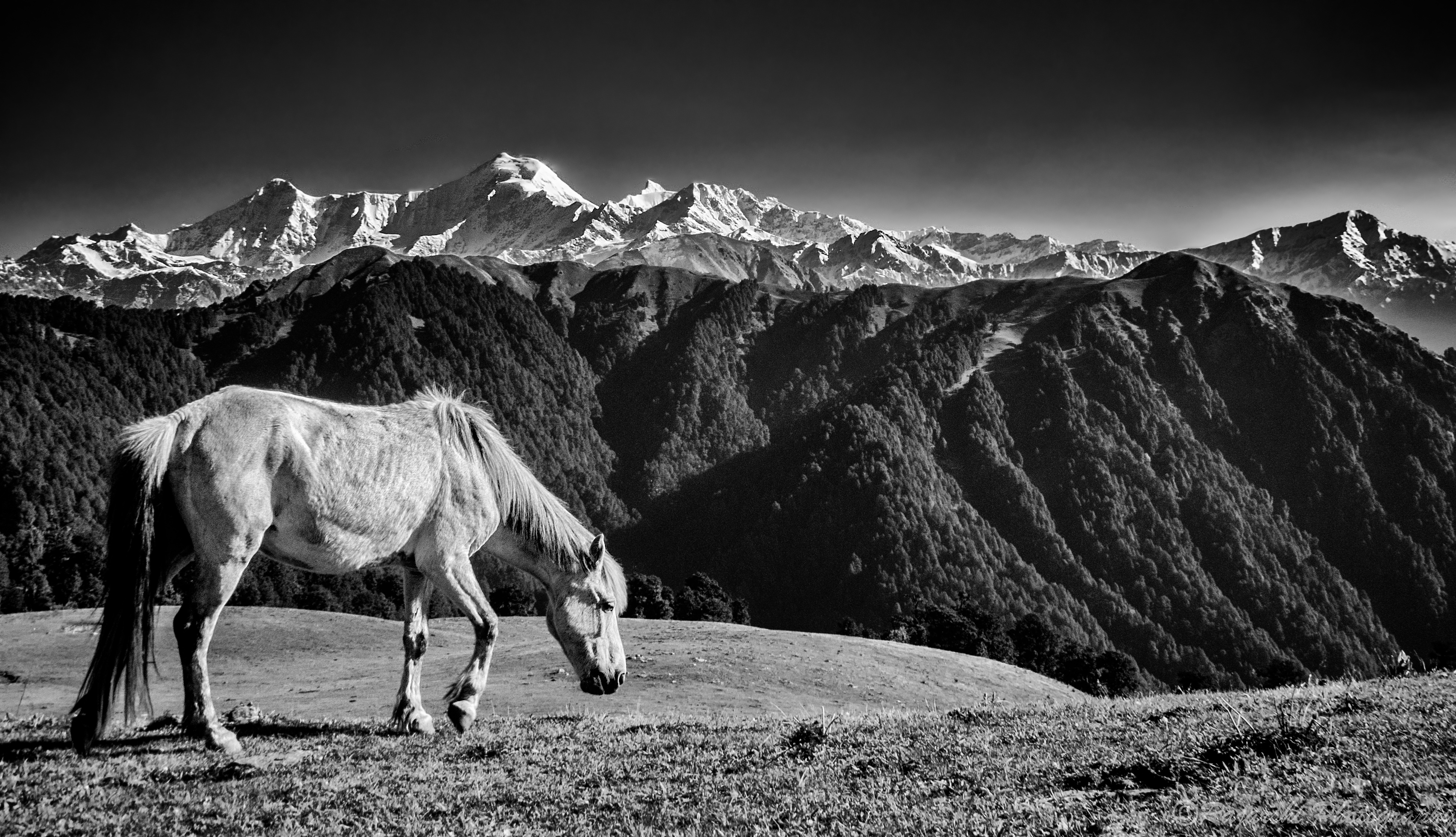
That dome shape is part of another valley called Gidara Bugyal, I had plans to trek to that point but unfortunately the snow was deeper than my heightMaybe it makes sense to everyone else, but could someone explain to me what the dome shape is between the two mountain ranges. At first I thought it was a shadow because it appears to be part of the last range, but from what? And why is it a different color if it isn't a shadow? I'm pretty sure it is part of the snowy range.


The photo is beautiful but I do agree about the crop. You and the Traveler are lucky to go to such places and take photos. I guess I will just have to live vicariously through pictures.
") I will admit that I consider myself lucky in that regard, living in India really gives a lot of opportunities. Don't let that stop you though, once a year is quite possible I'd say for most people.
I will admit that I consider myself lucky in that regard, living in India really gives a lot of opportunities. Don't let that stop you though, once a year is quite possible I'd say for most people. Thanks a lot annamariaI like yours and designers the best.
I agree with both the points, I think I learned a lot of lessons with this photograph and the interactions in this thread. I'm pretty sure I can do better next time1. the belance between the horse and the panoramic view is not right as far as I am concerned. Dave442 is correct, that was exactly my thought immediately. I would like to see a wider shot with horse further away Usually a subject is included in this kind of a panoramic view to underline the scale, so it must be relatively small. Here it is so big and too close, so it makes mountains look like toys.
3. The exposition is alright and I do not even want to talk about this boring stuff, you know it all. One thing I would do, I would change the grass colour slightly, it is too yellow, does not match the upper part of the photo. I do not know of you have the color tools. And I do not know if it will be better, but it is worth trying if you want to keep the image.
Oh, yeah, and probably put some makeup on the horsey as well
2. this magestic panorama needs a similarly magestic horse I am afraid. It would be perfect if you coud look at it and think, my God what a panorama... my God what a horse.. or at least oh, and the horse is lovely.. Now, look at this poor creature, it is starved almost to death. Instead of looking in awe at the mountains, I look at the horse thinking why does it look like a Nazi concentration camp prisoner? It can hardly stand.
This is where I'll have to agree with Leonore, I am assuming you've never really been into horses that much and the general idea that you have about horses, extremely muscular and elegant, is from television or race horses. Wild horses don't train like horse athletes, and hence don't have any need for those extra muscles. Most wild horses have a little bulging stomach and can be a bit bony depending upon the terrain.I don't agree about the horse. This is a mountain horse in the mountains - in other words, she's perfectly suited to the task of being in a picture of mountains. Plus, I think she's beautiful.


I agree with both the points, I think I learned a lot of lessons with this photograph and the interactions in this thread. I'm pretty sure I can do better next time1. the belance between the horse and the panoramic view is not right as far as I am concerned. Dave442 is correct, that was exactly my thought immediately. I would like to see a wider shot with horse further away Usually a subject is included in this kind of a panoramic view to underline the scale, so it must be relatively small. Here it is so big and too close, so it makes mountains look like toys.
3. The exposition is alright and I do not even want to talk about this boring stuff, you know it all. One thing I would do, I would change the grass colour slightly, it is too yellow, does not match the upper part of the photo. I do not know of you have the color tools. And I do not know if it will be better, but it is worth trying if you want to keep the image.
Oh, yeah, and probably put some makeup on the horsey as well
2. this magestic panorama needs a similarly magestic horse I am afraid. It would be perfect if you coud look at it and think, my God what a panorama... my God what a horse.. or at least oh, and the horse is lovely.. Now, look at this poor creature, it is starved almost to death. Instead of looking in awe at the mountains, I look at the horse thinking why does it look like a Nazi concentration camp prisoner? It can hardly stand.This is where I'll have to agree with Leonore, I am assuming you've never really been into horses that much and the general idea that you have about horses, extremely muscular and elegant, is from television or race horses. Wild horses don't train like horse athletes, and hence don't have any need for those extra muscles. Most wild horses have a little bulging stomach and can be a bit bony depending upon the terrain.I don't agree about the horse. This is a mountain horse in the mountains - in other words, she's perfectly suited to the task of being in a picture of mountains. Plus, I think she's beautiful.
Remember, real horses have curves!
 Yes, they try to use this argument with female models, but somehow fail time after time

 18346651765_9f22d6d9bd_o by Franklin Rabon, on Flickr
I haven't been out of state in 12 years.The photo is beautiful but I do agree about the crop. You and the Traveler are lucky to go to such places and take photos. I guess I will just have to live vicariously through pictures.
Thanks a lot @Forkie , I think you got the horse exposed correctly. Do you happen to remember the exact steps?
Thanks a lot annamariaI like yours and designers the best.
Thanks man!It is a great shot, and you have gotten a lot of really nice editing ideas!
But I thought it looked really good right from the start!
I don't really think that I've got to follow the rule, but I've also never thought about balancing the photograph the way you've explained, so that's one lesson I learned today. I'll keep it in mind fjrabon, thanks a lot!1: it's unbalanced. To me this is where people mess up rule of thirds. Rule of thirds is about creating dynamic balance, ie not purely half and half. But you still need a balancing element on the other side of the frame of some sort (in some cases implied movement or an eyeline can even serve as that balancing element). Here the horse is looking down and mostly stationary. So there's nothing from the horse to help with the balance. The background actually compounds this issue, since the mountain peak is also right above the horse. The image feels left side heavy. In cases like this I feel that rule of thirds can actually hurt more than help intermediate photographers. They think "okay, gotta follow this rule" without really thinking about (or knowing about) where it came from.
How can I work on that? Do you mean something like focus stacking?2) There's just enough depth of field to want more. The mountains in the background are just sharp enough to want them to be completely sharp.
I haven't been out of state in 12 years.
Now is as good a time as any 

![[No title]](/data/xfmg/thumbnail/39/39224-aa3271aa220fe57f37caf898b6984846.jpg?1619738926)