Not too bad overall. In my opinion, no 6 is the best of the bunch.
Some critiques:
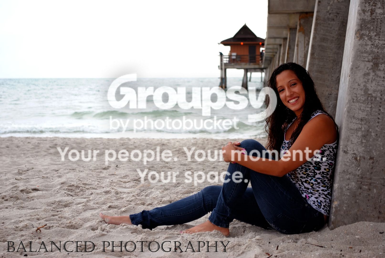
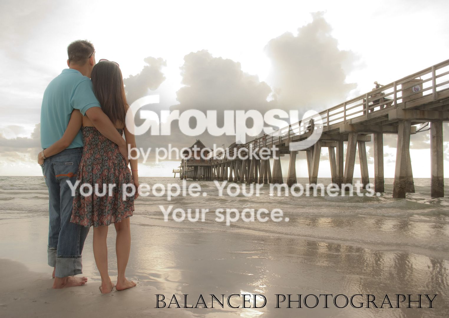
No 2 (the girl sitting on the sand against the pier) : severely blown background. You could have exposed for the sea scape and used a fill lighting on the girl.
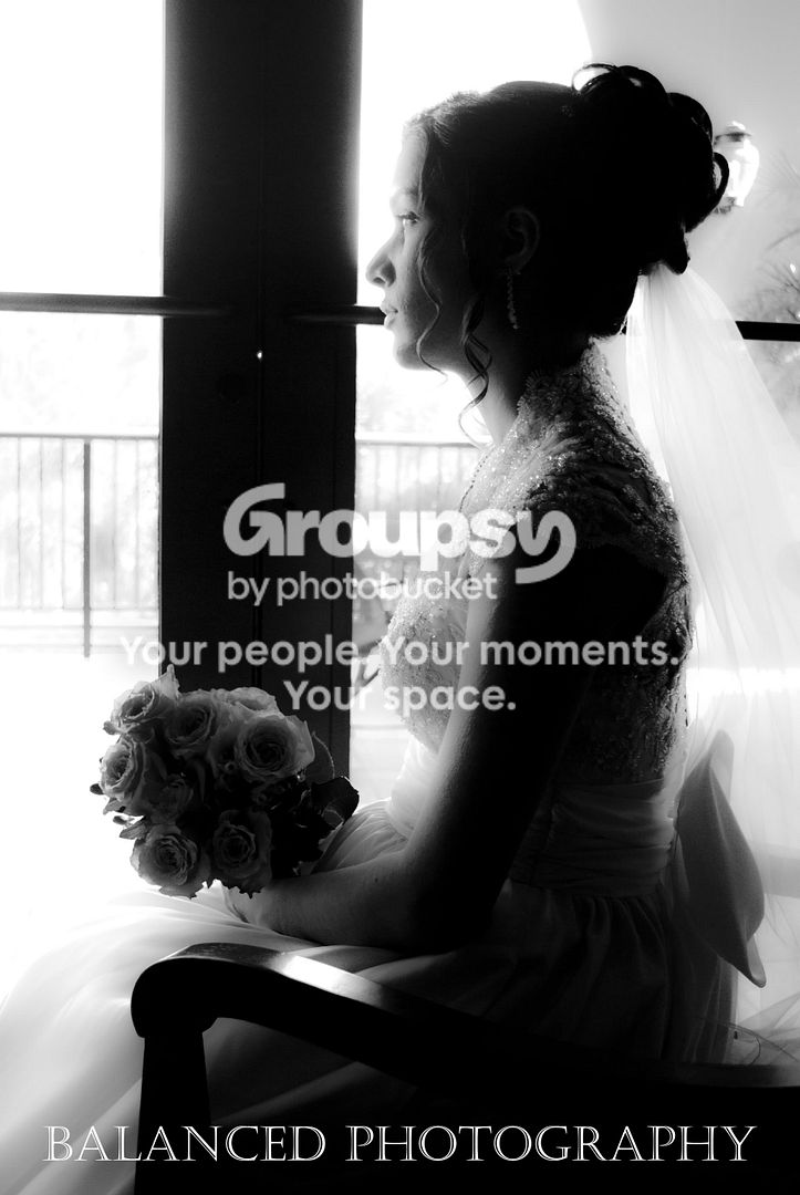
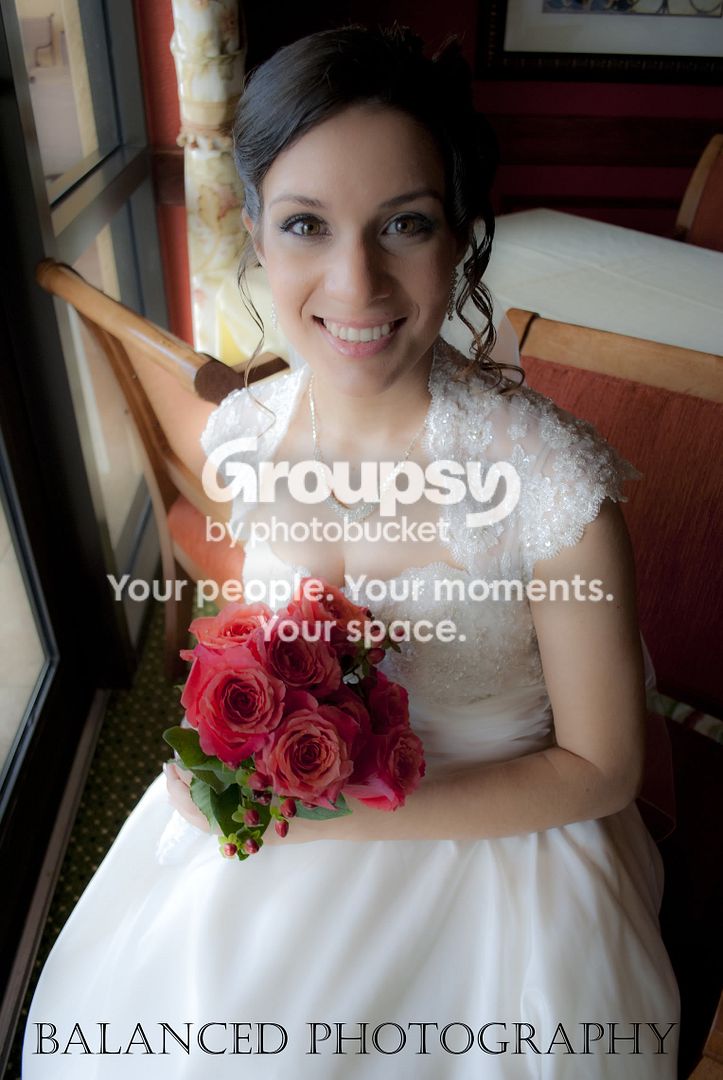
No 5 (bride by the window): your use of 18 mm focal length was not sympathetic to the girl, the size of her nose is considerably exaggerated.
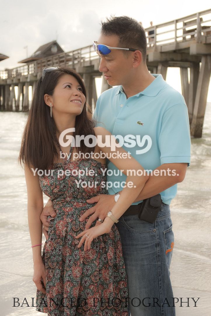
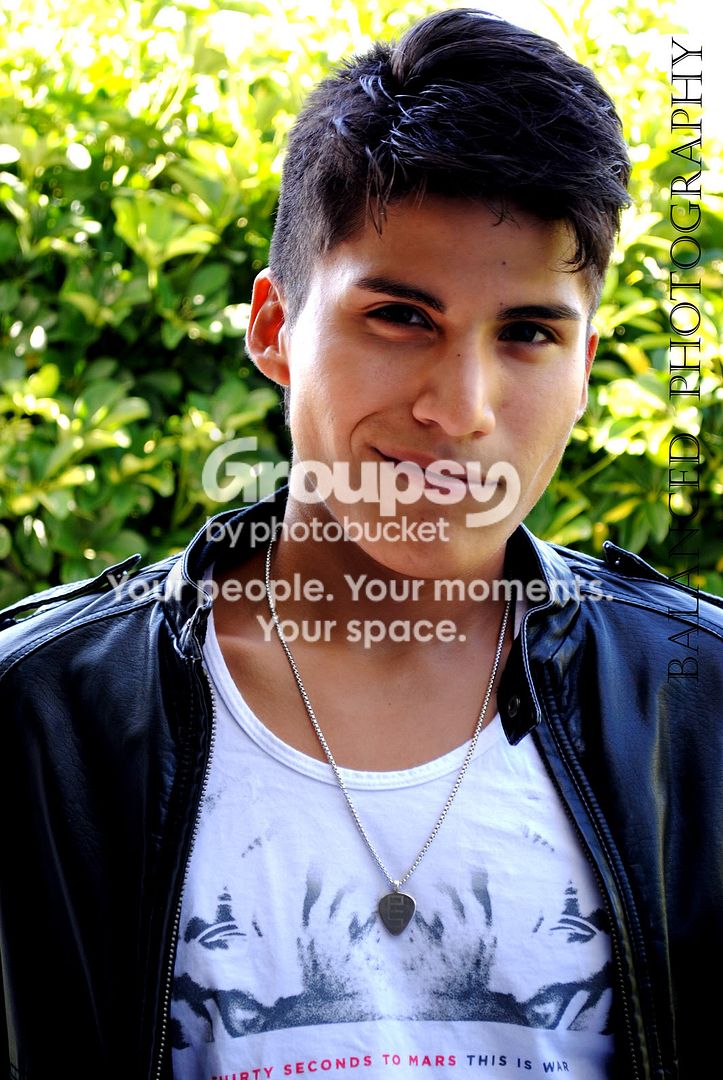
I agree with pixilstudio, the sunglasses perched on the head is just careless in photos 6 and 7.
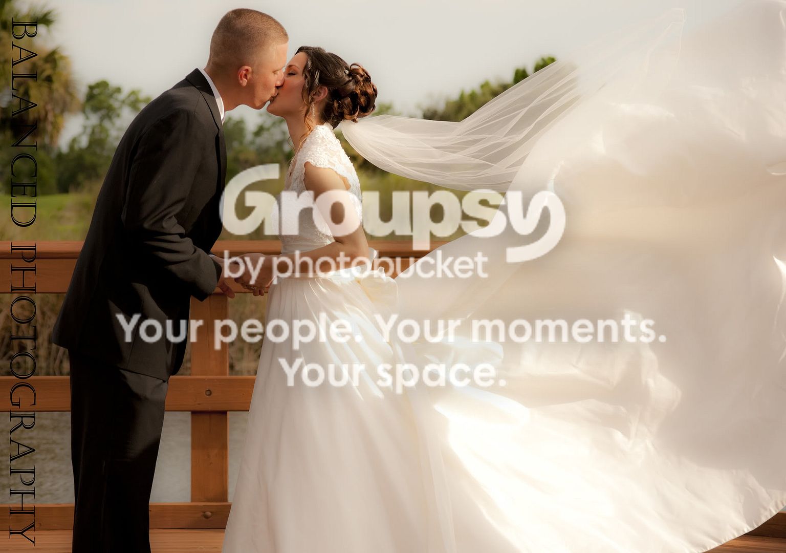
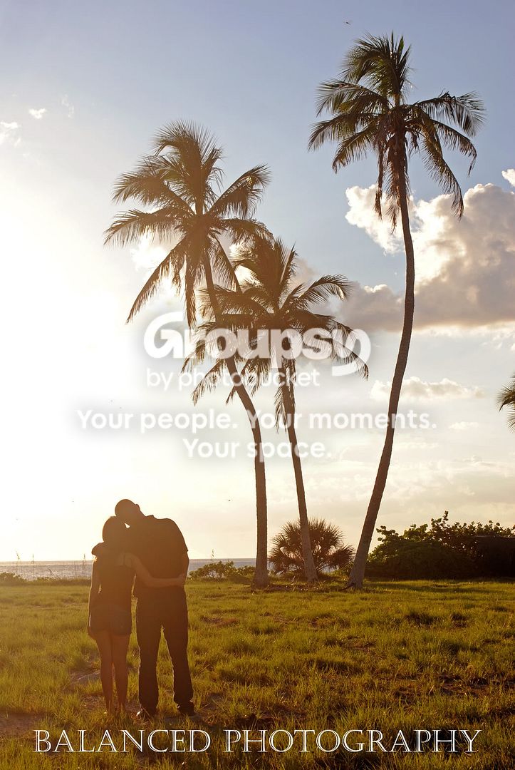
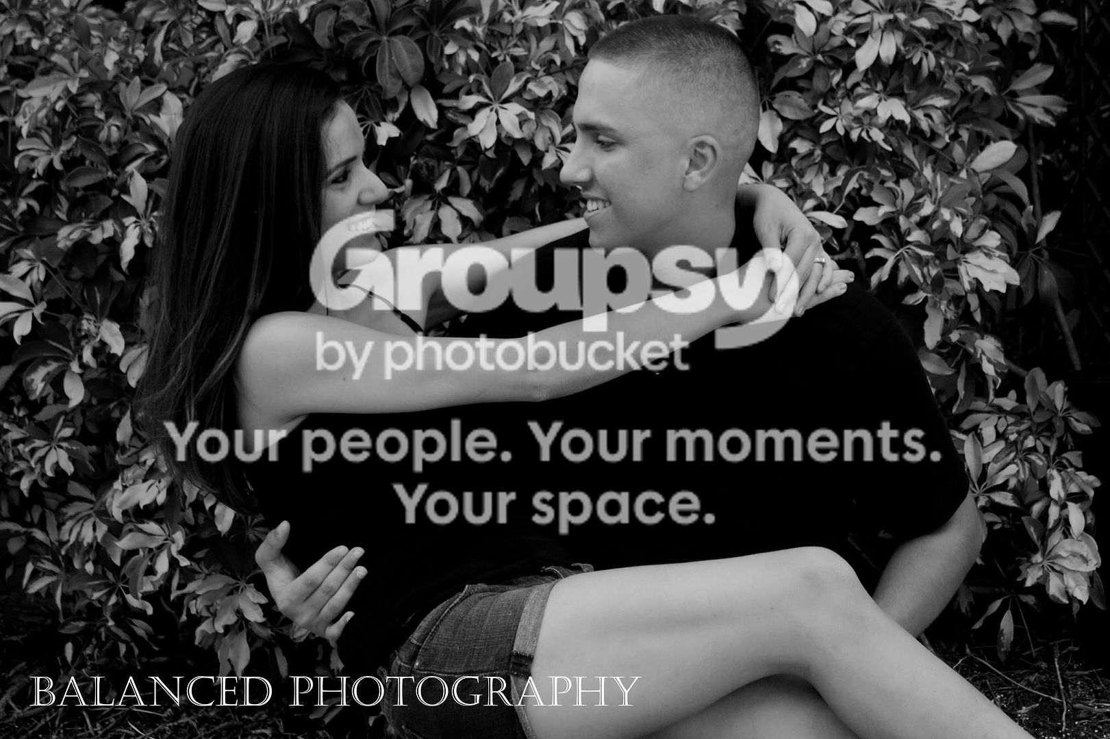
These photos indicate you need to get a handle on the use of fill lighting.
BTW, it's a bit difficult to give c&c with so many images showing varying styles and approaches, better to show 2 or 3 of the same approach or style and give some indication of what you want c&c on. Otherwise, it just a bunch of pictures for which you just want a pat on the back.
Thanks for posting.






![[No title]](/data/xfmg/thumbnail/1/1592-cfae4a7ea791f96c6e2d03484be2e454.jpg?1734142210)
![[No title]](/data/xfmg/thumbnail/32/32810-094482c1ef1c76eae62a96107013a72e.jpg?1734162496)