It certainly doesn't suck. It can be better, but the path to better is probably different for different people.
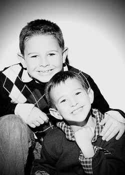
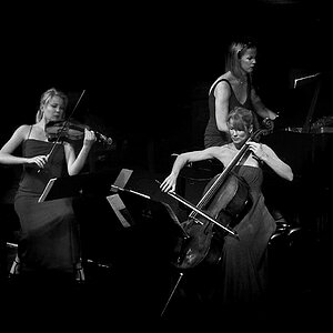
The posing and expressions are good, and the clothes work well with b&w. But the knee is prominent (it caught the light) and the closer subjects hand is like a fist. not bad, but maybe not what you would want. Noticing things like the knee and the fist during the shoot lets you try again for a better shot.
Once you settle on this as the as the best from the session and you want to post it... maybe burn the knee a little... knock it down so it's not so bright and prominent.
For me, I don't see the overall shot as too contrasty. Rather, I see the faces as having a flat tonal range... and being stuck in the silver range.... almost what I'd expect if printing a b&w on silvered paper. To my taste, I'd try using levels to get some range and get out of the flat silver look. I might also try cropping closer and using a softer vignette (if any).
As others noted, the shadows are harsh... I'm guessing a bare flash. If you have a light modifier, softener, it would help with the shadows. If you don't, and you have white walls and/or are going to go to b&w, you can try facing the flash AWAY from the subject and let the light bounce all around the room so it comes from all angles. You can also bounce it off a wall or the ceiling. But if the walls aren't white, you can pick up weird color casts when bouncing. Imagine bouncing off a white wall.. but with red curtains and a tan couch. You can get varying color balance which is a pain to fix in post.
And most of this is taste and preference, so just take all the ideas you get and do something different next time.






![[No title]](/data/xfmg/thumbnail/37/37519-6093821531f744039f3ac2b3e30c7dbf.jpg?1734170680)