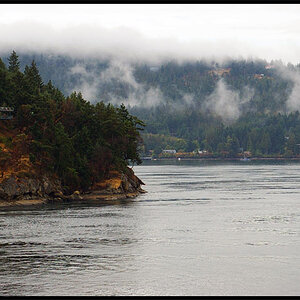
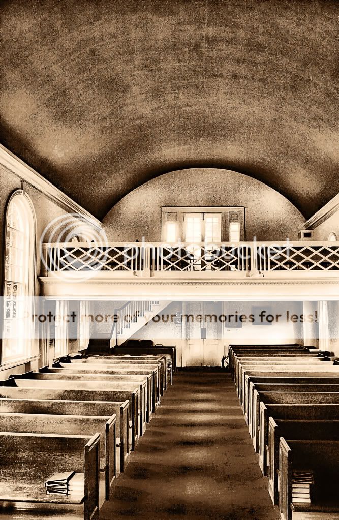
overprocessed. i hate how you can see past the bridge/walkway thing on the left, but is cutoff on the right. it should be more balanced. dead space on the top.
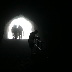
That staircase looks familiar... You shot this before, but I think last time you shot it symmetrically. I find the antisymmetry here curious. Looks like you're trying to do something, but you're not pushing it enough.
There's no such thing as an absolute no no in photography. Sometimes, things that shouldn't work, do work. And things that should work, don't. Don't be afraid to experiment with different things. You might be surprised.
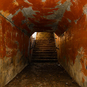
I think its cool composition, I just ain't feeling the post processing you did. Little heavy IMO. I think it would also be a cool shot from a very low angle.
I for one love the PP. It might not be the "normal" thing to do but Vangogh didn't do the "normal" thing either. The shot itself isn't pleasing to me but keep doing your own thing!
The window crowding at the left hand side of the frame is causing unwanted visual tension. Overall this shot doesn't move me...it just "is". Neither good, nor bad.

")
![[No title]](/data/xfmg/thumbnail/31/31746-12607d714ca2713b95250821c881aea9.jpg?1619734987)
![[No title]](/data/xfmg/thumbnail/31/31747-2e2e2bda16938a6a1d5fd6120c558293.jpg?1619734987)