- Joined
- Aug 6, 2012
- Messages
- 4,829
- Reaction score
- 5,764
- Location
- near St Louis
- Can others edit my Photos
- Photos OK to edit
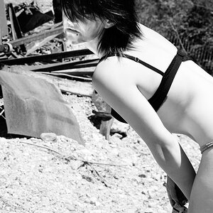
Quincy was the same color as the concrete background. The exposure is the same as shot. I did raise the black point up a little and the lower midtones down a hair as a curve adjustment. Used Nik's Silver Efex. Too light? Not light enough? Contrast? C & C please
 Quincy - high key by Cheryl, on Flickr
Quincy - high key by Cheryl, on Flickr


![[No title]](/data/xfmg/thumbnail/31/31095-2b52a6dcc956382cffdd384ae4d156f2.jpg?1619734612)
![[No title]](/data/xfmg/thumbnail/31/31012-f5e0c7cdea2f2c3e44737e3f61c2461a.jpg?1619734567)
![[No title]](/data/xfmg/thumbnail/42/42351-b976e32171d0405397bf5237bc4b902e.jpg?1619740148)