What's new

Hooked on Primes

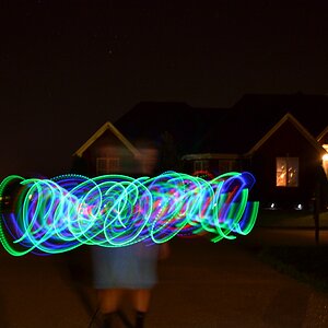
"negative space" "I wanted it there" "different strokes" gotcha...

You asked, I answered. Are we having a snarkiness contest? :) If so, I concede that you're the winner, especially since I acknowledged your earlier points and you still continue to be snarky.

You have been here what? A month? Your retorts are pretty common whenever somebody points out ugly dead space in a photo. "Negative space" and "I like it that way." Gotcha. CLASSIC examples of people who want or ask for evaluation of photographs, and then get defensive and fire back at those who C&C their photos. Your responses, "negative space" and "I like it that way" have been discussed here on many,many,many threads which try to highlight how beginners, in the beginner's forum, respond to C&C, or even to just simple evaluations of their presented photos. If you wish to call dead space "negative space", and think that ugly creosote-covered poles look "good" and "tell a story" when seen as part of a series, okay....whatever...

Maybe you'll take my comments and do something about it the next time you frame up a shot, and think, "is that just dead,empty space?" Or possibly, "Is this really the best thing to include in the shot?" perhaps you will even think to yourself, "Am I including too much dead, uninteresting background in this shot? Should I perhaps use my wrist, and flip the camera to vertical, and then take three steps to the left, to make the background look clean and all-natural."

Or.....you can continue to call it "negative space" (even though other more-experienced shooters are calling it distracting and a buzz kill, etc). And you can continue to say, "I like it that way,". I've seen and heard your responses dozens of times in m y nearly 10,000-post time here...so, yeah...gotcha'...I understand how you feel about your photos. perhaps you can understand where I was coming from if you go back and search, or wait for new, threads on how to accept C&C, and whether it's best to listen and evaluate what your critiques, or to just sit there and smugly defend wort that could benefit from some better compositional skills and better camera-handling and a bit of background evaluation through the viewfinder and on the LCD screen in the field.

As a nearly 40-year prime lens shooter, I will pass along a bit of advice right here: primes force you to LEARN how the lens frames, and how it de-focuses the background, and EXACTLY what a lens's angle of view behind the subject encompasses. When you use a prime focal length, you will LEARN what the background rendering and angle are, and will be able to envision the image width behind the subject. A prime never varies. What you need to do is to start looking behind the subject before pressing the shutter release, and your prime lens will soon become a valuable tool, constant and faithful. So...look at the backgrounds...

Thanks! And I mean it. No snarkiness intended. This is valuable advice and I will take it to heart. I wasn't ever intending to be dismissive of you or your experience. I was trying a lot of different shots that day for different reasons. It was just for practice. All I meant was that in that particular picture (the "space" picture), the extra space was intended and it still gives me the impression of being well balanced, but maybe I'm just not experienced enough to know a well-balanced picture.

With regard to the other picture, my edit in my response clearly indicated that you were right and that I was re-thinking that photo. Since I was there at the shoot and saw the surrounding area, I have memories and context of the site that no one else has the benefit of. That means that I was imparting context to the image that no one else would get. All they see is the pole and the woman, which doesn't make much sense as a photo. That is definitely a mistake on my part. I didn't stop to think, "What would someone with completely fresh eyes see when they look at this?" That right there is one of the best lessons I've taken away from your post. With regard to the overall composition, the context, and the background, I need to always pause for a second and consider if the image stands on its own, shows what I want to show, and doesn't show anything I don't want to be there.

In all seriousness, thanks!
 
Okay, I'm *really* trying to view that first picture with fresh eyes and now I agree that there is too much space on the left side. It took a bit of a mental exercise to re-think it without having any attachment to it. Maybe I'll try a new edit tonight that crops out some from the left, and I can try to clean up that car a bit, too, just to see what it would look like. Of course, it would be better to to have framed the picture so there was no car right behind her. :)
 
Regarding one of the sample pictures you sent us to look at, this one: All sizes | Tessa - Before & After | Flickr - Photo Sharing!

Okay....woman in stylish autumn clothes, with beautiful fall foliage BUT--a massive failure as a fashion shot, or a for-pay outdoor portrait. Why? Here's a design principle that simplifies human vision: "Light advances, dark recedes". See those two very dark tree trunks on the right hand side of the photograph, and then see that car parked, showing up, burned-out white and RIGHT BETWEEN TWO DARK PILLARS? My eye goes right past her, and zooms right to that ugly light advancing out of the dark...I look right PAST the woman...it's virtually automatic, and part of the human visual system.As in, the kind of thing we know from psychology and the visual perception field. Good God...that's not a skilled shooter framing that shot. How about the cheap little econo-box car on the right hand side of the frame??? Anybody who has any training in the visua arts KNOWS that an object placed exactly on the edge of the composition creates visual TENSION.

He did a "before and an after". Yeah...he boosted the saturation a bit....but his photo still has a snapshooter's background with two GLARING mistakes: first the glare on the car, positioned between two dark, anchoring "pillars". Errrrrrrr!@! Buzzer!!!!! And then he puts an econo-box automobile directly at the right hand edge of the frame!!!!!!! My eye leaves the woman every single time. The eye flow through the example photo is poor. Extremely poor. It's not a successful photo.

As a "prime lens shooter", what should he have done? Well, first off, he should have tried to eliminate the car between the two dark trees; have her move over two steps to the right side of the frame, step, and he takes three steps to the left, and the car will be blocked by her body. Or he uses a slightly longer prime lens, one that has a narrower angle of acceptance BEHIND the subject, and he gets the colors of the fall foliage, and the space around her, but he manages to keep that car from showing up right between two very,very strong visual "anchor points". he could have made an absolutely,positively lovelty image with a 300mm lens from about 45 yards...and the background would have been a wash of lovely fall color....but...he shot medium, from medium close...and didn't look at the ugly background elements. he did a before and an after, but he did not do what the shot desperately needed, which is serious retouching to remove two UGLY CARS that ruin the photo...

I learned photography before retouching was feasible, unless done by trained women with airbrushes at $25-$35 an hour, back when $35 was five hours' pay...the example shown at All sizes | Tessa - Before & After | Flickr - Photo Sharing! is a good example of a before and after where the BASICS should have been addressed in the field...AND THE AFTER parts should have been cloning out the ugly stuff that ruins the shot.
 
Last edited:
That was an excellent breakdown of a shot. Thanks a lot! That was very helpful. I appreciate it.
 
Hey - I take offense to that statement! :) Not ALL newbies are like that!

Settle down, missy. Not all are like that, but more than enough are. Once in a while a newbie surprises you by not defending their pics. The number of newbs, however, who justify poor technique/composition as "artistic license" without knowing the fundamentals makes me offer C&C and advice less than I would like to. And yes, you are one of the exceptions. ;)
 
Derrel, I looked @ that link as well & thought the pic would have been torn apart if presented here by the originator. I agree with what you posted but could never articulate it as well as you.
 
I didn't say he was wrong. In fact, I've twice said that I appreciate the content of his message. And to characterize my response to him as a simple, "I like it that way" minimizes what I actually meant. For example, in the first pic, is it technically wrong to have that space there? No, it's not. Some people don't like it, others do like it. In that particular case, that was what I was going for. I chose to have space because I wanted a feeling of space. I fail to see how this is objectively wrong. The biggest mistake in that picture was not paying enough attention to the background. That was certainly a mistake. I don't agree that the use of space is an objective mistake. It seems as if some here are making subjective style decisions into hard-and-fast rules.

On the other hand, even I think I tend to use too much space in portraits. I didn't post any shots from my other shoot, but this problem became very apparent to me later when I had to time to view those pictures with fresh eyes. I was too focused on one set of issues and didn't see the glaring composition issue in front of me. I was treating portrait photography the same way I was treating architectural photography where I tend to balance elements against each other in the frame. That works great for architecture, but it moves the main subject too far off to the side in portraits. It was just a habit that worked well in one context but wasn't working at all in a different context, and it took a while to spot the problem.

I was posting while you were responding to Derrel, therefore I didn't see your acknowledgements. My post was also directed more towards all the newbies, and, yes, a bit towards you as well.

There is a place, time and effective way to use space. The most common misuse of space you see on this, and other fora, is putting a subject on left/right side of frame, looking in that direction, but the space is on the opposite side. This makes for a pic that looks claustrophobic as the visual "feel" is that the person is crammed up against the side of the frame. The effective way of doing this is to have the empty space where the subject is looking/facing (sometimes referred to as "looking space"). Sometimes empty space is just that. It actually detracts from the pic because of the visual sense of being off balance. So you're correct in saying using space isn't an objective mistake, but the way it's (mis)used often is.

As far as minimizing your comments, certainly not my intent. Once you've been here for a while, and hopefully you will be, you'll see time and again newbs saying the exact same things that I referenced. They know their pics are perfect because they are exactly what they intended. I call shenanigans. Again, artistic conventions are in place for a reason; they work. And they work because they are based on the way the human eye/brain connection works. Without understanding how things work, it's impossible to consistantly break rules in a way that makes for a good shot.
 
If there is one person on this site whose posts are worth reading, it's Derrel. His posts should be linked on the front page. Even if he isn't talking about photography, he still writes very well, and I can feel the enthusiasm.

We're all going to end up on someone's ignore list sooner or later. I lasted 800 posts. Are we here to be touchy of someone's "tone" (read: omg) or to look past that and actually just read what the post says? When new members understand that, they'll do fine here.
 
althought it took some wading thru and arguing allot of very good points are being brought up. things i never would have thought to look for in shots like that. some of the info shared here is the exact reason why visit these sites.
 
Actually, subscuck's IMO was much better articulated.

Derrels response gets lost in his rant like style... spending a paragraph to simply state the darken trees and car highlights are distracting. What subscuck pointed out in words accurately is why the model looks cramped in frame even though there is adequate space.... the space itself is not an integral part of the photo.... its just there.

bravo..... this is what the tpf used to be like.
 
His rants should be hand written in calligraphy and put in a book with gold on the edges of the pages, hand drawn illustrations and a red band for bookmarking pages. Hardcover with classy drawings and illustrations on front.
 
His rants should be hand written in calligraphy and put in a book with gold on the edges of the pages, hand drawn illustrations and a red band for bookmarking pages. Hardcover with classy drawings and illustrations on front.

Yeh.. its exactly what's wrong with this place.

Place is suppose to be fun... but how many people find it tense..


The content of crap may be good but it still stinks.
 
It only stinks if your glasses stink. I, for one, aren't wearing glasses.
 
There is a place, time and effective way to use space.

I agree. The best use is for the prolific watermark. I swear that is the only reason these spaces exist anymore. In fact I'd swear from what I have seen they are positioned by photogs new and not new just for that purpose. :confused:
 

Create an account or login to comment

You must be a member in order to leave a comment

Create account

Create an account on our community. It's easy!

Log in

Already have an account? Log in here.

Back
Top Bottom