jowensphoto
Been spending a lot of time on here!
- Joined
- Feb 28, 2011
- Messages
- 2,983
- Reaction score
- 906
- Location
- Northern Viriginia, US
- Can others edit my Photos
- Photos NOT OK to edit
- Thread Starter 🔹
- #16
I dig the bw!!! A lot!
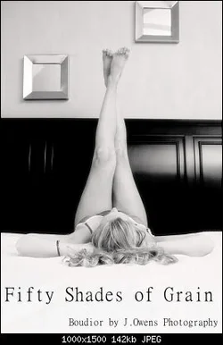
In the first one the railing in the foreground crops off her arm - you can see just part of her fingers which to me seems to make for a distraction, but that's a fun shot that I'd think a client would love. In the second one her legs are so much of the photo but the feet especially don't look real sharp, not sure if that would be from the focus/depth of field or the lighting (or maybe lack of decent lighting in that room since something seems off).
(I don't know, I think she's kind of lost in the B&W, she's so light nothing looks very defined and that headboard is so dark I think it overpowers the image.)
Just cuz I cannot leave stuff alone. I solve all problems, not just white balance problems, by going monochrome. Let's see what happens to the softness in the toes when we do a little diffusion glow stuff?
Brighten it all up a bunch, desaturate. Fool with curves a bit to get more contrast/lighten the into skin tones.
Duplicate the layer.
Add a layer mask -> grayscale copy OF the layer
Replace the duplicate layer (not the mask, the layer) with a solid panel of almost white, slightly pink.
Blur the layer mask, gaussian blur radius 85 or so. The effect of this mucking about with layers is left as an exercise to the reader.
Paint all over the layer mask to let the base layer show through here and there around the girl. Mainly because I can't leave the airbrush alone.
I dunno, I kinda dig it, but I would, wouldn't I?
View attachment 49249

In the first one the railing in the foreground crops off her arm - you can see just part of her fingers which to me seems to make for a distraction, but that's a fun shot that I'd think a client would love. In the second one her legs are so much of the photo but the feet especially don't look real sharp, not sure if that would be from the focus/depth of field or the lighting (or maybe lack of decent lighting in that room since something seems off).
(I don't know, I think she's kind of lost in the B&W, she's so light nothing looks very defined and that headboard is so dark I think it overpowers the image.)
^^ I thought the same for the B&W.