What's new

I have never done this before...suggestions?

YvetteC

TPF Noob!
Joined
Oct 19, 2012
Messages
84
Reaction score
49
Location
PA
Can others edit my Photos
Photos OK to edit
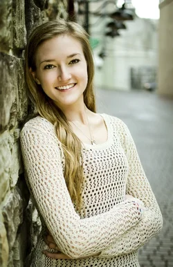
A close family friend needed to have her senior pictures done...I offered to give it a try (knowing I was in way over my head) because I wanted to help. There is a long sad story involved but I guess the point is that I love this girl and want to do an amazing job for her. I would greatly appreciate any suggestions or pointers. I have only edited a few but I want to make sure I am going in the right direction:

1.
DSC_9822 by Yvette C., on Flickr


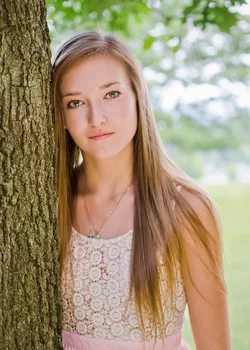
2. Her legs looked strange in this one but cropping them out means no hands or elbow....is there a better way to crop this?

DSC_8006 by Yvette C., on Flickr

3.
DSC_7929a by Yvette C., on Flickr

4. She wanted a few serious ones...to reflect what she has been through. Any thoughts on how to achieve this?

DSC_7767 by Yvette C., on Flickr


Thank you for your help!
 
Watch out on #1, the composition with the street lights in the background jetting out close to her head.

Slightly underexposed. (1 and 4)

Get your self a light meter, and take some readings around the model's face and you'll be amazed at your new consistency.
 
I think you did OK. When the whites of a subjects eyes are gray instead of white, you can be pretty sure the image is underexposed.

#1 is actually under exposed quite a bit. I think the background is sufficiently blurred that the lights are a non-issue, and actually kind of help frame her face.

It's not your fault, but I have seen so many 'high school senior leaning on a wall', 'high school senior leaning on a tree', 'high school senior sitting on a loading dock', and 'high school senior on the railroad tracks' that they all pretty much make me want puke anymore. :D

In #3 I would move the catch lights to the upper camera left part of each iris. I'm iffy on the pose and the background, but it's an interesting angle for the light.

In #4 the busy bark of the tree is stealing some attention from her.
 
The few things mentioned here are minor, all & all you did a fine job and this pretty young lady has some nice images of herself.
 
The first image was my favorite, but I felt it could use some retouching adjustments to make it pop a little more. I did some white balance adjustments, brightended the image and increased the contrast, brightened her eyes, whitened her teeth in lightroom. I also did a crop because I felt there was too much blur in the rocks on the left side and I found it distracting. I then took it into photoshop and did some clean up on her skin to remove any blemishes. Finally I did some dodging and burning to make the image pop a little more. I have a resized version and link to the full resolution image. I hope you like :)

$ImageRetouchedResized.webp

http://i866.photobucket.com/albums/ab229/StolarzStudios/ImageRetouched_zps4f598c38.jpg
 
The first image was my favorite, but I felt it could use some retouching adjustments to make it pop a little more. I did some white balance adjustments, brightended the image and increased the contrast, brightened her eyes, whitened her teeth in lightroom. I also did a crop because I felt there was too much blur in the rocks on the left side and I found it distracting. I then took it into photoshop and did some clean up on her skin to remove any blemishes. Finally I did some dodging and burning to make the image pop a little more. I have a resized version and link to the full resolution image. I hope you like :)

View attachment 56261

http://i866.photobucket.com/albums/ab229/StolarzStudios/ImageRetouched_zps4f598c38.jpg


This WB is horrible. The first one was MUCH better IMHO.
 
I think there's a bit too much yellow and or yellow/green in the skintones of most of these. Overall though, decent for a first effort. Trees with lots of leaves tend to filter the daylight, and reflect it as well, so there often *is* a lot of yellowish or yellow/green cast to the light.
 
I did a quick edit on one.. this monitor is terrible I've been editing on the last week or so while I get my other working again. I really like the poses on these but the biggest standouts to me were that they seem underexposed, wb off and a little repetitive for framing.. all upper half of the body. Mix it up!

$9854083743_d342ff362c_c-2.webp
 
The first image was my favorite, but I felt it could use some retouching adjustments to make it pop a little more. I did some white balance adjustments, brightended the image and increased the contrast, brightened her eyes, whitened her teeth in lightroom. I also did a crop because I felt there was too much blur in the rocks on the left side and I found it distracting. I then took it into photoshop and did some clean up on her skin to remove any blemishes. Finally I did some dodging and burning to make the image pop a little more. I have a resized version and link to the full resolution image. I hope you like :)

View attachment 56261

http://i866.photobucket.com/albums/ab229/StolarzStudios/ImageRetouched_zps4f598c38.jpg


This WB is horrible. The first one was MUCH better IMHO.

Wow, little harsh wouldn't you say ;).

I said I adjusted it, not that it was skin tone accurate. I was going for a look.
 
I did a quick edit on one.. this monitor is terrible I've been editing on the last week or so while I get my other working again. I really like the poses on these but the biggest standouts to me were that they seem underexposed, wb off and a little repetitive for framing.. all upper half of the body. Mix it up!

View attachment 56272


Now she has gone pink
 
Probably if you just make some adjustments to the color and/or brightness in your edits you'll be fine - you got some lovely portraits of her, great expression etc.

It looks like the first and last were shot on the same day so I'm assuming at about the same time of day in almost the same light (obviously some difference from the wall to the shade under the tree) and they seem to need to be brightened and might need similar editing; the other two seem like the color and/or brightness needs further adjustment. Once you tweak your edits you'll probably be giving her photos she'll be happy with.
 
Thank you all so much for your suggestions...this is exactly what I needed. I will work on exposure, color cast, etc and re-post.


It's not your fault, but I have seen so many 'high school senior leaning on a wall', 'high school senior leaning on a tree', 'high school senior sitting on a loading dock', and 'high school senior on the railroad tracks' that they all pretty much make me want puke anymore.

I couldn't agree more. Really. This was a challenge for me.

The first image was my favorite, but I felt it could use some retouching adjustments to make it pop a little more. I did some white balance adjustments, brightended the image and increased the contrast, brightened her eyes, whitened her teeth in lightroom. I also did a crop because I felt there was too much blur in the rocks on the left side and I found it distracting. I then took it into photoshop and did some clean up on her skin to remove any blemishes. Finally I did some dodging and burning to make the image pop a little more. I have a resized version and link to the full resolution image. I hope you like

Thank you so much! I love your crop!

I did a quick edit on one.. this monitor is terrible I've been editing on the last week or so while I get my other working again. I really like the poses on these but the biggest standouts to me were that they seem underexposed, wb off and a little repetitive for framing.. all upper half of the body. Mix it up!

Thanks! I actually have a bunch to edit with various poses...she's just so pretty that I am drawn to the photos where you can really see her face and eyes...so they are the ones that got my attention first :)
 
Good attempts I recon. I really like 1 but I'd desaturate the green thing by her head, its really bugging me in an otherwise good photo though you've blown out the sky too.

I'd also crop a bit off the tree in the 4th pic. It takes up a wee bit too much of the frame imo and I think she could have used a touch more light on her right to make her eyes look a bit more even.

2 and three I think your pose is off, they look strained to me for some reason.
 

Create an account or login to comment

You must be a member in order to leave a comment

Create account

Create an account on our community. It's easy!

Log in

Already have an account? Log in here.

Back
Top Bottom