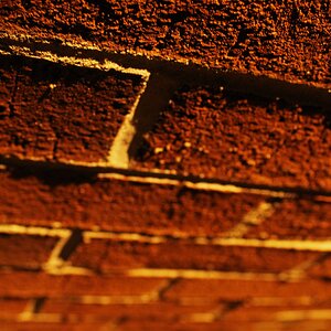
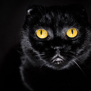
I love doing Black & White.but not always easy to decide when.

Photo Lady

Been spending a lot of time on here!
Joined
Dec 25, 2009
Messages
6,387
Reaction score
6,446
Location
ny
Can others edit my Photos
Photos OK to edit
but i find it very tricky that it just doesn't work all the time.. how can you look and realize it is the right time to go black and white or is it a quessing game and experiment.. thanks
1-1-1-dogs 027.JPG
1-1-eagles or hawks 023-001.JPG
1-463302_10150692712384634_493188727_o-002.jpg
 
When a photo uses design elements or principles such as lines, shapes, textures, repetition, or value then oftentimes a black and white conversion looks pretty good.

I really like the way you have added the micro white border along with the black border in your last photo.
 
When a photo uses design elements or principles such as lines, shapes, textures, repetition, or value then oftentimes a black and white conversion looks pretty good.

I really like the way you have added the micro white border along with the black border in your last photo.
very good advice Derrel... when you look at something you want to photo..{if they qualify with all the elements you mentioned}... do you know automatically that it will be better in black and white..or is usually trail and error....just curious if you know after you have been doing it awhile..
 
Well I started with black and white and I shot 95% black and white for twenty years or so,so I am used to seeing things and how they will look as black and white. for the last 25 years or so I have been shooting color almost exclusively, and for the last 18 years or so I have been doing almost all digital which gives me the opportunity to shoot in color, but to make a black and white conversion with very little effort in only seconds. I often think "hey that would look good in black and white! " when I'm at the computer, and using Lightroom, I can look at the photo multiple ways in less than 5 minutes, and Since switching from Photoshop to Lightroom in 2012, I have become more and more interested in seeing how images look with various filter effects and black and white looks. I think that Lightroom makes very good black and white conversions, with a lot less effort, and with greater repeatability than the channel mixer approach ever did in Photoshop.
 
IMO, one of the keys to a good monochrome is exposure. If you don't nail the exposure, it's only every going to be so-so. I quite often just click the 'Black and White' selection in LR or PS to get an idea of what the image will look like as a monochrome... sometimes it works and I process it, other times it doesn't.
 
IMO, one of the keys to a good monochrome is exposure. If you don't nail the exposure, it's only every going to be so-so. I quite often just click the 'Black and White' selection in LR or PS to get an idea of what the image will look like as a monochrome... sometimes it works and I process it, other times it doesn't.
thank you.... i appreciate your info..
 
Well I started with black and white and I shot 95% black and white for twenty years or so,so I am used to seeing things and how they will look as black and white. for the last 25 years or so I have been shooting color almost exclusively, and for the last 18 years or so I have been doing almost all digital which gives me the opportunity to shoot in color, but to make a black and white conversion with very little effort in only seconds. I often think "hey that would look good in black and white! " when I'm at the computer, and using Lightroom, I can look at the photo multiple ways in less than 5 minutes, and Since switching from Photoshop to Lightroom in 2012, I have become more and more interested in seeing how images look with various filter effects and black and white looks. I think that Lightroom makes very good black and white conversions, with a lot less effort, and with greater repeatability than the channel mixer approach ever did in Photoshop.
Derrel i appreciate you input.. i think i understand now that there is no one measure.. it takes practice.. and having a good soft ware program is a must.. i really enjoy B&W ..so thank you for the tips
 
I rarely use black and white, and it's something I should probably start trying more often. I've always thought of black and white as a way to eliminate distracting color. If the colors in an image pull my eye away from what I want to be the focal point, I'll often convert to black and white. Also, as Darrel said above, anything with strong lines often works well in black and white.

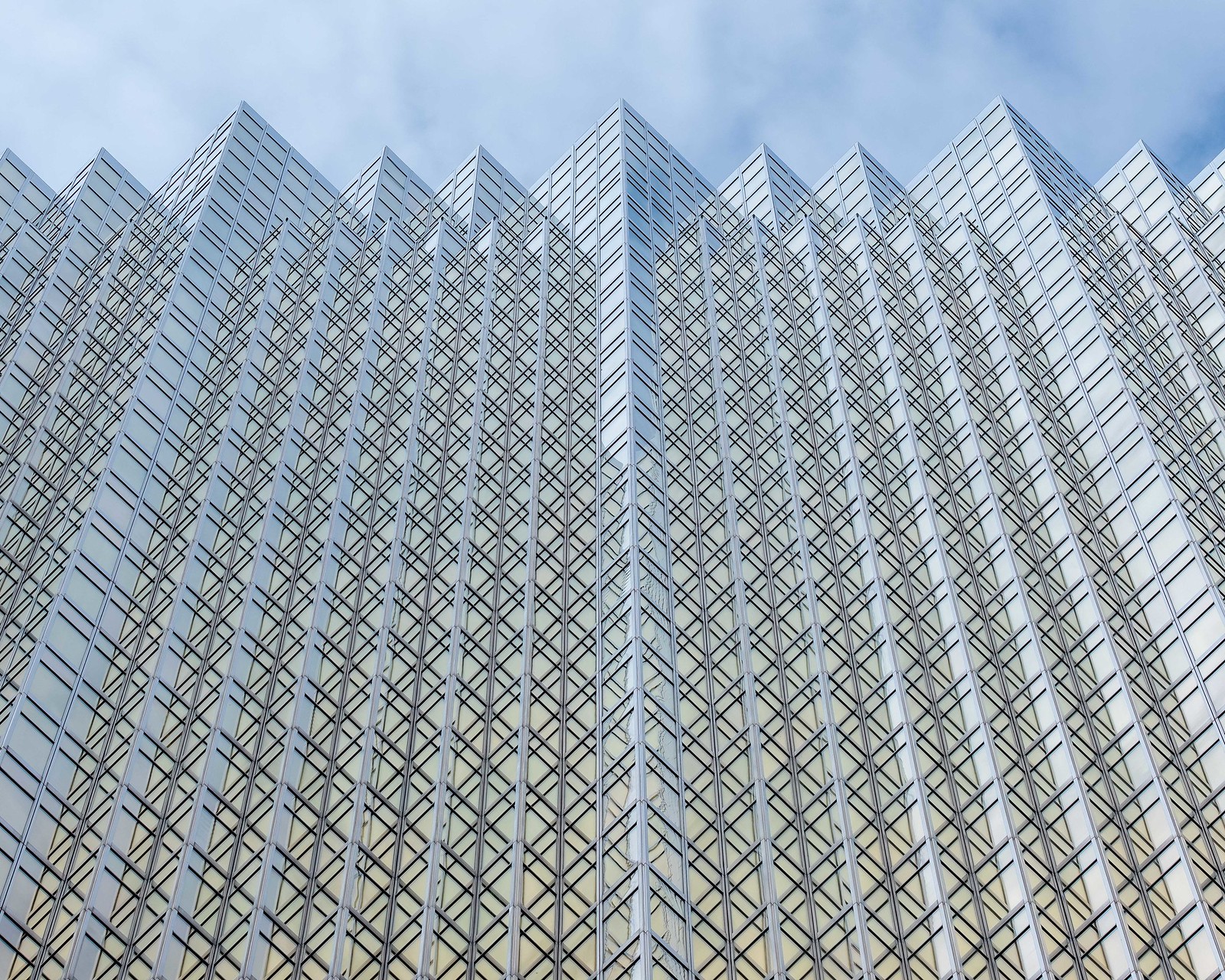
Here's the most recent example of this in my work to help show what I'm talking about. I apologize for the slightly different crops/edits.. I'm at work and don't have access to my LR catalog to make it a perfect comparison.

1.) Original Color - I didn't like how the deep blue of the sky in the upper right pulled my eye away from the building. I also didn't like how the different color casts in the building moved my eye around more than the lines. The whole thing seemed muddy and overcomplicated.
48886798496_105557e6bb_h.jpg


2.) Final Edit - BW - I like this better because it allows the lines to take charge. Color is not competing to pull your eye away from where the lines want it to go, and it allows the viewer to focus more on the geometric shapes without distraction
48886182548_ac10a33646_h.jpg


Hopefully this input is useful to someone. I probably have better examples from the past but this is what I had readily available.
 
Also, black and white can be used to save images that are otherwise unusable. It's sort of a cheaters tactic, and some would frown upon it. I did it a lot when shooting weddings: dance floors have tons of multi colored lights from the DJ. This makes them extremely hard to shoot.

If someone was basked completely in bright red light it could totally ruin the photo, but a simple black and white conversion could easily save the image. It wouldn't be a masterpiece, but it would be deliverable.
 
I rarely use black and white, and it's something I should probably start trying more often. I've always thought of black and white as a way to eliminate distracting color. If the colors in an image pull my eye away from what I want to be the focal point, I'll often convert to black and white. Also, as Darrel said above, anything with strong lines often works well in black and white.

Here's the most recent example of this in my work to help show what I'm talking about. I apologize for the slightly different crops/edits.. I'm at work and don't have access to my LR catalog to make it a perfect comparison.

1.) Original Color - I didn't like how the deep blue of the sky in the upper right pulled my eye away from the building. I also didn't like how the different color casts in the building moved my eye around more than the lines. The whole thing seemed muddy and overcomplicated.
48886798496_105557e6bb_h.jpg


2.) Final Edit - BW - I like this better because it allows the lines to take charge. Color is not competing to pull your eye away from where the lines want it to go, and it allows the viewer to focus more on the geometric shapes without distraction
48886182548_ac10a33646_h.jpg


Hopefully this input is useful to someone. I probably have better examples from the past but this is what I had readily available.
wow yes... i understand... good reasons explained too.. thank you so much.. i really see the difference things you pointed out.. and how right you are.
 
IMO I think simple compositions or those with strong elements like the above tend to make better B&W conversions. For example a single tree vs a forest, or an individual vs a crowd of people. Without color to provide some separation, multiple details similar in texture or structure tend to get lost in a gray scale image.
 
IMO I think simple compositions or those with strong elements like the above tend to make better B&W conversions. For example a single tree vs a forest, or an individual vs a crowd of people. Without color to provide some separation, multiple details similar in texture or structure tend to get lost in a gray scale image.
yes.. you are right .. i can understand so much better now.. sometimes i feel like i am asking a silly question.. but you guys always make my silly question become important with your tips and logic.. There are so many aspics to everything involved with photography. .. okay everyone.. i have a better idea of what to do and what not to do with black and white photography now.. when color is out of whack.. when there are lines and shapes in repetition.. when there is more or less a singular subject.. thank you all so much.. i would have never thought of all this on my own..
 
I sort photos by subject. Alaska trip, festivals, dog etc.

Sub folders by location, Fairbanks, Seward, cannery, fish nets etc.
 
I sort photos by subject. Alaska trip, festivals, dog etc.

Sub folders by location, Fairbanks, Seward, cannery, fish nets etc.
thats good idea.. i better start getting more organized..
 

Most reactions

New Topics

Back
Top