I rarely use black and white, and it's something I should probably start trying more often. I've always thought of black and white as a way to eliminate distracting color. If the colors in an image pull my eye away from what I want to be the focal point, I'll often convert to black and white. Also, as Darrel said above, anything with strong lines often works well in black and white.
Here's the most recent example of this in my work to help show what I'm talking about. I apologize for the slightly different crops/edits.. I'm at work and don't have access to my LR catalog to make it a perfect comparison.
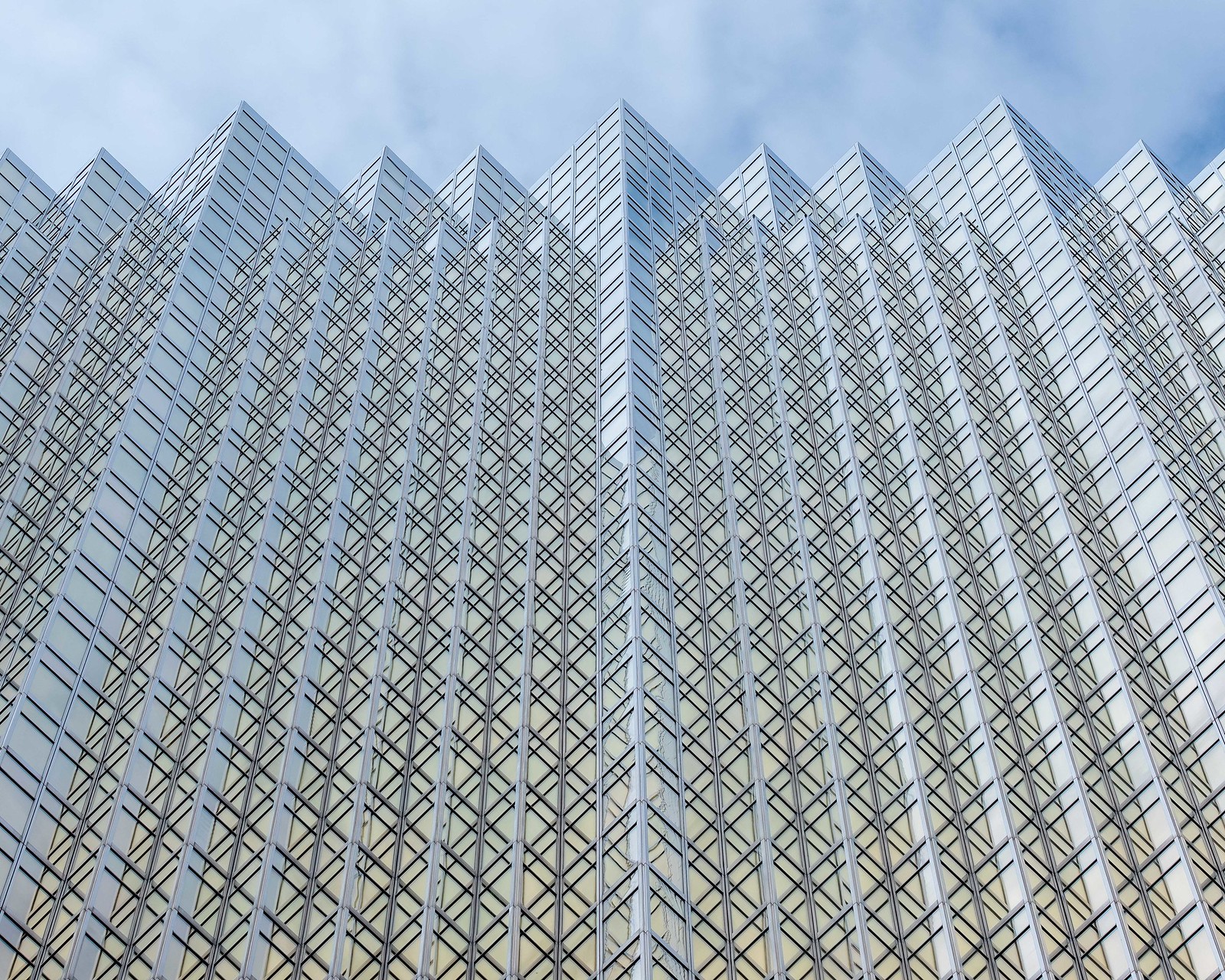
1.) Original Color - I didn't like how the deep blue of the sky in the upper right pulled my eye away from the building. I also didn't like how the different color casts in the building moved my eye around more than the lines. The whole thing seemed muddy and overcomplicated.
2.) Final Edit - BW - I like this better because it allows the lines to take charge. Color is not competing to pull your eye away from where the lines want it to go, and it allows the viewer to focus more on the geometric shapes without distraction
Hopefully this input is useful to someone. I probably have better examples from the past but this is what I had readily available.


![[No title]](/data/xfmg/thumbnail/34/34081-b60dc01a4635d409083c1fbe16b8fb95.jpg?1734164516)


![[No title]](/data/xfmg/thumbnail/35/35264-5ade32b7036391926536661aeb7491c3.jpg?1734166921)


![[No title]](/data/xfmg/thumbnail/41/41862-7cc80b10f9effd079847b9dd210dbe2a.jpg?1734176216)

![[No title]](/data/xfmg/thumbnail/42/42397-30faa170de7ed9be38adf00b9b26a220.jpg?1734176928)
