I need fresh eyes

limr

Moderator
Staff member
Supporting Member
Joined
Jun 9, 2013
Messages
20,580
Reaction score
12,709
Website
moderndinosaur.wordpress.com
Can others edit my Photos
Photos NOT OK to edit
Well, I don't literally need fresh eyes. Just a few different pairs of them to help me decide about some photos.

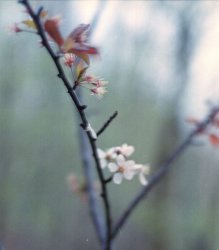
I don't need critique, per se. For example, I don't need to know that I know I missed the focus - it landed higher than I wanted and it's not as sharp as it should be. It was a slow shutter hand-held - just braced against the branch of the tree - and wide open with a Mamiya C330, and the wind was blowing, so I know why I didn't nail the focus where I envisioned it.

But despite the missed focus, is there something there anyway?
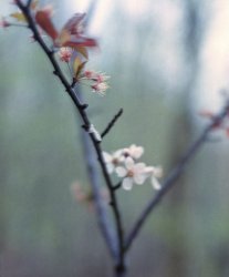
$rs Flowers.jpg

This one has similar issues and also leaves me a bit undecided:

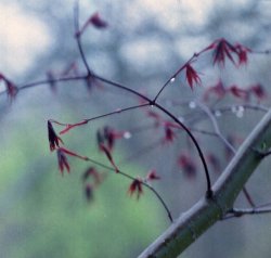
$rs Red leaves.jpg

So, I'm looking for reactions - yea, nay, almost?
 
For me it's yea.

I do like #2 more. I don't care about focus because both of them convey some nostalgic and sad (in a beautiful kind of way) feelings when I look at them.

In #1 I'm kind of bothered by that bright upper corner.
 
Even though you've missed the focus, they do appeal to me in a dreamy misty sort of way. So i'd say yay!
 
I prefer the sparseness and the simplicity of the trio of branches in #1. To me the way the branches each sprout from a common point of origin RIGHT AT THE BOTTOM of the frame, and are seen diverging from that point is a very strong basis for the overall shot. What adds more to it are the sky-tones, and the "other tree", or the hint of another tree, in the top right area. Each thin branch has at least some blooms on it. It's a case of where a little, very little, fills an entire frame. For me, the first image is better. The second image feels messier, and less balanced, and more, well, more chaotic, and it doesn't have a really beautiful,simple construct, the way the first images does. In the first shot, the background out of focus areas seem to further the image; in the second, while the OOF area is obvious of another tree, it doesn't seem to feel quite right that there is that big,prominent green patch in the lower left corner.
 
I like #1 the best. It reminds me of standing and daydreaming while looking out the window on an overcast day.
 
For me it's yea.

I do like #2 more. I don't care about focus because both of them convey some nostalgic and sad (in a beautiful kind of way) feelings when I look at them.

In #1 I'm kind of bothered by that bright upper corner.

To be honest, I didn't even notice it until you pointed out. I guess it doesn't bother me as much because I feel it's balanced by the darker areas in the opposite lower corner. I see it as a gradient. But I can also see how it can compete for attention with the flowers.

Even though you've missed the focus, they do appeal to me in a dreamy misty sort of way. So i'd say yay!

Thanks :)
 
I prefer the sparseness and the simplicity of the trio of branches in #1. To me the way the branches each sprout from a common point of origin RIGHT AT THE BOTTOM of the frame, and are seen diverging from that point is a very strong basis for the overall shot. What adds more to it are the sky-tones, and the "other tree", or the hint of another tree, in the top right area. Each thin branch has at least some blooms on it. It's a case of where a little, very little, fills an entire frame. For me, the first image is better.

Thanks so much for this!

It's always interesting to read a description that helps me understand what I myself was reacting to when I worked on the photo. It started life, of course, as a square image. There was another branch that was on the left of the frame and it was pretty dominant. That, plus the missed focus, and I figured it was a lost shot. But I kept staring at it with the feeling that there was still a picture in there somewhere. But what to do to find it? I didn't consciously but that common point of origin where it was, but when I was deciding on the crop, I knew that it had to be in the frame and the larger branch had to go. I tried to remember what I was feeling when I took it - what did I want to get with this image? I've always been attracted to visual scenes that showed balance without symmetry, so I played with this crop until I felt that balance.

And then your comment explained this more explicitly. :)

The second image feels messier, and less balanced, and more, well, more chaotic, and it doesn't have a really beautiful,simple construct, the way the first images does. In the first shot, the background out of focus areas seem to further the image; in the second, while the OOF area is obvious of another tree, it doesn't seem to feel quite right that there is that big,prominent green patch in the lower left corner.

Again, this helps me understand why I was still struggling with the second image. So I figure I need to either keep playing with the crop or give up on this one.

I like #1 the best. It reminds me of standing and daydreaming while looking out the window on an overcast day.

Cool, it reminds me of that too :)
 
Again, this helps me understand why I was still struggling with the second image. So I figure I need to either keep playing with the crop or give up on this one.
no, don't give up on the second picture!
 
I like the flowers in #1 and the water droplets in #2 , there was a drop in one but only one.
 
Again, this helps me understand why I was still struggling with the second image. So I figure I need to either keep playing with the crop or give up on this one.
no, don't give up on the second picture!

I won't give up yet! :) But I will play with some different crops perhaps.

I like the flowers in #1 and the water droplets in #2 , there was a drop in one but only one.

Thanks for your comment :)
 
Hey Lenny, I didn't read the other responses to not sway my thoughts.

I like both with a bit of tweaking.

In the first I like almost everything about it, except the dark line of bokeh on the right that appears to be "crooked" to me, it throws off the balance for me, perhaps try straightening by it?

The second, again like almost everything, except the light part at the top, did you consider a crop taking about 1/4 off the top? I think that will make it pop better.
 
Thanks for the suggestions, Pixie!

How are these? I straightened the first one a bit. It's not wildly different but maybe the lines are less distracting?

$rs Flowers B.jpg

As for the leaves, here's a slightly tighter square crop. There's still light parts at the top but perhaps a bit less clutter.

$rs Red leaves C.jpg

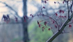
And here's a completely different crop. I was trying to keep this one square, like the original, but here I abandoned that and tried for different proportions. I think the tree in the background is too dominant for this one, though. But I also kind of like the lines, how the branch in the front sort of mirrors the lines of the tree in the back. I think the problem (or the interest?) is that the more in focus subject is on the right, but the lines and the dominant background tree pull the eyes towards the left. It might be confusing, or it might be dynamic. I'm too tired to decide right now ;)

$rs Red leaves B.jpg
 
I'm not objective here, completely .. I like the first version of your second picture... but why, I can't tell. I just like it :)
 
Last edited:

Most reactions

Back
Top