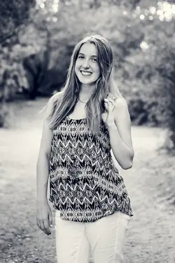
I suck at B&W..

Super rough little attempt at that but yeah.. I think so! I feel better about this one for sure. I didn't think the other was so bad initially.. until I see them side by side. I swear b&w makes me cross eyed.

$Samantha-27.jpg
 
Fail. I half read that.. all I addressed was the chin.. but yeah, the hair shadows could definitely easily be handled I think. Thank you!
 
Again.. 5 second edit to just give an idea.. I will have to go in later and try to address those dark shadows more precisely. This is my husband's cousin.. she's already seen all the photos and loves them as is so I'm not worried really but I definitely took it as an opportunity to play with the b&w because I really liked the image in b&w for whatever reason. $Samantha-28.jpg
 
$Samantha-29.jpg

One more from the same set.. with basically copy pasted adjustments for fun
 
I have really been trying to work on my B&W processing and would love a critique on this conversion..

Samantha-3bw by capturedbybc, on Flickr

Okay, a general rule about B&W (vs. color). Other than some silly perceptual biases (like you've shot a nude and in color it looks like Playboy, in B&W it appears like an "art nude"...or a portrait...in B&W it's suddenly serious), I would argue that the best times for B&W are when we want to emphasize lines and form and shades of light and contrast. B&W eliminates color spectrum so it eliminates that distraction. Sam is lovely and it's a nice spontaneous looking pose (thanks for sharing). But I'd argue it's a terrible selection to go all B&W on us. She's got a top that is all patterns, it's incredibly busy. And it's what drew my eye(s). Not her face, not her overall appearance but her top.

My recommendations:
1. Stay with color with this photo. If you want to shoot her in B&W, change that top.
2. If you like to "go bright" with her on B&W then aim for a high key concept. Shoot her with strong lipgloss and eye makeup so the emphasis is on her hair, eyes and lips.
3. For the existing color portrait, wipe out those holes of light in the upper right and top center in the photo. They grab our attention (rather than her). And I suspect that encourage you to brighten her up to not appear darker by contrast. You might even think about darkening the upper right and left corner so she's the brightest light in the picture.
 
Thank you JoeW for a detailed critique, very helpful! And Gary, thank you for the edit. I have no idea what the Tmax 100 comment means though? lol
 
Thank you JoeW for a detailed critique, very helpful! And Gary, thank you for the edit. I have no idea what the Tmax 100 comment means though? lol

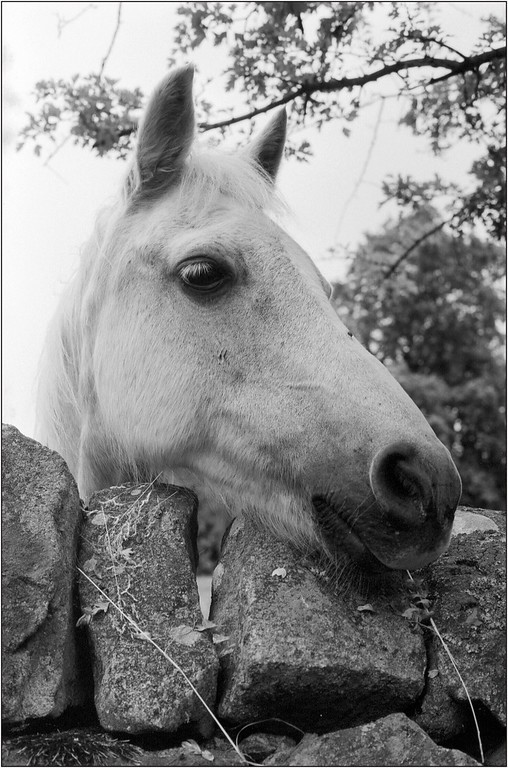
Tmax 100 is real B+W, this is tmax 100 about 30 years out of date and shot at iso400 which on film is under exposing then i did a stand developement in Rodinal 1+100 :wink: did you understand all that

Scan-130721-0001-XL.jpg
 

Most reactions

Back
Top