I think I'm getting better....maybe. C&C please

Digital Dustin

TPF Noob!
Joined
Dec 29, 2009
Messages
50
Reaction score
0
Location
Oahu
Can others edit my Photos
Photos OK to edit
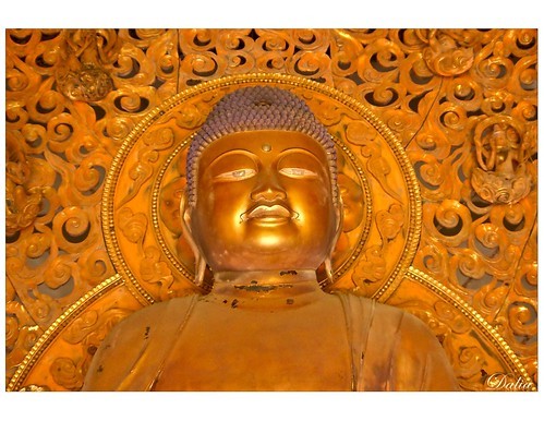
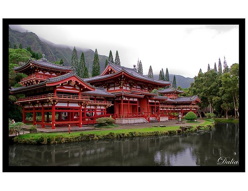
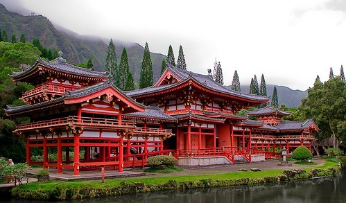
This is at the Valley of Temples on Oahu, pretty amazing. Please be as honest as possible.
1.
4356071914_86be56e56c.jpg

2.
4357263816_3b93f103e1.jpg
 
Last edited:
1. First image doesn't do much for me...just don't find it that interesting.

2. The second image is better. I like the clarity of the image but not the composition. Seems too tight to the temple on the left, I don't like how the temple has an upward tilt to the right, a little too much water in the foreground and the blown out sky is competing for attention with the temple. A tighter crop might work better. Colors could use a little more saturation brightness.

thank you for the critique, is this any better?

4357267070_c976310da1.jpg
 
I personally think that looks much better! Less water made a world of difference in my opinion.
 
I like the second one. The first image looks a little crooked to me? plus it seems to lack enough contrast. And sorry just doesn't have anything to draw you into it.

I like the edit on the second one as well. Reflections are typically a good thing, just didn't work in the original you posted.
 
I really like the 2nd one. I agree with Samanax except, I'd like to see it in a bit wider angle shot, show the surroundings, kinda put the temple into context of terrain. I personally think cropping so tight leaves a boring image, where if you zoom out and get a little wider, I want to know where the is coming from and going. As well as where the mountain ridge behind it takes you. But very nice.
 
#2 is a great shot. I prefer ther original edit, personally.
 
I like the water there, but I agree that the sky is a bit too much.
 
I like the water there, but I agree that the sky is a bit too much.

early in my photography education I am struggling with the blown out skies. I've heard you have to meter on the sky but it still shows all blown out in the pick. That will be a big hurdle for me whenever I'm able to do it.
 
I like the unedited version of your 2nd picture best, but I'm not very qualified to give C&C. I did wonder, however, how you post photos with black frames around them? My noobieness is showing.
 
I like the first one the best, but would have preferred to see maybe more of a straight on, wider angle shot. love the contrasting colors, and its a super crisp image. Good job! :thumbup:
 
I like the water there, but I agree that the sky is a bit too much.

early in my photography education I am struggling with the blown out skies. I've heard you have to meter on the sky but it still shows all blown out in the pick. That will be a big hurdle for me whenever I'm able to do it.
This maybe a dumb question? But when you meter off the sky, how are you doing it? If you're pointing at the sky and holding the shutter half way down, then recomposing, you're doing it wrong.

I only ask this because you say you've been doing it and it hasn't made a difference, and because I know a ton of people, some of which have been tinkering with photography for a while and still made that same mistake.

What ever you meter for, that is what the camera is exposing for. So if you do meter off the sky, then the sky will be exposed correctly. And you may already know this, but just incase, when you meter off of whatever, make sure you press the AE lock button. That will lock in that exposure, then that will give you a few seconds to recompose and take the shot.
 
Last edited:
i like them both. #2 without the border looks much better. do you have more? as a pair they are a bit disconnected. i liked to see more about the place.
 
I like the second photo in your original post, however I would like to see more space on the left side of the temple. I like the amount of water in the original. In the future you could shoot two exposures, one like you have now, the one using a faster shutter speed, to reduce the exposure (metering for the sky like you mentioned),underexposing the temple, but capturing some of the details of the sky, then merge the two together in post. You could do an HDR, or simply stack the 2 images then use a layer mask.
The angle that you shot the photo at is very good, just enough of the front and side. I also think that the angle that the shore line cuts through the frame works well.

The first photo in your original post doesn't really do much for me without any other context.
 

Most reactions

New Topics

Back
Top