What's new

I will c&c your work for you, beginners welcomed.

Thanks for the comments ! I am glad I can help.

It just goes to show you how powerful composition is. Your first photo
went from a snapshot photo to a great artistic piece of work in just one simple off center crop. Great job !
Here are two tweaked photos, your black and white one and a desaturated one.

You just desaturate the colors using the global saturation slider then use
selective color saturation in this case the shirt and popcan. Both versions
I have added a tad of contrast boost and USM (sharpening) to get over the AA filter.

Also I cropped a little off the top of your photo to make it more of a 4x6
format photo.

Hope this helps and thanks for posting.

Take care,

Dwayne Oakes

p369943032-3.jpg


p502116947-3.jpg

Nice improvement on the b&w; LOVE the desaturated version! Thank you very much Dwayne!
 
Id love to attach a photo but i cant seem to find a way of attaching it? Can anyone help? It says at the bottom that i may not post attachments?

Many thanks.
 
This is awesome. I would greatly appreciate if you could take the time to offer C&C, and also work you magic on this one. This is straight out of the camera. I have just started using/attempting to learn NX2, so I am excited to see what you can do, and how you do it. Thanks a million++:D

DSC_3755small.jpg
 
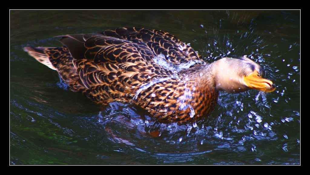
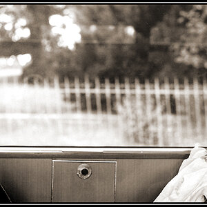
I am just starting out and would love to learn a few things. This photo was taken at a park and I was obviously behind glass!!! What can I do to enhance this image?

DSC06143.jpg


Taken with a SONY DSLR A200
On Auto, F/5.6 ISO 400

Do you need any more info?
 
Hi, I really like your PP and wonder, what you can do with this one. It is straight out of the camera.

4f54db0cfc_51102285_o1.jpg


I tried some PP myself and ended up with this.

3789544407_33be517c08_b.jpg


Thank you very much for your help and suggestions.
 
You are my Idol DWayne! My future goal is to edit photos as naturally as you do. Here is a photo I took that feel the colors are a bit off, I can't quite find the right ones. Please help!
Original
3788327491_1abd55de78_b.jpg


Tweaked
3789142648_083e3d78b2_b.jpg

Thank you very much for the comments, I really appreciate it !!

Here are two versions, both are tweaked the same just one is cropped
tighter for a different look and I healed out half the pole in the center of
the tighter cropped version so it is less of a distraction.

good

-very good comp (main boat placed off center)
-good contrast and detail
-very good DOF
-exposure is right on (some clipping but is typical in harsh light)
-low noise

nit

-photo could use a slight tilt to the roght to straighten the pole
-photo could use a tad of color boost

tweak

-straightened the photo so main pole it straight (not worried about
the shoreline as it has a natural curve to it)

-used selective contrast and lightened (dodge) the main boat and dock
water reflections

-lightened (dodge) the reflected light (sparkle) on the back of the
main boat

-added a tad of global contrast boost
-added a tad of global color boost
-added a tad of global USM (sharpening) to get over the AA filter

Hope this helps and thanks for posting.

Take care,

Dwayne Oakes

p667846874-3.jpg


p742069355-3.jpg
 
Last edited:
^^^ waaaaaaaaait a sec... are you really quoting yourself in your .sig?

:lol:

Wow.

Ok, back to your regularly scheduled photo editing.
 
This is awesome. I would greatly appreciate if you could take the time to offer C&C, and also work you magic on this one. This is straight out of the camera. I have just started using/attempting to learn NX2, so I am excited to see what you can do, and how you do it. Thanks a million++:D

DSC_3755small.jpg

good

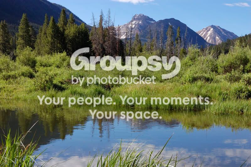
-amazing place
-very good comp
-exposure is right on
-great DOF
-nice vivid colors

nit

-WB is a tad on the cool side (blue color cast) personal choice
-photo is a tad flat (lacks contrast)
-photo is a tad soft

tweak

-set WB a tad warmer to get rid of the blue color cast (personal choice)
-made photo darker to start with so the (dodge) steps stand out more

FG
-lightened (dodge) the evergreens in the water reflection (left)
-lightened (dodge) the mountain peak in the water reflection
-lightened (dodge) the clouds in the water reflection

MG
-lightened (dodge) the evergreens highlights on the left
-lightened (dodge) the little brown grass patch in the center

-added a tad of selective color saturation to just the dried out evergreen

BG
-lightened (dodge) the mountain treeline on the left
-lightened (dodge) the the lit mountain peaks

Global
-added a tad of contrast boost
-added a tad of USM (sharpening) to get over the AA filter

-healed out the stray grass in the bottom right corner

Hope this helps and thanks for posting.

Take care,

Dwayne Oakes

p250526577-3.jpg
 
Last edited:
good

-amazing place
-very good comp
-exposure is right on
-great DOF
-nice vivid colors

nit

-WB is a tad on the cool side (blue color cast) personal choice
-photo is a tad flat (lacks contrast)
-photo is a tad soft

tweak

-set WB a tad warmer to get rid of the blue color cast (personal choice)
-made photo darker to start with so the (dodge) steps stand out more

FG
-lightened (dodge) the evergreens in the water reflection (left)
-lightened (dodge) the mountain peak in the water reflection
-lightened (dodge) the clouds in the water reflection

MG
-lightened (dodge) the evergreens highlights on the left
-lightened (dodge) the little brown grass patch in the center

-added a tad of selective color saturation to just the dried out evergreen

BG
-lightened (dodge) the mountain treeline on the left
-lightened (dodge) the the lit mountain peaks

Global
-added a tad of contrast boost
-added a tad of USM (sharpening) to get over the AA filter

-healed out the stray grass in the bottom right corner

Hope this helps and thanks for posting.

Take care,

Dwayne Oakes

p250526577-3.jpg


Thanks for the tips, I had attempted some global sharpening and contrast adjustments, but I had overdone them a bit. I now have a good idea where they need to be. I also like the local lightening or dodging adjustments. I think you stated in an earlier post that you were using NX2. If so, did you use the color point tool for the local lightening adjustments?
Thanks again, I really appreciate you taking your time for this.
 
I'd like to see what you can do with the one below. I really struggle with getting good landscapes and always seem to overedit them.....not sure how to get around that. I'd like to hear your thoughts on this shot as well as how you'd edit it....I've posted the SOOC version for you.
2009-08-04_61unedited.jpg
 
good

-amazing place
-very good comp
-exposure is right on
-great DOF
-nice vivid colors

nit

-WB is a tad on the cool side (blue color cast) personal choice
-photo is a tad flat (lacks contrast)
-photo is a tad soft

tweak

-set WB a tad warmer to get rid of the blue color cast (personal choice)
-made photo darker to start with so the (dodge) steps stand out more

FG
-lightened (dodge) the evergreens in the water reflection (left)
-lightened (dodge) the mountain peak in the water reflection
-lightened (dodge) the clouds in the water reflection

MG
-lightened (dodge) the evergreens highlights on the left
-lightened (dodge) the little brown grass patch in the center

-added a tad of selective color saturation to just the dried out evergreen

BG
-lightened (dodge) the mountain treeline on the left
-lightened (dodge) the the lit mountain peaks

Global
-added a tad of contrast boost
-added a tad of USM (sharpening) to get over the AA filter

-healed out the stray grass in the bottom right corner

Hope this helps and thanks for posting.

Take care,

Dwayne Oakes

p250526577-3.jpg


Thanks for the tips, I had attempted some global sharpening and contrast adjustments, but I had overdone them a bit. I now have a good idea where they need to be. I also like the local lightening or dodging adjustments. I think you stated in an earlier post that you were using NX2. If so, did you use the color point tool for the local lightening adjustments?
Thanks again, I really appreciate you taking your time for this.

No problem, I am glad I could help. Yes I use the color point tool
(U-point technology) no layers for most of my tweaks. Very simple to use but
a very powerful editing tool, your computer mouse will now become an artist paint brush.

Take care,

Dwayne Oakes
 
Last edited:
I am just starting out and would love to learn a few things. This photo was taken at a park and I was obviously behind glass!!! What can I do to enhance this image?

p148053208-4.jpg


Taken with a SONY DSLR A200
On Auto, F/5.6 ISO 400

Do you need any more info?

Nope I am good on the info, but thanks.

good

-amazing animals
-great comp
-great capture

nit

-white and black point not set (still room left on the histogram)
-photo is flat (lacks contrast)
-photo lacks color vibrance
-photo is a tad noisy

tweak

-set the black and white points off the tigers stripes
-added a tad of global contrast boost

-added selective color saturation to just the orange fur of all the tigers
and the moss on the wall and moss on the rock in the FG

-put the photo through NR software
-added a tad of selective USM (sharpening) to all of the tigers faces and
to the rock in center FG

-healed out all the brick mortar and steel channel on the wall (left)
-healed out some stray grass in the bottom right corner

Hope this helps and thanks for posting.

Take care,

Dwayne Oakes

p4141169-4.jpg
 
Last edited:
3790111112_d08361c450_b.jpg


I think i understand now. I would love to see what you do with this. I am extremely new to it all and have just started experimenting with photoshop CS.

Looking forward to seeing what you do!!
Kat

Hi Kat,

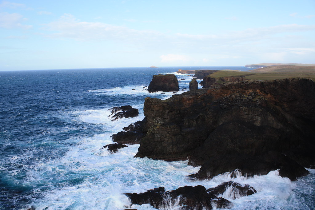
Great seascape !

good

-amazing place
-great comp (1/3 rule,sky vs land)
-nice color (blues) and contrast
-low noise and no sensor dust

nit

-lens barrel distortion (cuvre in the horizon) typical at wideangle
-photo has a slight tilt to the left when placed on a grid
-dark shadow (rockface)

tweak

-used lens distortion tool to fix the curve in the horizon
-straightened the photo

-lightened (dodge) the shadow in the rockface

-added selective color saturation to just the orange iron deposits
in the rockface, grass on top of the rockface flat and the little
turquesa color area in the sea in the bottom left corner

-added a tad of global contrast boost
-added a tad global USM (sharpening) to get over the AA filter

Hope this helps and thanks for posting.

Take care,

Dwayne Oakes

p138085907-4.jpg
 
Last edited:
I don't want to troll this thread but boy the tiger photo has to be the most depressing and sad image i have seen in a long time. The way they are cornered agaist that cement wall is just heartbreaking, no offense to who took the picture but this is the way i feel when i look at it, i mean, poor things, they look SOO bored and unhappy..

Peter
 

Create an account or login to comment

You must be a member in order to leave a comment

Create account

Create an account on our community. It's easy!

Log in

Already have an account? Log in here.

Back
Top Bottom