What's new

I will c&c your work for you. Beginners welcomed

I have croped it and played with the color a bit in GIMP (which was my second ever time PP). I also realised from other comments that I had my WB on tungsten. Any help is appreciated!

4293985001_62a987584d_b.jpg
 
Sarai2copyedit.jpg


Nikon d40 with pop up flash.
 
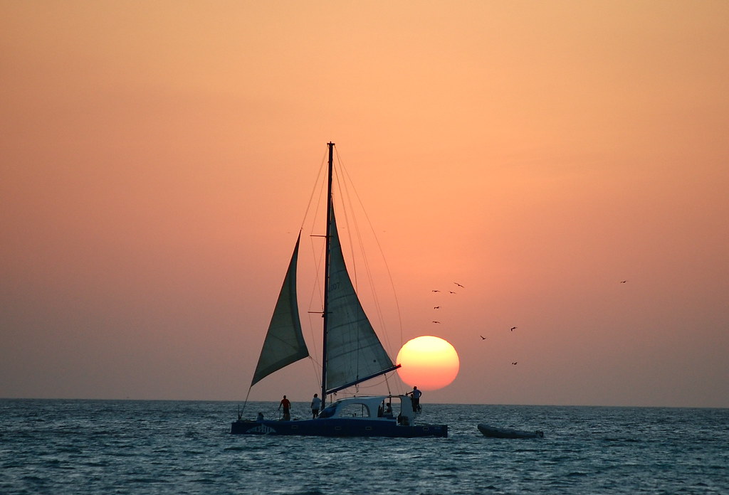
Dwayne, you've done some great work in this thread and have provided fantastic feedback! I was wondering if you could give me some comments on this one... thanks so much:

4267108134_4463929929_b.jpg

good

-great pastel colors
-good detail and contrast
-exposure is right on
-great light coming through the sails and on top of the boat roof
-good DOF
-the birds add to the photo

nit

-the comp (subject placed near center)
-a tad noisy (sky)
-horizon has a slight tilt to the right when placed on a grid

tweak

-straightened the photo
-cropped the photo and placed the subject to 1/3 rule

-lighten (dodge) the light coming through the sails and on top of the roof

-put the photo through NR software to reduce the noise in the sky area
-added a tad of global USM (sharpening) to get over the NR software

-used the midtone slider in (levels) to set final exposure

Hope this helps and thanks for posting.

Take care,
Dwayne Oakes

p512921670-3.jpg
 
this is a great idea dwayne, thank you i appreciate it.
this shot was taken at upper canada village, a mid summer day
but no sun which i feel is lacking in this image.

how would you add some 'sunny' quality to this shot?

thanks again.
wim

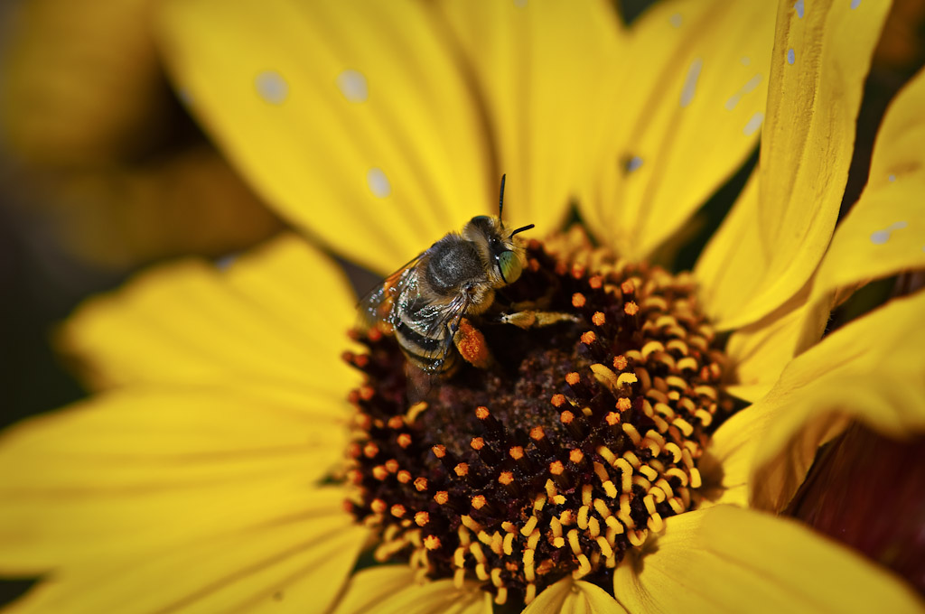
butterfly2.jpg

good

-great butterfly (black swallowtail)
-good off center placement of the butterfly
-great light coming through the butterfly's wing
-exposure is right on
-very good detail and contrast

nit

-colors are a tad over (personal choice)
-butterfly is getting lost with the other flowers (DOF flowers are bit of a distraction)

tweak

-cropped the photo a bit tighter to get rid of some DOF flowers and
placed the subject to 1/3 rule

-desaturated the colors (personal choice)

-healed out all DOF flowers (this takes several passes with the tool
because of the size of flowers)

-put the photo through NR software to smooth out the BG

-lighten (dodge) the flower
-lighten (dodge) the light coming through the butterfly's wing

-added selective color saturation to just the flower
-added selecitve color saturation to just the orange spots on the wing

-added selective USM (sharpening) to the center part of the flower
-added selective USM (sharpening) to the lit wing

-used the midtone slider and whitepoint slider in (levels) to set final exposure

Hope this helps and thanks for posting.

Take care,
Dwayne Oakes

p7202989-3.jpg

thanks dwayne, i imagine you are pretty busy with this thread you started :)

in particular i like the work you did on the wing of the black swallowtail in my photo.
i am not familiar with nr software. what is it ?
 
Last edited:
NR = Noise Reduction

Dwayne, can I hire you as a PP person? Probably wouldn't be happy doing just PP... :grumpy:
 
NR = Noise Reduction

Dwayne, can I hire you as a PP person? Probably wouldn't be happy doing just PP... :grumpy:

I am flattered CC and thank you !! But you are right I could not just do
pp. In my opinion you need a balance as a photographer with
equal amount of time spent in the field and on the computer. "darkroom"

I can tell you the two are an important relationship. They
bounce off each other, meaning they help each other. What you learn
to "see" in the field will help your pp and vise versa.

Also I believe if you are along in the craft to give back some of your
time (free) to help up coming photographers get a start. Like
I have said on other forums it is kind of yoda thing.

Take care,
Dwayne Oakes
 
Not that I expected a positive answer :meh: but I am actually looking for a PP person right now.

Although I know I will have to learn and will learn computer PP, even if just to be able to tell that person what i want, I feel like right now my time is better spent shooting than PPing. Finance wise anyway. Shooting time is still more valuable than its PP counterpart.

I didn't have a darkroom person when I had my last studio because I never could find someone whose work I liked and it will probably be the same this time around :lol:
 
I forgot to respond to the second part of your post.

I do believe in helping the up and coming for the simple reason that I grew up surrounded by artists and they are the reason I am doing today what I am doing. :thumbup:
 
thank you so much for doing this Dwayne!!! I appreciate it.

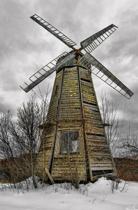
Here's mine (I chose it because I actually edited 7 times in total to get the final product) :
windmill5.jpg

Wow great processing ! Great job ! It has an HDR feel to it.

good

-great pp
-great comp
-great detail and contrast
-great DOF
-great selective colors
-great highlight control
-exposure is right on

nit

-none

Here is some finite tweaks that I can offer that might add to this
great photo

tweak

-darken (burn) the dark areas of the clouds to add more drama (personal choice)

-added a tad of selective contrast to just the window reflection

-lighten (dodge) the snow in the FG to make it whiter as there is
still room left in the histogram before the highlights start to clip

-healed out the mark in the snow in the bottom right corner.

Hope this helps and thanks for posting.

Take care,
Dwayne Oakes

p1069458556-4.jpg
 
Last edited:
Also beginner photographers don't be overwelmed by all the terms being
used here. Make a list of the terms and when you get a chance just look
them up on the net and read up on them when you get a chance.

What I teach here is the "art of seeing" and you will start to see a pattern
form on what to enhance.

So far we have

2 window reflections (the house and the windmill)
2 translucent areas (the sails on the boat and the one wing on the butterfly)

Take care,
Dwayne Oakes
 
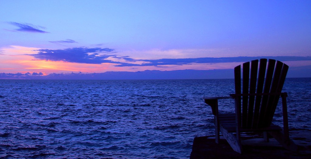
Dwayne, you've done some great work in this thread and have provided fantastic feedback! I was wondering if you could give me some comments on this one... thanks so much:

4267108134_4463929929_b.jpg

good

-great pastel colors
-good detail and contrast
-exposure is right on
-great light coming through the sails and on top of the boat roof
-good DOF
-the birds add to the photo

nit

-the comp (subject placed near center)
-a tad noisy (sky)
-horizon has a slight tilt to the right when placed on a grid

tweak

-straightened the photo
-cropped the photo and placed the subject to 1/3 rule

-lighten (dodge) the light coming through the sails and on top of the roof

-put the photo through NR software to reduce the noise in the sky area
-added a tad of global USM (sharpening) to get over the NR software

-used the midtone slider in (levels) to set final exposure

Hope this helps and thanks for posting.

Take care,
Dwayne Oakes
p512921670-3.jpg


That's great, thanks! For some reason, horizon is a common problem with me. I typically have an issue with an uneven horizon and it always seems to dip the right... maybe I'm a little crosseyed or something when looking through the viewfinder.

Right now, I do all my editing on iPhoto. Very, very bare bones. I have downloaded GIMP but have not taken the time to learn how to use it yet. Do you think that's a fine program to use or should I buy Photoshop or Aperture?
 
thank you so much Dwayne! your feedback is much appreciated.

I also have to say that I am learning TONS from this thread so thanks to everyone for posting pictures.
 
I hate to overload you Dwayne, but I thought I would throw one into the mix to see what you feel can be done with it.

775163373_AfVvm-XL.jpg
 
Thanks so much for taking your time to do this.
Here's one of mine I need some input on.
I'm thinking of turning this in for an assignment for class and I need a boost.
4312445235_7642b1860f_b.jpg
 

Create an account or login to comment

You must be a member in order to leave a comment

Create account

Create an account on our community. It's easy!

Log in

Already have an account? Log in here.

Back
Top Bottom