What's new

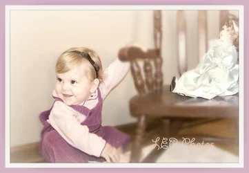
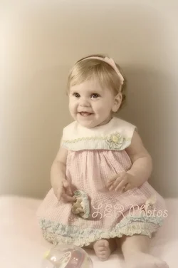
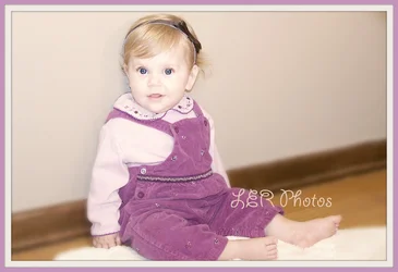
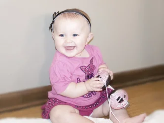
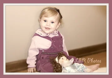
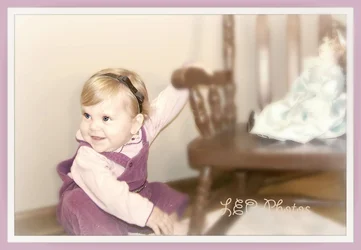
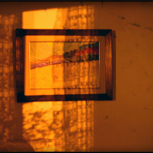
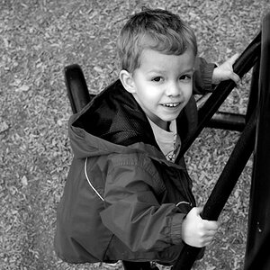
I would like feedback on these photos. What do you think?

Ream

TPF Noob!
Joined
Jul 31, 2013
Messages
74
Reaction score
31
Location
Indiana
$100_2219new.webp
$100_2218new.webp
$100_2227new.webp
$100_2229new.webp
$100_2226new.webp
 
Last edited:
Fake blur effects are usually a bad idea. You can use a combination of:

- mild burning and dodging to brighten up areas of interest and darken the rest (see also: vignette)
- selective adjustments of saturation when you're shooting color
- selective sharpening/local constrast to give a little more "pop" to interesting parts

to draw the eye where you want it and away from other areas.

In a horizontal, better to have the subject looking "across" the frame rather than "out" of the frame. Nice skin tones for babies/kids in these, but bordering on blown out. You might want to back off just a touch on lightening them (or overexposing them -- however you got them bright like that).

Watch the backgrounds. The baseboard/trim in the last three is ugly and.. ugly. The first two are quite nicely staged.

More directional light would made these more appealing. A large window with sheers on one side, perhaps. Something soft and big, but definitely directional. The second picture seems to have something like that going on.

Not much in love with the quasi-vintage look, but it's a popular thing these days.
 
I like the color processing on most of them (the ones with the beige wall).

The faux-blur is kinda nice on some, not so nice on others, like the one with the doll on the chair. The doll can't be in focus if none of the chair it's on is - it wrecks the illusion that this is an effect caused by the lens.

The cutting of extremities like fingers and toes is something to avoid though. I'm not fond of the crops on any of them.

Not crazy about the deer-in-the-headlights look and pose of the third one.
 
For the record, Buckster has demonstrated for us that you can introduce fake DoF and make it perfectly well convincing. What I am referring to is specifically fake blur which is clearly fake blur, with no real effort at faking a lens effect -- just a "don't look at this stuff" effect. I, and others, find it ham-fisted and crude. You could combine a very slight blurring with other effects, I suppose, as long as it wasn't obvious. Just a little softening, a little burning, a little de-saturation, all combining to create a subconscious "not important" feeling.
 
K. I'm hoping the you are referring to clumsy and not inept on the fake blur. I can totally back-off the edits but I don't feel that it's offensive at this point. I was not keeping in mind that every edit should be a mild. Thanks . Do you really think it's crude? Lacking taste? Or just obvious revision?
 
It's not "crude" in the sense of offensive, it's "crude" in the sense of clumsy and obvious.

To be fair, non photographers probably won't find any of it nearly as clumsy as I do.
 
I am reading your book, "Intermediate Photography", and find it useful. I will look into Buxter's demonstrations as well. Thanks
 
IMHO it looks fake and distracts.
 
K. I'm hoping the you are referring to clumsy and not inept on the fake blur. I can totally back-off the edits but I don't feel that it's offensive at this point. I was not keeping in mind that every edit should be a mild. Thanks . Do you really think it's crude? Lacking taste? Or just obvious revision?
To people with a knowledge of photography it's very obvious. The doll, the front of the chair, and the child are on virtually the same plane so there's no way the chair would have a depth of field blur while the doll and child do not.
 
Feedback per req:

First, in future, please post your images vertically and and number them to make responding easier.

In addition to Amolitor's points with which I agree, I will add that ALL of these have cropping issues. If you need to crop limbs, do it boldly and not at/near a joint or along a lateral axis and NEVER crop off little bits the way you have in all of these. The exposure is decent, but you really need to get the flash OFF of the camera. The $150 you will spend for an inexpensiv stand, modifier, trigger-set and speedlight will probably make a bigger difference in your work than anything else you can do! Last but not least, your processing on #2 is very well done. This looks EXACTLY like a early-late 1960s child's studio portrait (expcept for the cropping).

Just my $00.02 worth - your mileage may vary.

~John
 
K. I'm hoping the you are referring to clumsy and not inept on the fake blur. I can totally back-off the edits but I don't feel that it's offensive at this point. I was not keeping in mind that every edit should be a mild. Thanks . Do you really think it's crude? Lacking taste? Or just obvious revision?
To people with a knowledge of photography it's very obvious. The doll, the front of the chair, and the child are on virtually the same plane so there's no way the chair would have a depth of field blur while the doll and child do not.
Actually, it's just the doll that gives it away. You can have everything on the same plane and still get a blur with lens effects at the time of shooting. Tilt/shift, lensbaby, freelensing, or even "substandard" lenses like those on Diana cameras can all be used to do that in-camera.
 
:) Your $.02 is noted, and I will definitely use it in the future. :) Thanks
 
I've seen the topic of "cropping issues" raised above several times, but it's more substantive than that. These have fundamental posing and framing issues, which are two different, but related, issues. These seated poses are some of the first poses a baby can perform independently...this baby is now old enough to sit up on her own; she has trunk control, and can also perform simple tasks using her arms. In short, she can now "sit up on her own". The poses you are doing however need a bit of refinement from you, the photographer. And then, the camera needs to be framing the shots the best way, to avoid awkward crops and visual tension from trying to cram a baby into a frame that's not oriented quite the right way.

The answer? Simply turn the baby more toward the camera, or even more away if you want to get a profile or an over-the-shoulder profile with her looking back toward you, and turn the camera to vertical. Shot #2 is pretty much what I mean, but it has her foot cropped off awkwardly, and has way too much top space, and the camera height is too high. But the pose is tall, and the frame agrees with the pose.

Shot # 1 *is* a natural logical horizontal, but there's too much top space, causing her to be cut off awkwardly. But the pose and props are wide, and so there is a natural,logical horizontal pose that should be framed in agreement, meaning framed horizontally.

Shots 3,4,and 5 have her head crowding the top of the frame, which causes a lot of tension. In 3,4,and 5, if the baby had been turned slightly, then the camera could have been turned vertically, and she would fit better into the frame, and a "tall" camera orientation would have made three classic "just sitting up" baby poses. The blur effects and the processing would make a good pairing with classic baby poses, which is what these are supposed to be, but the poses needed minor refinement and the camera needed to be oriented in agreement with the body positioning. "Tall portraits" would have allowed her to occupy the longer dimension of the frame, so she would have been bigger, clearer, and placed in a psychologically active "upright" frame.

 
Great. Thanks. All that info will keep me busy for a bit. :)
 

Create an account or login to comment

You must be a member in order to leave a comment

Create account

Create an account on our community. It's easy!

Log in

Already have an account? Log in here.

Back
Top Bottom