Ross Photography
TPF Noob!
- Joined
- Jan 9, 2018
- Messages
- 2
- Reaction score
- 7
- Website
- www.flickr.com
- Can others edit my Photos
- Photos OK to edit
Would like to know your thoughts on the image, I love constructive criticism, feel free to edit and show me what you would have done!
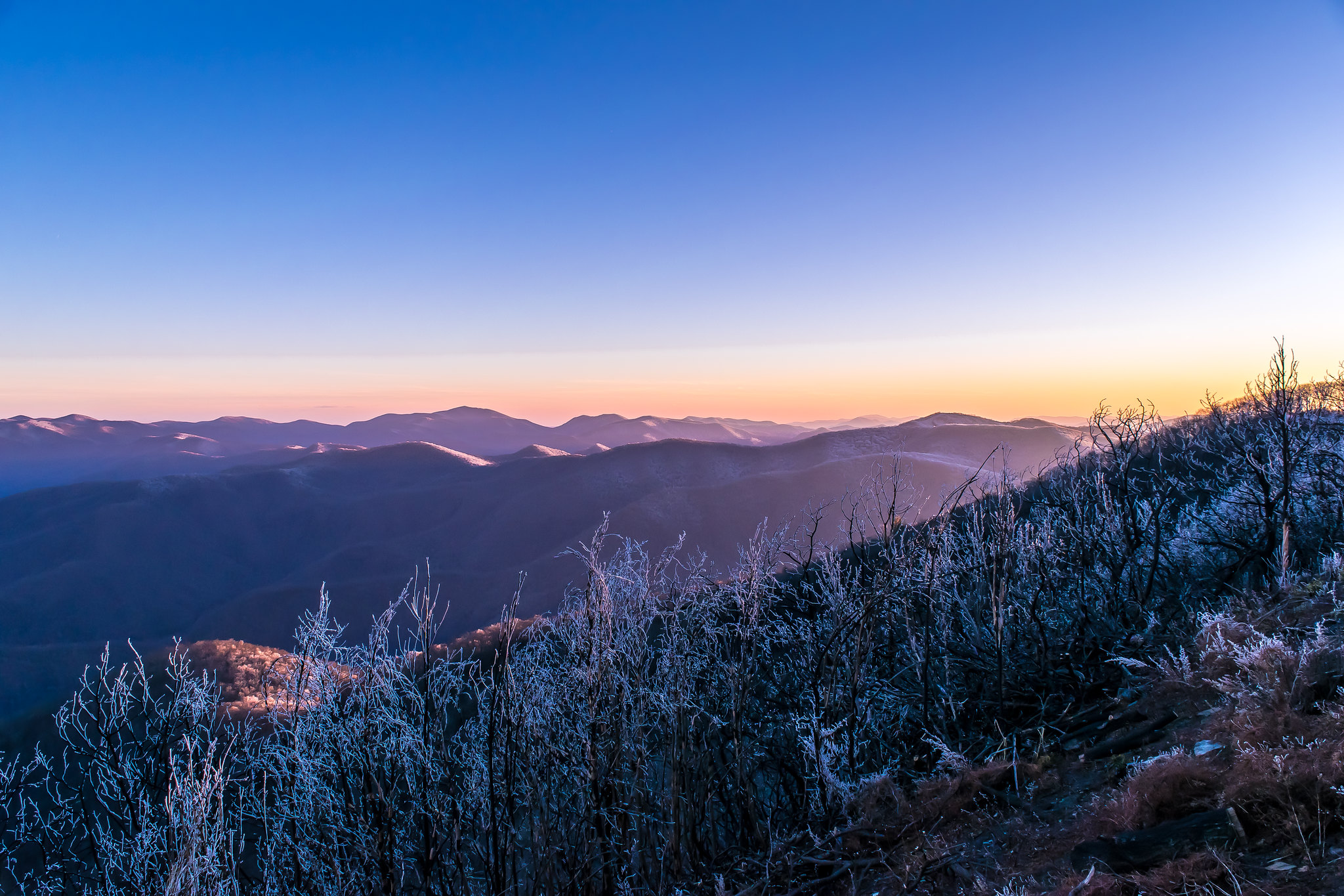 Frozen Mountains by Marshall Ross, on Flickr
Frozen Mountains by Marshall Ross, on Flickr


![[No title]](/data/xfmg/thumbnail/36/36658-525087f40e1bdbfe8b995ce4296ef4a6.jpg?1619737675)