Im not sure and could use some advice

iBats

TPF Noob!
Joined
Nov 15, 2009
Messages
460
Reaction score
0
Location
philly
Can others edit my Photos
Photos OK to edit
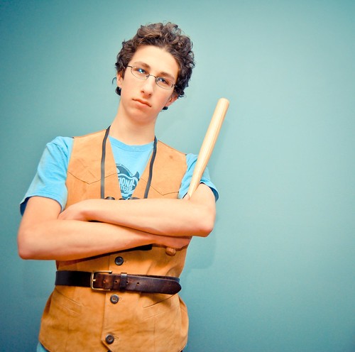
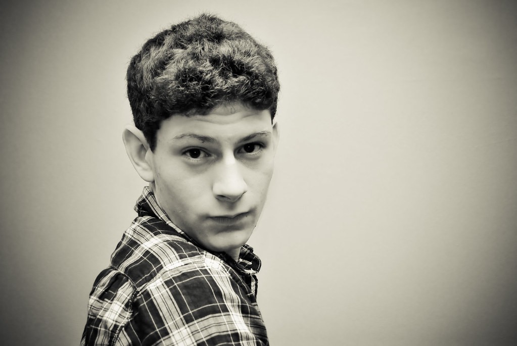
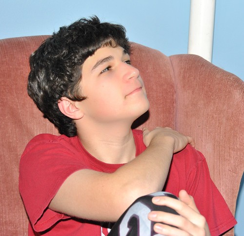
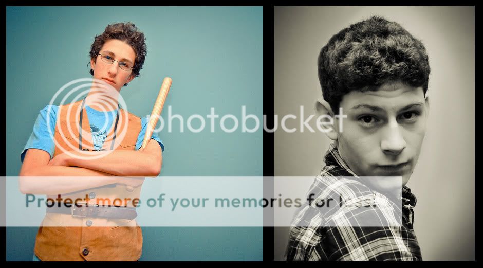
So my friends were over tonight, and they thought it would be interesting if i took some portraits.

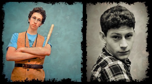
These were spontaneous and im not sure if they came out alright.

Looking for some basic C&C and maybe some advice on portraiture.

4410348660_a7e84df1e2.jpg


4409583005_f7f6ea0f5f.jpg


4410348870_7c6b0da380.jpg


4409583199_db64075921_b.jpg


4410349010_bd06585ed5.jpg
 
4 might be ok if his face was in focus, not his shirt, plus his hair seems to be casting a shadow over the top of his face
 
I think #1 has the most impact. I think it's really funny. I like the pose, the vest, the small bat, the lean, and the look on his face. I love the color choices as well. Is this one vicnetted, or is it the light on the back drop? I think it is effective here. I think it accents the humor of the tiny bat. A little over exposed though.

I think #4 is hilarious too. In a good way. He seems to me totally making the "I'm a model" face. I don't dig the composition though. The vignetting works for me on this one though.

Tell me you guys weren't having fun.
 
Last edited:
4 might be ok if his face was in focus, not his shirt, plus his hair seems to be casting a shadow over the top of his face

His face is in focus lol
 
4410348660_.jpg


I think dude #1 needs that space to fall into. You could clean up the little shadows in post, too.
Dude #2...Zoolander. :lmao:
 
I think #1 has the most impact. I think it's really funny. I like the pose, the vest, the small bat, the lean, and the look on his face. I love the color choices as well. Is this one vicnetted, or is it the light on the back drop? I think it is effective here. I think it accents the humor of the tiny bat. A little over exposed though.

I think #4 is hilarious too. In a good way. He seems to me totally making the "I'm a model" face. I don't dig the composition though. The vignetting works for me on this one though.

Tell me you guys weren't having fun.

haha, yeah we were, lots of fun, and its a bit vignetted
 
4 might be ok if his face was in focus, not his shirt, plus his hair seems to be casting a shadow over the top of his face

His face is in focus lol

I guess I meant, his eyes are not in focus, and I think the main focus is on his shirt.
 
4 might be ok if his face was in focus, not his shirt, plus his hair seems to be casting a shadow over the top of his face

His face is in focus lol

I guess I meant, his eyes are not in focus, and I think the main focus is on his shirt.

yeah i set it on a high aperture so i could get them in focus but im not sure what went wrong there, any suggestions
 
Eh, too much work to comment on with no numbers near the photos. I like the B&W one.
 
What do you like about the black and white one?
 
my take on bitter's edit

4410566212_bb40075b0e.jpg
 
I like the ragged edge edit too. I would straighten out the guy with the mini-bat who is leaning, then crop out the extra space.
 

Most reactions

New Topics

Back
Top