What's new

Incoming Rain

PixelRabbit

A naughty little bunny...
Joined
Nov 28, 2011
Messages
6,593
Reaction score
3,719
Location
Ontario
Can others edit my Photos
Photos NOT OK to edit
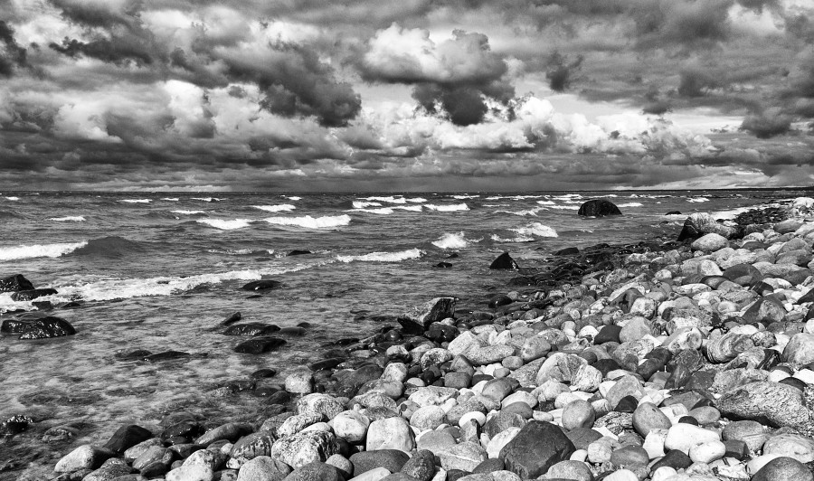
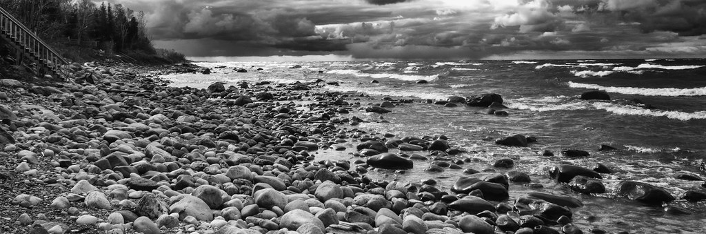
The clouds were delicious over the lake with little rain showers here and there, would love to hear your thoughts, thanks for taking a look!
(can be viewed larger on Flickr)

Looking North


Looking South


Second one is better, has a place to anchor your eyes. The first is overly busy with no distinct break up between beach, water and clouds.

Have you tried different BW conversion techniques?
 
Exactly what Runnah said; I should like the first image, a lot, BUT... I find my eyes wandering all over the palce.
 
Yes the second one is better.
 
Thanks guys, yanno, when I first posted the thread I ONLY had the second one posted and added in the first at the last minute, I should trust my instincts!
 
Oh Runnah, yes I tried other conversions but couldn't bring out the best in both sky and land in them, perhaps my edit prior to the conversion is in need of some help to get a less "dark" edit to work.
 
#1 I like, but it seems to me that the rocks are competing way too much with the sky . # 2 I like better I just wish that maybe you had a little more sky . My 2 cheap cents .:)
 
comment on technicalities of the image, Make sure you blacks are black. your whites are definitely white, expose the image via Lightroom slightly more and voilá!
 
I like both of them, great shots. But, you know me, always a "but" I would do some changes. #1 how you see, in opinion of many has less impact, and no wonder. But I like it better as it has better potential (in the form you presented it to us) than #2. (IMHO). In #2 I would eliminate the stairs, it is a foreign object in this harmony of nature. In #1 you have three distinctive bands of landscape: sky, water and rocks. The problem is, that they are not very much distinctive in this shot. You had to compromise the exposure I guess. Much of the highlights lost texture and there is not much 100% black. This creates the feel of flatness. There is no solid cut between the water and sky. Play a bit with burning of the three elements at different ratios and see, how it will change the feel of the landscape, especially the rocks. Simply add drama and depth and let see.
 
Oh Runnah, yes I tried other conversions but couldn't bring out the best in both sky and land in them, perhaps my edit prior to the conversion is in need of some help to get a less "dark" edit to work.

I would try NOT bringing out the 'best' in both land and sky. What I mean is - in that first shot, there is so much going on in both halves that, as other have said, it's too much to look at. What's interesting, though, is how the tones and shapes are mirrored, so I wonder how it would look if you kept the contrast in one half - probably the land - and muted the tones in the sky to make it look more like a "reflection," (obviously not a literal reflection) so the hints of mirrored tones and shapes are there but they aren't so strong on their own that they challenge the bottom half of the picture.

I think that's why the second picture works better - there's much less sky to distract from the expanse of beach and water. And I do like the stairs on the left side of that shot.

 
#1 I like, but it seems to me that the rocks are competing way too much with the sky . # 2 I like better I just wish that maybe you had a little more sky . My 2 cheap cents .:)
Thanks Manny, I'll take all the 2 cents I can get, they ALL teach me!
#1 I agree, that is the biggest thing that made me hesitant to post it. #2, I cropped it as it is first because of the same issue in 1 and there is a big white piece of sky above the crop that is pure white, not blown, just a big patch of white that isn't pretty.

comment on technicalities of the image, Make sure you blacks are black. your whites are definitely white, expose the image via Lightroom slightly more and voilá!
Thanks Doug, I'll revisit the blacks.
I like both of them, great shots. But, you know me, always a "but" I would do some changes. #1 how you see, in opinion of many has less impact, and no wonder. But I like it better as it has better potential (in the form you presented it to us) than #2. (IMHO). In #2 I would eliminate the stairs, it is a foreign object in this harmony of nature. In #1 you have three distinctive bands of landscape: sky, water and rocks. The problem is, that they are not very much distinctive in this shot. You had to compromise the exposure I guess. Much of the highlights lost texture and there is not much 100% black. This creates the feel of flatness. There is no solid cut between the water and sky. Play a bit with burning of the three elements at different ratios and see, how it will change the feel of the landscape, especially the rocks. Simply add drama and depth and let see.
Hey T :) I agree that there is "something" in 1 but I'm unfortunately missing it with this edit. I will take your thoughts forward when I redo it tomorrow, I've been looking at it and editing as a whole, I think you are onto something with treating it in sections.
The ladder in 2, I like that it breaks up the dark there a bit and adds an element of scale, kind of a reference to how big a human would be.
Oh Runnah, yes I tried other conversions but couldn't bring out the best in both sky and land in them, perhaps my edit prior to the conversion is in need of some help to get a less "dark" edit to work.

I would try NOT bringing out the 'best' in both land and sky. What I mean is - in that first shot, there is so much going on in both halves that, as other have said, it's too much to look at. What's interesting, though, is how the tones and shapes are mirrored, so I wonder how it would look if you kept the contrast in one half - probably the land - and muted the tones in the sky to make it look more like a "reflection," (obviously not a literal reflection) so the hints of mirrored tones and shapes are there but they aren't so strong on their own that they challenge the bottom half of the picture.

I think that's why the second picture works better - there's much less sky to distract from the expanse of beach and water. And I do like the stairs on the left side of that shot.

Thanks Leonore, that helps me think around it, you and Timor are on the same page ;)
 
I learned the same type thing as Doug - 'black' blacks and 'white' whites. I learned that doing film and darkroom work, but found adjusting for that seems to work for my digital images too. I quit using the Photoshop conversion, I use the remove color setting - I found doing some comparing of my own that using the convert to B&W setting didn't seem to look good (I don't have Lightroom to compare).

I like the waves, that adds some nice interest to the water I think.
 

Create an account or login to comment

You must be a member in order to leave a comment

Create account

Create an account on our community. It's easy!

Log in

Already have an account? Log in here.

New Topics

Back
Top Bottom