
Garbz
No longer a newbie, moving up!
- Joined
- Oct 26, 2003
- Messages
- 9,713
- Reaction score
- 203
- Location
- Brisbane, Australia
- Website
- www.auer.garbz.com
- Can others edit my Photos
- Photos NOT OK to edit
I am starting this thread to open up a full discussion on colour management, based on the recent threads asking about profiles, and other questions Ive received. I intend to give a bit of info here from what Ive learned the past 6 months since taking on a fully colour managed approach to photography. But I mean this to be a starting point. There may very well be some misinformation in here so feel free to point out anything.
What I present here is intended to be simply the what and why of my approach to NOT using ProPhoto and rarely even using AdobeRGB for my photos. For those who want to skip to the end theres a summary in the conclusion. It covers some basics and some advanced themes at the same time. So lets get into it.
Intro to ProPhoto:
For those who havent heard of colour manangement or gamuts the concept is simple. The reddest red in your photos (255,0,0) is not the reddest red in existence. Its simply the reddest value your screen displays and for most of the screens out there which use the industry standard colour space sRGB, this isnt very red at all. The gamut is a diagram showing the colours. The CIE1931 diagram below shows the 3 gamuts talked about here. The smallest is sRGB, the middle is AdobeRGB, and the largest is ProPhoto.
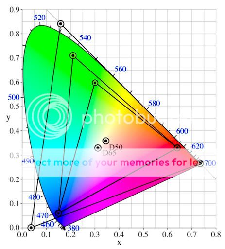
The good parts about this is obvious. ProPhoto can display a far wider range of the visible values than any other space meaning it can cover nearly all colours that exist and is far larger than any device can actually currently display. Right now down to the bad.
Bit Depth:
The first problem that many dont realise is part of the principle of wider colour gamuts. There are more colours to represent. There are weekly discussions on this very forum about the benefit of using 16bit processing with the existing sRGB gamut to improve processing quality. The use of ProPhoto strains this further. An example using the Relative Colorimetric rendering intent, arguably the best for photos:
sRGB(255,0,0) = ProPhoto(179,71,27)
sRGB (0,255,0) = ProPhoto(138,237,78)
sRGB(0,0,255) = ProPhoto(86,35,235)
So to display the same colour in ProPhoto uses less of the 8 bit space (which is obvious from the gamut above). Now assuming you have all the extra information to make good use of the ProPhoto space this is fine, but for content that may not contain colours that rich to begin with you are just wasting valuable bits which could be used to more accurately represent the colours you have.
Fortunately the fix is easy. Work in 16bit mode at all times when using wider gamuts. Using ProPhoto for an 8 bit image is taking a step back in quality not forward.
Real Colours:
Still talking about bit depth ProPhoto(0,255,0) and ProPhoto(0,0,255) dont actually exist. They are off the spectrum of colours present and exist only as a mathematical tool to help convert lesser colours. This is even more of a reason to use 16bits to edit such files as bits are wasted on imaginary colours. Admittedly this is minor, just pointing it out.
Processing Displaying and Printing:
This is the one that gets me the most. For people who do colour critical work why work on something you cant see. Few screens display the AdobeRGB gamut even, NO screens display the ProPhoto gamut. HPs new colossal screen comes somewhat close but I dont think anyone here will sell their car to buy one. I am willing to bet most of the people here have a TN panel LCD in which case they cant even produce the sRGB space with consistent accuracy since they have a 6 bit output.
Even if this is not the final output intent (if its for screen you really better be using sRGB since I guarantee that thats what 99.999% of the world will see it in), even if you will produce some nice wide gamut prints it makes little sense working with colours you cant see since the output becomes un predictable.
The point is with a wide gamut screen the AdobeRGB space makes sense since this is a standard many wide gamut screens use, but going further is again one step towards pointless. For output the same thing happens. You need a very fancy printer to get this colour purity out on paper. Often the paper itself becomes a limiting factor. Ive used the finest lab in Brisbane I can find a few times (this doesnt really say much but bear with me) and they have always asked for AdobeRGB files because their fancy printer doesnt print much outside of this colour space anyway. A few other labs use this profile too and it somewhat seems to have cemented itself as a standard for colour critical work. ProPhoto has not.
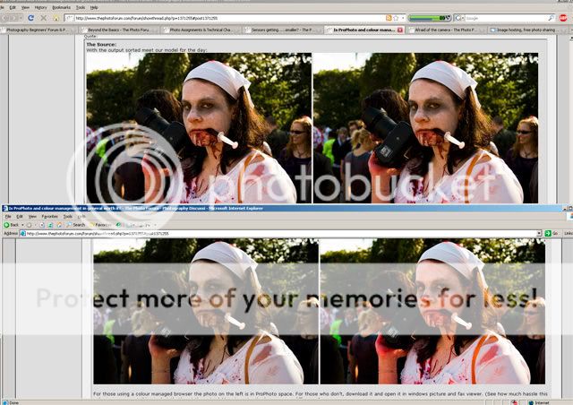
The Source:
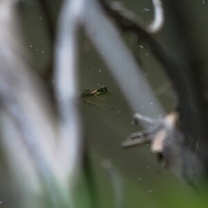
With the output sorted meet our model for the day:


For those using a colour managed browser the photo on the left is in ProPhoto space. For those who dont, download it and open it in windows picture and fax viewer. (See how much hassle this colour management thing is, but thats not the point.) More importantly do you see a difference?
Now our blood thirsty model above was opened from the RAW in ProPhoto space in 16bits. And then the image was artificially saturated. Yes even this image taken on a bright sunny day was saturated further and is more colourful than a real image. I chose this image because red and green are colours that make a difference. Blues are very pure across all colour spaces.
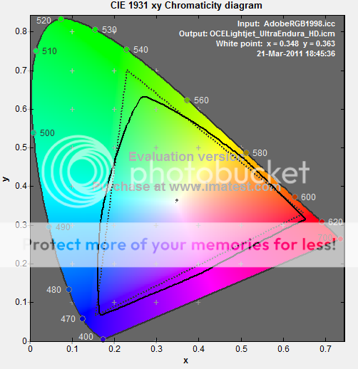
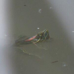
Now it is widely known that cameras capture larger gamuts than the sRGB space. So with that in mind lets check exactly how much more we get out of the world.


The image on the left is the ProPhoto original, soft-proofed to sRGB, and the image on the right is soft-proofed to AdobeRGB. The grey pixels indicate out of gamut colours. So here in our artificially saturated scene a very tiny percentage of the image is actually larger than the sRGB gamut. Nearly none of it is outside the AdobeRGB, but it gets even better.
This only shows the out of gamut colours. It does not show what the actual image would look like after conversion. The process of colour space conversion is somewhat more complex than that. It will do subtle actions that arent even notable to me on a wide gamut monitor. Depending on how its set it will either shift the out of gamut colours to the nearest reproducible colour, or slightly adjust the saturation of the entire image to keep the relationships the same and move the colours all into the visible.
In this case the relative colorimetric rendering intent produces an sRGB image that is entirely visually indistinguishable from the ProPhoto to the naked eye, even on a wide gamut monitor. To show exactly the differences below is a difference taken of the sRGB layer converted back to ProPhoto (remember its lossy so the new old pure colours are not recovered). Now considering just how hard to see this is I adjusted the levels of the result quite severely the settings: (0, gamma 1, 40) and displayed it on the right.


I havent done the math but Im willing to bed that the deltaE of the different colours is so low that most people could barely distinguish them side by side let alone be accurately reproduced during printing. Which brings me to my final point.
Colour conversion is not an exact science:
To start with the conversion is lossy. Like going from 16bits to 8bits you throw away the colour information. But worse yet for each set of colour profiles there are different methods of converting from the profile to a standard conversion space and arriving at the new profile. Relative Colorimetric, Perceptual, Absolute, and saturation adjustment. In each case there are settings such as black point compensation, and dithering. Furthermore there are various processing engines. The windows ICM engine and the Adobe ACE engine are the ones used by Photoshop. And now unless your process your own colours on your fancy expensive screen, and print them on your fancy expensive printer there is no way of knowing how the conversion will be handled. My lab didnt tell me, and neither did the guy who looked at my webpage in a colour managed browser. Does it make a difference? Heres our blood sucker again converted from ProPhoto to sRGB using Absolute colorimetric conversion, with dithering enabled. On the left via AdobeACE, on the right via Windows ICM.


Wow there's a character limit. Continued below:
What I present here is intended to be simply the what and why of my approach to NOT using ProPhoto and rarely even using AdobeRGB for my photos. For those who want to skip to the end theres a summary in the conclusion. It covers some basics and some advanced themes at the same time. So lets get into it.
Intro to ProPhoto:
For those who havent heard of colour manangement or gamuts the concept is simple. The reddest red in your photos (255,0,0) is not the reddest red in existence. Its simply the reddest value your screen displays and for most of the screens out there which use the industry standard colour space sRGB, this isnt very red at all. The gamut is a diagram showing the colours. The CIE1931 diagram below shows the 3 gamuts talked about here. The smallest is sRGB, the middle is AdobeRGB, and the largest is ProPhoto.
The good parts about this is obvious. ProPhoto can display a far wider range of the visible values than any other space meaning it can cover nearly all colours that exist and is far larger than any device can actually currently display. Right now down to the bad.
Bit Depth:
The first problem that many dont realise is part of the principle of wider colour gamuts. There are more colours to represent. There are weekly discussions on this very forum about the benefit of using 16bit processing with the existing sRGB gamut to improve processing quality. The use of ProPhoto strains this further. An example using the Relative Colorimetric rendering intent, arguably the best for photos:
sRGB(255,0,0) = ProPhoto(179,71,27)
sRGB (0,255,0) = ProPhoto(138,237,78)
sRGB(0,0,255) = ProPhoto(86,35,235)
So to display the same colour in ProPhoto uses less of the 8 bit space (which is obvious from the gamut above). Now assuming you have all the extra information to make good use of the ProPhoto space this is fine, but for content that may not contain colours that rich to begin with you are just wasting valuable bits which could be used to more accurately represent the colours you have.
Fortunately the fix is easy. Work in 16bit mode at all times when using wider gamuts. Using ProPhoto for an 8 bit image is taking a step back in quality not forward.
Real Colours:
Still talking about bit depth ProPhoto(0,255,0) and ProPhoto(0,0,255) dont actually exist. They are off the spectrum of colours present and exist only as a mathematical tool to help convert lesser colours. This is even more of a reason to use 16bits to edit such files as bits are wasted on imaginary colours. Admittedly this is minor, just pointing it out.
Processing Displaying and Printing:
This is the one that gets me the most. For people who do colour critical work why work on something you cant see. Few screens display the AdobeRGB gamut even, NO screens display the ProPhoto gamut. HPs new colossal screen comes somewhat close but I dont think anyone here will sell their car to buy one. I am willing to bet most of the people here have a TN panel LCD in which case they cant even produce the sRGB space with consistent accuracy since they have a 6 bit output.
Even if this is not the final output intent (if its for screen you really better be using sRGB since I guarantee that thats what 99.999% of the world will see it in), even if you will produce some nice wide gamut prints it makes little sense working with colours you cant see since the output becomes un predictable.
The point is with a wide gamut screen the AdobeRGB space makes sense since this is a standard many wide gamut screens use, but going further is again one step towards pointless. For output the same thing happens. You need a very fancy printer to get this colour purity out on paper. Often the paper itself becomes a limiting factor. Ive used the finest lab in Brisbane I can find a few times (this doesnt really say much but bear with me) and they have always asked for AdobeRGB files because their fancy printer doesnt print much outside of this colour space anyway. A few other labs use this profile too and it somewhat seems to have cemented itself as a standard for colour critical work. ProPhoto has not.
The Source:
With the output sorted meet our model for the day:
For those using a colour managed browser the photo on the left is in ProPhoto space. For those who dont, download it and open it in windows picture and fax viewer. (See how much hassle this colour management thing is, but thats not the point.) More importantly do you see a difference?
Now our blood thirsty model above was opened from the RAW in ProPhoto space in 16bits. And then the image was artificially saturated. Yes even this image taken on a bright sunny day was saturated further and is more colourful than a real image. I chose this image because red and green are colours that make a difference. Blues are very pure across all colour spaces.
Now it is widely known that cameras capture larger gamuts than the sRGB space. So with that in mind lets check exactly how much more we get out of the world.
The image on the left is the ProPhoto original, soft-proofed to sRGB, and the image on the right is soft-proofed to AdobeRGB. The grey pixels indicate out of gamut colours. So here in our artificially saturated scene a very tiny percentage of the image is actually larger than the sRGB gamut. Nearly none of it is outside the AdobeRGB, but it gets even better.
This only shows the out of gamut colours. It does not show what the actual image would look like after conversion. The process of colour space conversion is somewhat more complex than that. It will do subtle actions that arent even notable to me on a wide gamut monitor. Depending on how its set it will either shift the out of gamut colours to the nearest reproducible colour, or slightly adjust the saturation of the entire image to keep the relationships the same and move the colours all into the visible.
In this case the relative colorimetric rendering intent produces an sRGB image that is entirely visually indistinguishable from the ProPhoto to the naked eye, even on a wide gamut monitor. To show exactly the differences below is a difference taken of the sRGB layer converted back to ProPhoto (remember its lossy so the new old pure colours are not recovered). Now considering just how hard to see this is I adjusted the levels of the result quite severely the settings: (0, gamma 1, 40) and displayed it on the right.
I havent done the math but Im willing to bed that the deltaE of the different colours is so low that most people could barely distinguish them side by side let alone be accurately reproduced during printing. Which brings me to my final point.
Colour conversion is not an exact science:
To start with the conversion is lossy. Like going from 16bits to 8bits you throw away the colour information. But worse yet for each set of colour profiles there are different methods of converting from the profile to a standard conversion space and arriving at the new profile. Relative Colorimetric, Perceptual, Absolute, and saturation adjustment. In each case there are settings such as black point compensation, and dithering. Furthermore there are various processing engines. The windows ICM engine and the Adobe ACE engine are the ones used by Photoshop. And now unless your process your own colours on your fancy expensive screen, and print them on your fancy expensive printer there is no way of knowing how the conversion will be handled. My lab didnt tell me, and neither did the guy who looked at my webpage in a colour managed browser. Does it make a difference? Heres our blood sucker again converted from ProPhoto to sRGB using Absolute colorimetric conversion, with dithering enabled. On the left via AdobeACE, on the right via Windows ICM.
Wow there's a character limit. Continued below:
")


![[No title]](/data/xfmg/thumbnail/39/39286-ae386da044402acf92e55d8b68c26af3.jpg?1619738956)

![[No title]](/data/xfmg/thumbnail/34/34083-76406a409bc520ead3cc11af09ebd257.jpg?1619736269)