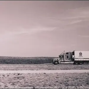
I like #2. I think the Toys R Us one would have been cool, but I think there were some key things that weren't there...
1. Toys R Us sign lit up would have been way better.
2. Shot needed a fill flash- can't see the car at all.
3. Dead on side-shots of cars tend to be dull, an angle would have been better.
4. I would have turned the marker lights on, that always helps.
5. The image is slanted and heavily distorted... might have been ok, but I don't think it worked in this case.
6. The image has way too little of the car in it.
I hammer this one in particular because I think it COULD have been really cool. Not trying to bash the picture so much as support the idea of the picture, and make some suggestions on how to make it better next time.
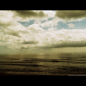
BTW, I would watch your color balance on some of these, and I would personally go a bit easier on the post processing. If you happen to like the style, just ignore me.
Hell, feel free to ignore me regardless.




![[No title]](/data/xfmg/thumbnail/36/36133-8b29212f67c25fcf353a0c2f376b1501.jpg?1734168234)


![[No title]](/data/xfmg/thumbnail/41/41778-1940e957c27e1919c300dfedbc32d1c3.jpg?1734176084)
![[No title]](/data/xfmg/thumbnail/36/36132-5bd4fa365c199003273e0ff128bf42f4.jpg?1734168228)