sabbath999
No longer a newbie, moving up!
- Joined
- Apr 11, 2007
- Messages
- 2,701
- Reaction score
- 71
- Location
- Missouri
- Can others edit my Photos
- Photos OK to edit
Follow along with the video below to see how to install our site as a web app on your home screen.

Note: This feature currently requires accessing the site using the built-in Safari browser.
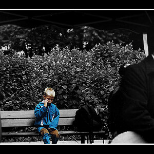
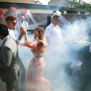
This seems quite an awkward use of space to me
3This seems quite an awkward use of space to me
Interesting... I guess all that talk about the "rule of thirds" is kind of a waste of time then?
")
But then the hand would look weird. And it would probably be less of the subject, filling more of the frame.3This seems quite an awkward use of space to me
Interesting... I guess all that talk about the "rule of thirds" is kind of a waste of time then?
I believe the comment implied that you might have done better in Portrait orientation, using the available spqace to show us more of the subject
This seems quite an awkward use of space to me
Interesting... I guess all that talk about the "rule of thirds" is kind of a waste of time then?
sabbath999 said:It's not that I don't want to hear your suggetions of how I might have done it better, it's just that your "opinion" is just internet snark.
I don't really pay attention to internet snark.
Say something productive or helpful and I will listen, assuming you know what you are talking about and make sense. I may or may not agree with you. A drive by "snarking"? Couldn't care less what you think.
I think a lot of stuff in your website is fantastic, and some of it pure crap. Should you care about my opinion? Not in the least, because I am just being snarky and am not offering you any constructive ideas. I am not telling you why I don't like the shots, and therefore my critique can be just ignored.
I don't care about your opinion unless you support it with solid data, and I am not going to waste time trying to parse what you are saying as if they are pearls of wisdom.
I am not being in the least closed minded to critiques, just to one-line half-explained snarky comments.
Like the picture, don't like it, couldn't care less. Tell me a way you think I can make it better, could have shot it better, or should look to do it the next time, THAT I care about because that gives me something to look at and consider, assuming you sound like you know what you are talking about.
Or just be snarky, it's all good by me.

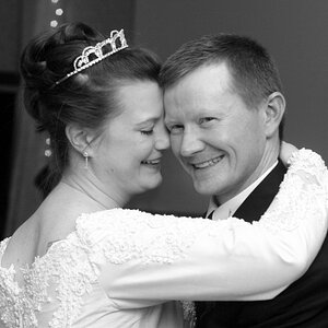
altho it follows the rule of thirds, it seems to ignore other guidelines of composition (maybe intentionally?) such as balance (arrangement of shapes, colors, or areas of light and dark that complement ), avoiding mergers (black material looks like its growing outside her head), and busy background.
Interesting... I guess all that talk about the "rule of thirds" is kind of a waste of time then?


![[No title]](/data/xfmg/thumbnail/37/37604-7ad625e983f92f880eb65a264eeef5e4.jpg?1619738148)