What's new

just my gf

dinucringuri

TPF Noob!
Joined
Jan 11, 2013
Messages
55
Reaction score
21
Can others edit my Photos
Photos OK to edit
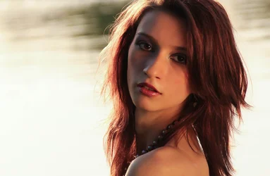
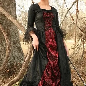
110 cm reflector and natural sunsetting light

$cvx (1 of 1).webp

C&C would be nice...
 
under-exposed, eyes are hidden in recessed sockets, orientation is not helping.

Increase exposure by metering for your subject! Hold the reflector higher so that light falls down on subject, not up from below. Shoot portraits in Portrait orientation OR make better use of the other elements.
 
She's gorgeous.

I don't object to the lighting setup, except that it's a nice dramatic look applied to what looks like a sun-drenched setting, which feels a little odd. Possibly just cooling the color temperature down a modest amount would give more of a "nighttime is vampire time" look, which I think would fit better with the lighting setup.
 
^^^ what Trever said, plus nice model but don't say Just my gf. That might get you in trouble.
 
In additions to the other posts, I might change her pose a little. Her neck looks like its on a very uncomfortable position.
 
I dig it. Lighting doesn't bother me. Obviously there could be a bit more fill, but I like the dramatic feel it gives as is. I also really like the back ground. I'm sure it's water but looking at it I get a sense of motion which is cool. Make up was done really well as well. Good job.
 
She is gorgeous, yes. This one being shot horizontal with the head chop and no bustline visible...ouch...it really hurts what could have been a nice glamour-type photo. The thing about the lighting is that it looks totally weird...her hair on the left side of the frame has bright,strong rim lighting of a color temp that strongly suggests late,late afternoon sunlighting coming in from the left....BUT that side of her face is in total shadow....and then on the opposite-the-sun side there is a tremendous amount of reflector light that is so,so strong it's acting pretty much like a second main light. It looks unnatural and cross-lighted. On the other hand, the background and the way that was done is simply amazing. Looks fantastic! I can only imagine what this would have looked like if the camera had been oriented "tall", and we could see more of her, and less water behind her. I think a good compromise with what's shown would be to crop it to a fairly narrow vertical composition.

 
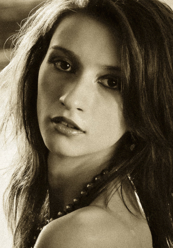
I took the image into Lightroom and cropped it the way I thought it looked best, and then converted it to a warm-toned B&W look, with a heavy grain pattern reminiscent of Tri-X in 35mm size.

Looks pretty good I think as a B&W!!! I burned down and dodged a couple areas just a tiny bit, to even things out and make the lighting look more like it was from the right.

149945417.jpg


[large image located at http://www.pbase.com/image/149945417 ]
 
You gave a skinny girl neck wrinkles. Shame on you!
 
I took the image into Lightroom and cropped it the way I thought it looked best, and then converted it to a warm-toned B&W look, with a heavy grain pattern reminiscent of Tri-X in 35mm size.

Looks pretty good I think as a B&W!!! I burned down and dodged a couple areas just a tiny bit, to even things out and make the lighting look more like it was from the right.

149945417.jpg


[large image located at cvx _1200BW_wgrain.jpg photo - Derrel photos at pbase.com ]

i actually like his orientation better.

this orientation is the obvious (first) choice.

and maybe he wanted the exposure to be that way.
 
Hey she is awesome, wholeheartedly wanna to say stunning shot !!!
 
What Trever said! What Derrel did! Much improved...

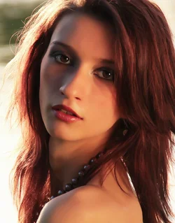
my take:
$finwi.webp
 

Create an account or login to comment

You must be a member in order to leave a comment

Create account

Create an account on our community. It's easy!

Log in

Already have an account? Log in here.

New Topics

Back
Top Bottom