
thomps6s
TPF Noob!
This is my first post here on this site.
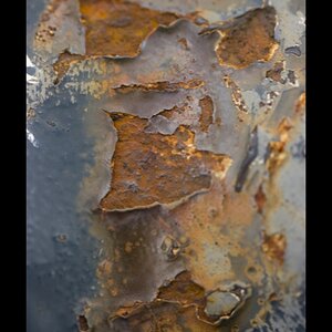
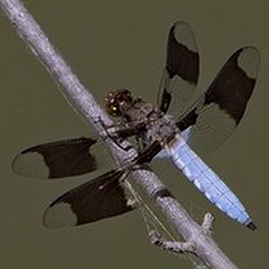
Here are a couple recent shots from Brighton Beach on Lake Superior.
All C&C welcome and anticipated.


Here are a couple recent shots from Brighton Beach on Lake Superior.
All C&C welcome and anticipated.

![[No title]](/data/xfmg/thumbnail/37/37523-291af5748bb3a98408cc748fb81bb365.jpg?1619738129)
![[No title]](/data/xfmg/thumbnail/34/34124-fcd12598382b4477643ef3dde2d6751d.jpg?1619736294)
![[No title]](/data/xfmg/thumbnail/38/38294-cb4a5aa0ded725d4c694e6eebe276f0d.jpg?1619738564)

![[No title]](/data/xfmg/thumbnail/30/30866-bdfc426e8ee7e6ad63f6d751c5f288f0.jpg?1619734485)