What's new

Last of the B&W Flowers

PixelRabbit

A naughty little bunny...
Joined
Nov 28, 2011
Messages
6,593
Reaction score
3,719
Location
Ontario
Can others edit my Photos
Photos NOT OK to edit
I posted a few from this series a while ago. Went through them with fresh eyes and liked these two.
Would love to hear your thoughts!
Thanks for taking a look :)
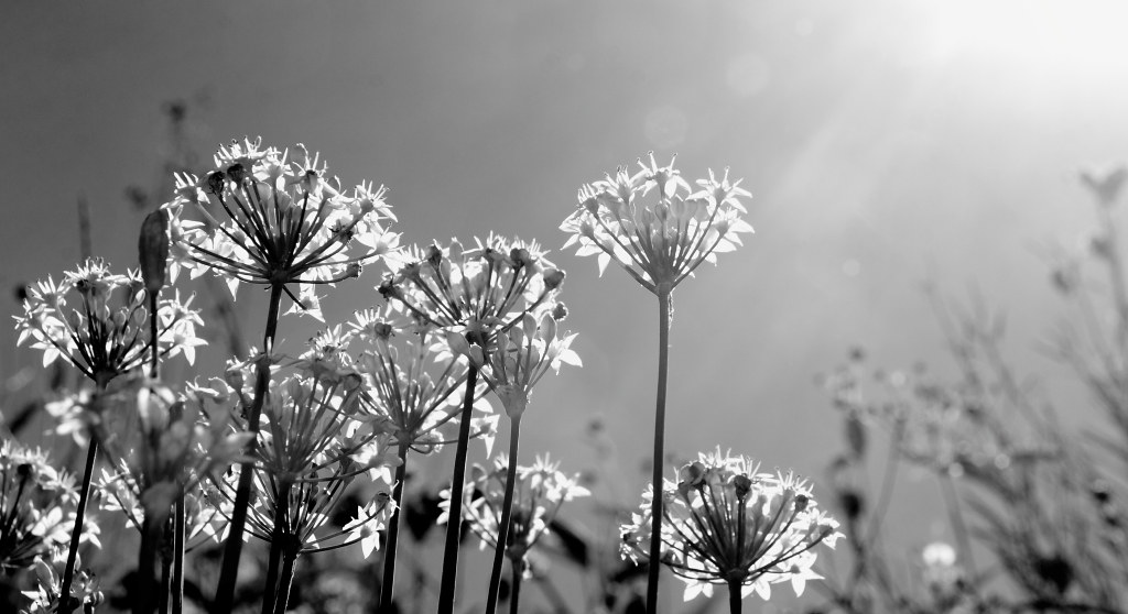


This one I remember, I wish there was a smidge more light on the flower in the foreground but at the same time I think it would really change the shot ?
 
Shameless bump, curious about the composition on these, the others from the set were shot from down low for a mouse eye view.
 
Hello,

I'm a beginner but I would like to point out something based on my point of view :-)

I like the 1st photo, its just that the sun's glare is overwhelming
Maybe tilt a bit lower

But thats just me ;-)

Still a nice set :-)

-BONES
 
Thanks Bones :) and welcome to TPF!

The sun caused debate in the rest of the set also when I posted it, some liked it some didn't so I suppose it can be considered a personal preference. That's not totally uncommon with my stuff so it's all good ;)
 
C&C per request:

1) Sun flare can be hit or miss...I generally like the effect of it here. The only thing that bugs me about the flare is how it relates to the composition of the shot. You have a nice stand of flowers grouped together in the foreground, going from off the left side of the frame until about a 1/4 of the way in from the right. The brightest part of the flare goes from the right edge to about 1/4 of the way in. That is, you can draw a vertical line dividing this shot into two parts, one with foreground flowers and essentially no flare, the other with flare but only (somewhat irrelevant) background stems. Had the flare overlapped the foreground flowers a bit the image wouldn't seem disjointed to me.

Otherwise there's a lot I like about this. Nice low angle, letting you shoot through the petals (using the sun to backlight them). I like the range in tones of the flowers, from a bit washed out in the one caught in the flare to the greater contrast in most of them. I like that you composed so the group goes off the left side of the frame but not the right (though in my opinion there is a bit too much of the blurred out background plants on the right, I might have cropped a little tighter).

2) I agree that more light on the foreground flower would have created a different shot. I like how it is set off from all the other flowers both by being darker and by being the only one sharp. However, since it is thus set off it seems to me to be the clear subject of the shot, so I think this shot falls a little short by putting that flower dead center. I do like the placement of the other flowers in the background - nice even spacing of the brighter blurred blooms, and the tilt to their stems gives the image some dynamics.
 
I'm pretty okay with the sunflare.

Perspective is also nice. The flowers look like giant trees in this shot, which is what I guess you were aiming for.

But for some reason I think having it in color would've been nice. The audience would have been able to see these were flowers instead of big, fancy trees or something.
 
C&C per request:

1) Sun flare can be hit or miss...I generally like the effect of it here. The only thing that bugs me about the flare is how it relates to the composition of the shot. You have a nice stand of flowers grouped together in the foreground, going from off the left side of the frame until about a 1/4 of the way in from the right. The brightest part of the flare goes from the right edge to about 1/4 of the way in. That is, you can draw a vertical line dividing this shot into two parts, one with foreground flowers and essentially no flare, the other with flare but only (somewhat irrelevant) background stems. Had the flare overlapped the foreground flowers a bit the image wouldn't seem disjointed to me.

Otherwise there's a lot I like about this. Nice low angle, letting you shoot through the petals (using the sun to backlight them). I like the range in tones of the flowers, from a bit washed out in the one caught in the flare to the greater contrast in most of them. I like that you composed so the group goes off the left side of the frame but not the right (though in my opinion there is a bit too much of the blurred out background plants on the right, I might have cropped a little tighter).

2) I agree that more light on the foreground flower would have created a different shot. I like how it is set off from all the other flowers both by being darker and by being the only one sharp. However, since it is thus set off it seems to me to be the clear subject of the shot, so I think this shot falls a little short by putting that flower dead center. I do like the placement of the other flowers in the background - nice even spacing of the brighter blurred blooms, and the tilt to their stems gives the image some dynamics.
Rob, thank you so much! I LOVE your kind of C&C, it helps me see the image how someone else sees it, it is so easy to get tunnel vision when looking at your own work. You gave me a lot of food for thought to move forward with on new shots. These are both crops with some room left in the originals, I will take a look and see if I'm perhaps missing the perfect compositions.
I'm pretty okay with the sunflare.

Perspective is also nice. The flowers look like giant trees in this shot, which is what I guess you were aiming for.

But for some reason I think having it in color would've been nice. The audience would have been able to see these were flowers instead of big, fancy trees or something.
Thanks PhotoWhoa :) When I shot these I had B&W in mind, the colours are very washed out and turn muddy when resaturated, I'm not sure that any would be suitable but I'll take a peek and see.
 
I like the second one more than the first; it's not the sun flare that bothers me--in fact, for this particular shot, the sun flare is what makes the shot. But I don't like the perspective on the flowers in this one; I'd like for it to be shot from a slightly lower angle. There's also just too much dead space on the right; I realize it's there in order to leave the sun flare in, but my eye just keeps wandering over to that dead space instead of staying on the flowers.

In the second, I feel more like I'm a tiny little observer, standing down there among the flowers, looking up. And like studio7four, I like the difference in lighting on the one foreground flower. I also agree that it's a little too centered around that foreground flower. I wonder how it would look if you took out that isolated flower on the right, cropping about a fourth of the photo from the right, to move that foreground flower out of center?
 
As requested, here are my comments:

#1. In general, I like the shot. I also feel the flare ADDS to the shot. Composition-wise, I also like it. While I agree with Studio7's comments, the separation of the flare and the flower does not really bother me. I feel that if the flare had been joined with the flowers, it would just get a bit confusing. Also, I like that the flare has some lines that lead to the flowers, which is why i think I like it like this... This shot is a keeper.

#2. I do not like, to be honest. I feel that you cut the background flowers, and this takes away from the shot. Also, the front flower is not illuminated enough, so it is not clear what your subject is. Is it the dark flower in the front? If so, becasue it is so dark, the eye does not go there... Is it the flowers behind? In that case, they are cut off the frame... Is it the flare itself? This is hardly a subject, but if so, it is not visible enough... you mention that the subject is the flower in the foreground, so based on that, I would (1) use a reflector to light it up a bit, (2) either use DOF to soften the other flowers to the point where they are a blurr, or include them in the frame, and (3) get the subject OUT of the middle of the frame (use a rule of 3rds composition). In all honesty, I would recompose the shot completely, as I see nothing special in it.
 
I like the second one more than the first; it's not the sun flare that bothers me--in fact, for this particular shot, the sun flare is what makes the shot. But I don't like the perspective on the flowers in this one; I'd like for it to be shot from a slightly lower angle. There's also just too much dead space on the right; I realize it's there in order to leave the sun flare in, but my eye just keeps wandering over to that dead space instead of staying on the flowers.

In the second, I feel more like I'm a tiny little observer, standing down there among the flowers, looking up. And like studio7four, I like the difference in lighting on the one foreground flower. I also agree that it's a little too centered around that foreground flower. I wonder how it would look if you took out that isolated flower on the right, cropping about a fourth of the photo from the right, to move that foreground flower out of center?
Thanks for the suggestions Sharon :) I will take one more look at these with the new thoughts in mind and then I will leave them be ;) I like this whole series but I think they are alllllllmost there and I'll be good with that.
As requested, here are my comments:

#1. In general, I like the shot. I also feel the flare ADDS to the shot. Composition-wise, I also like it. While I agree with Studio7's comments, the separation of the flare and the flower does not really bother me. I feel that if the flare had been joined with the flowers, it would just get a bit confusing. Also, I like that the flare has some lines that lead to the flowers, which is why i think I like it like this... This shot is a keeper.

#2. I do not like, to be honest. I feel that you cut the background flowers, and this takes away from the shot. Also, the front flower is not illuminated enough, so it is not clear what your subject is. Is it the dark flower in the front? If so, becasue it is so dark, the eye does not go there... Is it the flowers behind? In that case, they are cut off the frame... Is it the flare itself? This is hardly a subject, but if so, it is not visible enough... you mention that the subject is the flower in the foreground, so based on that, I would (1) use a reflector to light it up a bit, (2) either use DOF to soften the other flowers to the point where they are a blurr, or include them in the frame, and (3) get the subject OUT of the middle of the frame (use a rule of 3rds composition). In all honesty, I would recompose the shot completely, as I see nothing special in it.
Thanks J :)
The bolded, you are correct, I do have some shots with the flare is right across the image and it just washes it out way too much and overpowers the image, this was kinda a balancing act.
#2, I can agree with everything you have said, I cheaped out leaving it in the center. There is still something in there that I like but I think it is still falling short.


I appreciate everyone's C&C! Thanks so much, I will carry your thoughts forward with me for next time I play with this idea.
 
Love the first one!! Got a lovely fresh feel to it!


Not feeling the second though!

Kind regards
 

Create an account or login to comment

You must be a member in order to leave a comment

Create account

Create an account on our community. It's easy!

Log in

Already have an account? Log in here.

New Topics

Back
Top Bottom