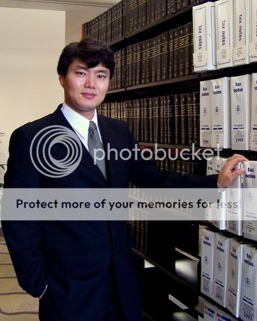
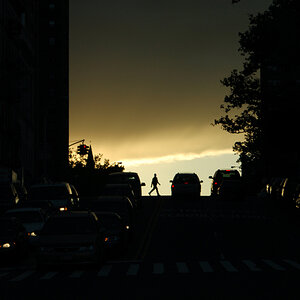
Yeah, I took a couple shot at the law school today, please give me critique as I want to improve. Comments on color, lighting, and composition, and all others would be great.Thanks. 1) 2)
#1 is a good shot, however very blury. Also note that shooting against a bright background while wearing a white shirt makes him appear to blend in. With #2 I see a very Lawyer type shot, but I think him resting his hand on the books behind him (get rid of the binders) may appear more professional. Also crop down the dead space on top. Good start though.:thumbup:
Thanks for the comment, yes, number 1 is blurry from camera shake, I think. I was trying to limit the iso and well next you know, you're zooming in like crazy. I got to check my camera setting more often for sure though, these kind of mistake are hard to swallow. lol. The first shot was a paparazi shot, he didn't know. lol. Thanks for the tips about the background!!! I agree that the second shot would have been better if I crop out the upper portion of it but I then I won't be able to keep the 4x5 print ratio anymore, you know what I mean? Any suggestion on that? Yeah, I'm not sure why the two of us decided to use the folders, lol. kind of spontaneous.
Well for #2 I'm not saying crop out the folders, because than you would have a handless lawyer. What I am trying to get at is a reshoot of that area, and maybe angle it so the black books are the background. Only because there's not much going on with that white wall.
I agree - have him stand in front of a set of Reporters or AmJurs instead of those icky binders! I vote for a re-shoot. Maybe some courthouse shots, too? Assuming you have a historical courthouse, that would give you lots of nice background opportunities to work with. Go after hours and you can get him in an empty courtroom.