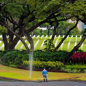
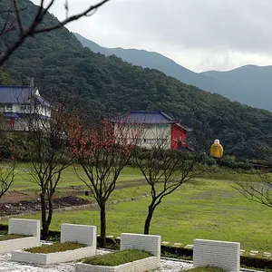
Just picked a photo at random and am playing around with different styles etc. and wondered what you may think of these; the first having no treatment:
You mean, the first image having no PS treatment other than significant color saturation? The red brick on that building is blinding! :shock:
That said, I've always liked that softening or blurred effect in PS. It really looks nice. But these colors are too garish for me as a starting point. Just personal preference.
Now there is a picture truely worthy of color. I like the first shot, but the second really gets my vote. I am just learning PS myself, but i really like the softer/difused colors on the second picture, really give the picture a mood.
Well to my untrained PS eye, I would say it looks good.

I prefer the original. Judging color or contrast over the web is not an exact science to say the least. Especially if you have a Windows os. Jokingly of course; I just love causing a stir.
Anyway, in PS7 try Layer... New Adjustment layer... then choose levels or what ever. This way you can "tone down" your adjustment using the "opacity" slider. It is also convenient to be able to turn the layer on or off. You will need to save as a .psd or tif to preserve the layers. If this makes no sense let me know and I will provide some screen shots or something.
:scratch: I can't see them now?? I saw these yesterday and I actually preferred the first. I thought your PS was great, but the colors and vividness of the first really stood out to me.