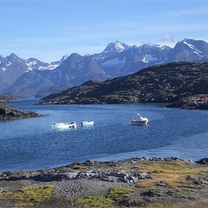
I like the small color detail better, like the glint of the sun off of the antennae, and the colored bumpers on the boats, plus the little bit of rust on the sides of the closest boat. The color elements are pretty small on the boats, but they add a bit of information for the eye.
^^ What Derrel said. Color, all the way. The color is so soft and muted, it simply adds dimension to the image without being overpowering at all. The second image lacks this dimension by comparison.
I like the B&W, but I love the color. If the sky were darker, the B&W might be more dramatic, but it looks a bit washed out with the bright sky you have. However, in color, the sky really pops with those lovely reserved hues.
I like the B&W, but I love the color. If the sky were darker, the B&W might be more dramatic, but it looks a bit washed out with the bright sky you have. However, in color, the sky really pops with those lovely reserved hues.
And that was the issue in the conversion. With so much yellow in the clouds and sky, it made it nearly impossible to introduce any drama to the sky that didn't look "fake." The conversion is nearly a tit for tat tonal exchange.
The sky is much more interesting in the color image. When you say the conversion's "nearly a tit for tat tonal exchange" do you mean you didn't move the sliders? I'd try lightening the yellow and darkening the blue, and then do some selective darkening on a brightness adjustment layer, but maybe you've been there already...
The sky is much more interesting in the color image. When you say the conversion's "nearly a tit for tat tonal exchange" do you mean you didn't move the sliders? I'd try lightening the yellow and darkening the blue, and then do some selective darkening on a brightness adjustment layer, but maybe you've been there already...
I'm not sure I understand what you mean by the yellows being troublesome...
Having yellow highlights and blue shadows in your sky makes it incredibly EASY to get exactly the contrast you want using sliders or filters, without any unwanted side effects. That's an ideal situation.
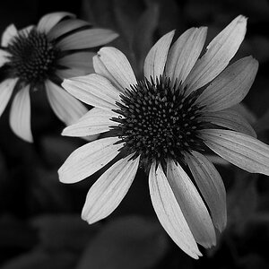
Anyway, I like the B&W a lot better. The colors are all dull and muted and unappealing to my eye. The lightness values are much more interesting IMO, and B&W capitalizes on this.
I'm not sure I understand what you mean by the yellows being troublesome...
Having yellow highlights and blue shadows in your sky makes it incredibly EASY to get exactly the contrast you want using sliders or filters, without any unwanted side effects. That's an ideal situation.
Anyway, I like the B&W a lot better. The colors are all dull and muted and unappealing to my eye. The lightness values are much more interesting IMO, and B&W capitalizes on this.
Only in the sense that working the yellows caused some contrast issues where I really didn't have the inclination to hand mask. I actually like the color as much as the B&W but I do like the color for the same muted tones you don't like...isn't it fun how we all see differently. It is respecting the vision that makes all this so much fun. Thanks for your comments.
Yeah I can see how the muted tones do look Norman Rockwellish or like an impressionist painting. But I tend not to like Normal Rockwell or impressionist paintings either =P Obviously, plenty of other people do.
I'm not much on Rockwell (though wish I owned an original) but I am a huge fan of Turner (really more pre impressionism) and Monet not so much for how they muted their colors as much as how they handled the light. And Rembrandt, more toned down color but with gorgeous light. There's still a lot to be learned from studying the old masters. My art quirk is Modernist movements; Matisse and Picasso bore me to tears.


![[No title]](/data/xfmg/thumbnail/42/42256-dce29145f58094ceabbe05c0c8cef7fc.jpg?1619740065)

![[No title]](/data/xfmg/thumbnail/35/35213-19b5e1596f756d523bfde9446f21ca8a.jpg?1619736951)