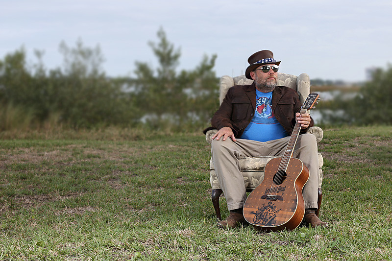
To be brutally honest, IMO, this is at best, a "Ho-hum". Other than identifying him as a guitar player, and my guessing (based on the hat and sunglasses) that he's possibly a blues player, there is nothing about the image that gives a clue to who he is, or what he does. Technically, the picture is fine, but as an illustration for an article, unless there's a LOT of explanation in the article... it's just not working for me.
The photo is going to be used in an article on him, so there won't be too big a mystery at who he is or what he does (he actually
doesn't play much blues), and he's already a known entity in town. The article is basically a short bio of him so, yeah, there will be a LOT of explanation.
The image isn't meant to stand on its own. It's simply supposed to be a photo of the guy being discussed in the article.
He wanted to. No other reason.
WHY is he sitting in a stuffed chair in the middle of a field?
This is a good example of something being perceived incorrectly. In fact, there's no field. It's actually a relatively narrow shoreline next to Matanzas Inlet.
WHY does he look annoyed?
The pensive, brooding musician type? I really don't know; I didn't ask.
Honestly, he's always upbeat. I know the guy, so I don't see this look as being annoyed at all. That said, I could probably cull through countless photos on the web in which normally bubbly folks have photos that make them look upset, angry, annoyed or brooding. If he was smiling, the question would be "Why is he happy?"
Do we really need explanations for a subject's facial expression?
I think this concept might have worked if you'd gone with a bigger field, showing him with a lot more space around him, or tighter, but, as-is? Sorry...
Again, this is not a photo meant to stand on its own (although the subject is purchasing a print and rights to use the photo on his website, and my Editor likes it, too). No one should expect, nor would I expect anyone, to look at the photo and know everything about this guy. The photo is meant to accompany an article about the person in the photo.
My question was more to the technical aspects of the photo, and you addressed that, so thank you.

![[No title]](/data/xfmg/thumbnail/31/31012-f5e0c7cdea2f2c3e44737e3f61c2461a.jpg?1734159086)


![[No title]](/data/xfmg/thumbnail/32/32005-d13a0bcc56327c42bd32dff4b0776658.jpg?1734160798)


