Local Musician...

Mr. Innuendo

No longer a newbie, moving up!
Joined
Sep 29, 2014
Messages
267
Reaction score
79
Location
Florida
Can others edit my Photos
Photos NOT OK to edit
Doing a shoot of a local musician for a new column in the magazine I work for.

I'm pretty well satisfied with what I came away with, but this is going to be an ongoing thing, so I'll be more than open to constructive criticism:
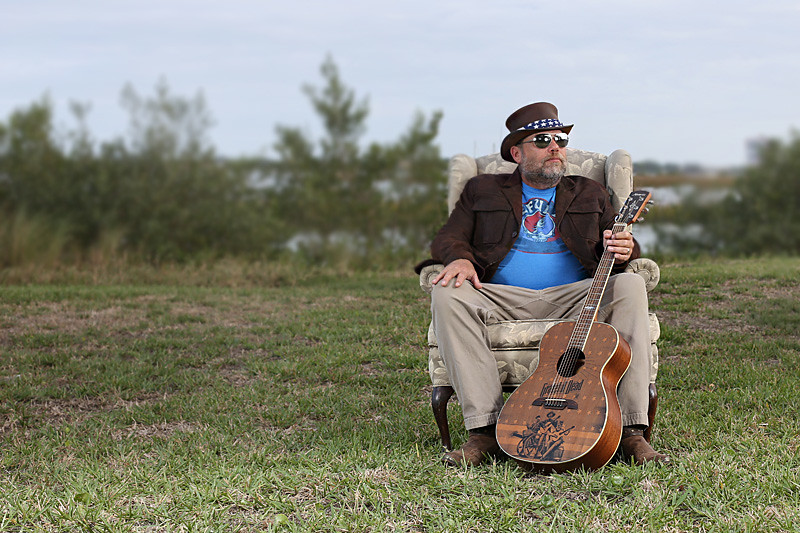
23882997096_5afb2a5c60_b.jpg
 
To be brutally honest, IMO, this is at best, a "Ho-hum". Other than identifying him as a guitar player, and my guessing (based on the hat and sunglasses) that he's possibly a blues player, there is nothing about the image that gives a clue to who he is, or what he does. Technically, the picture is fine, but as an illustration for an article, unless there's a LOT of explanation in the article... it's just not working for me.

WHY is he looking away? WHY is he sitting in a stuffed chair in the middle of a field? WHY does he look annoyed? I think this concept might have worked if you'd gone with a bigger field, showing him with a lot more space around him, or tighter, but, as-is? Sorry...
 
To be brutally honest, IMO, this is at best, a "Ho-hum". Other than identifying him as a guitar player, and my guessing (based on the hat and sunglasses) that he's possibly a blues player, there is nothing about the image that gives a clue to who he is, or what he does. Technically, the picture is fine, but as an illustration for an article, unless there's a LOT of explanation in the article... it's just not working for me.

The photo is going to be used in an article on him, so there won't be too big a mystery at who he is or what he does (he actually doesn't play much blues), and he's already a known entity in town. The article is basically a short bio of him so, yeah, there will be a LOT of explanation.

The image isn't meant to stand on its own. It's simply supposed to be a photo of the guy being discussed in the article.

WHY is he looking away?

He wanted to. No other reason.

WHY is he sitting in a stuffed chair in the middle of a field?

This is a good example of something being perceived incorrectly. In fact, there's no field. It's actually a relatively narrow shoreline next to Matanzas Inlet.

WHY does he look annoyed?

The pensive, brooding musician type? I really don't know; I didn't ask.

Honestly, he's always upbeat. I know the guy, so I don't see this look as being annoyed at all. That said, I could probably cull through countless photos on the web in which normally bubbly folks have photos that make them look upset, angry, annoyed or brooding. If he was smiling, the question would be "Why is he happy?"

Do we really need explanations for a subject's facial expression?

I think this concept might have worked if you'd gone with a bigger field, showing him with a lot more space around him, or tighter, but, as-is? Sorry...

Again, this is not a photo meant to stand on its own (although the subject is purchasing a print and rights to use the photo on his website, and my Editor likes it, too). No one should expect, nor would I expect anyone, to look at the photo and know everything about this guy. The photo is meant to accompany an article about the person in the photo.

My question was more to the technical aspects of the photo, and you addressed that, so thank you.

if your editor likes it then it's good!
I hope you took more pics of this musician in other settings. I agree sitting in a stuffed chair in what looks to be a field is a little strange but a lot of musician photoshoots are "different"
 
if your editor likes it then it's good!
I hope you took more pics of this musician in other settings. I agree sitting in a stuffed chair in what looks to be a field is a little strange but a lot of musician photoshoots are "different"

I've photographed this guy several times and, yeah, musician shoots are often very different and, I've found, completely ignore anything resembling rules.

The chair is actually an as important an aspect as the musician, as it's going to be one the one constant throughout a series of photographs, taken of prominent area musicians, that's published in the column. The importance of the chair won't come through in any one photo but, rather, when the photos are considered together.
 
Was the background blurred in post?
 
Was the background blurred in post?

Only a quick pass with the blur tool; I mean, REALLY quick. Looking at it, I could've done without it. It was pretty blurred already...
 
Was the background blurred in post?

Only a quick pass with the blur tool; I mean, REALLY quick. Looking at it, I could've done without it. It was pretty blurred already...
The reason I ask is that there are areas (e.g., back of the chair on both sides, both elbows) that are blurred when they shouldn't be with respect to the rest of the DOF.

Also, there is an area just camera left to the chair and above his elbow that may need to be blurred. If it's already blurred, maybe it's something in the background playing tricks with me.
 
And just below the head of the guitar...
 
I could see this as a double page spread with the title of the article and story in the negative space on the left hand side. As an image there is nothing technically wrong or really needs improving. I quite like the nonchalant character sitting passively with his guitar. It's a musician portrait, they always are a bit odd/quirky. For me if was shooting the same shot and scene I would have opted for a wider lens and got in closer. The longer focal length used and the compression disconnects us a little from him. I would have also slapped a strobe in there camera right and overpowered the sun by a stop just to get some drama and character into the shot, but that's just me, I'm addicted to artificial light.
 
Thanks, FKP.

Unfortunately, it's going to be a one page piece, but I see where you're goin' with it!
 

Most reactions

New Topics

Back
Top