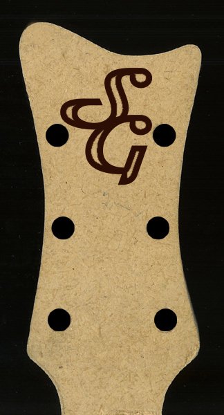
Shouldn't all of these be rotated to where you can see what the logo says when the guitarist is playing? I can't explain it clearly. But it bothers the guitarist side of me.
Shouldn't all of these be rotated to where you can see what the logo says when the guitarist is playing? I can't explain it clearly. But it bothers the guitarist side of me.
nah, I don't like it when guitar logos are placed so the player sees it correctly... I like them so when the guitar is standing up straight it looks good. :thumbup:
nah, I don't like it when guitar logos are placed so the player sees it correctly... I like them so when the guitar is standing up straight it looks good. :thumbup:
I could do you one.... but i'd have to charge :mrgreen: ...... can't mix business with pleasure...... how does $250 sound ...... kidding.....
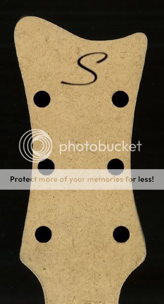
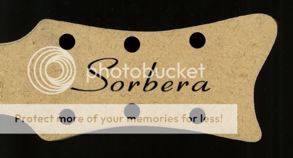
But for all you trying.... sticking with just an 'S' is a good idea..... or 'sorbera', ...... but it needs to be made more original looking..... and distinctive.....


![[No title]](/data/xfmg/thumbnail/37/37524-6c51828efbc2361f9cfed53f63f28aa2.jpg?1619738130)