What's new

Logo Opinions please! (PIC)

mjhoward

TPF Noob!
Joined
Sep 22, 2010
Messages
2,014
Reaction score
414
Location
Bowling Green, KY
Can others edit my Photos
Photos OK to edit
I've been trying to work on a logo that incorporates my initials and I was kindof wanting something somewhat simple that could also be used as a small semi-transparent watermark. Here's what I have so far:
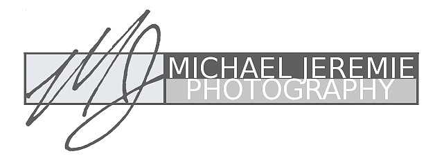
5551421887_bdbb05fe15_z.jpg


So... Opinions, criticism, advice, and/or suggestions please!
 
I think perhaps a little more vertical separation between your name and the word 'Photography'.
 
I like it. Of course I want a more fancy one for myself just haven't quite figured out how to get it all together yet. :scratch:
 
I like it, and agree with TiredI, and will add that I don't like the J dropping below the line at all.
 
Thanks for the quick responses. I'll widen the gap between the name and 'photography'.

Bitter, I let the J drop below the line because if I didnt, the either the two lines would have to be different thicknesses OR they'd be the same thickness and one would appear to have a lot more blank space... I'll see if I can find a happy medium though :)

Anything else? I mean does the logo look ok being as simple as if is or would it look better with some form of graphic, color, or a different kind of arrangement? Again, I really appreciate everyones input!
 
I like it except, I know it's not your fault and maybe I'm being candor but Michael Jeremie sounds very flamboyant. Not that there's anything wrong with that.
 
IMO I think that the simple logo looks great it's clean and fresh. I want a vine type circle for mine with Humburg Photography inside just havent found the outer image that really says "that's it" to me.
 
I like it simple like this.

On the J, no other letter drop or raises above the line, so it is part about consistency. All the letters are capitals, and generally only lower case letters drop. You also have an odd looking jumble of letters...L G J, and as suggested, giving both lines of text some breathing room will help immensely.

Here's some Midol, your logo is cramping.
 
LOL... I actually did laugh out loud... reason... My MOTHER was the one in charge of my middle name. Did she spell it with a 'Y' like every other Jeremy? Nope. She goes with 'ie'. It worked out OK though because since nobody else spells it that way, you can type 'Michael Jeremie' in Google and Yahoo and my domain name comes up number 1 and I dont have ANYTHING on the website yet. :lmao: Thanks Ma!
 
LOL... I actually did laugh out loud... reason... My MOTHER was the one in charge of the spelling of my middle name. Did she spell it with a 'Y' like every other Jeremy? Nope. She goes with 'ie'. It worked out OK though because since nobody else spells it that way, you can type 'Michael Jeremie' in Google and Yahoo and my domain name comes up number 1 and I dont have ANYTHING on the website yet. :lmao: Thanks Ma!

Oh mothers... They are great aren't they!? It's okay, my last name is Cream.
 
But yes, I agree you need to space it out a bit. It looks nice otherwise :)
 

Create an account or login to comment

You must be a member in order to leave a comment

Create account

Create an account on our community. It's easy!

Log in

Already have an account? Log in here.

Back
Top Bottom