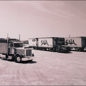
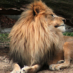
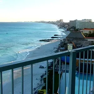
#5, hide and seek is my favorite...it's just got a wonderful vibe to it.
Shot #4 is a pretty good photo to look at as a learning experience in framing/composition. The issues are the upper right hand corner and the cables, and the low placement of the eyes, and the low placement of the overall, total animal as a whole, within the frame space. That shot, #4, is a good example of the camera being aimed too high...there is too much top space above...it includes the cables in the upper right. The excessive top space forces everything else to "ride low in the frame". The camera's height is actually below eye-level of the dog, but the camera is aimed just a bit too high....which is making the nose of the dog very close to the bottom of the frame.



 But it is still saved in the text box, so here is what I wrote 2 days ago:
 ..
..



![[No title]](/data/xfmg/thumbnail/34/34138-0ecadfd41de9ae178e53528e0eb1a32c.jpg?1734164691)
![[No title]](/data/xfmg/thumbnail/37/37626-4a6ffc3f17ab3a8e97170fda3276640e.jpg?1734170750)