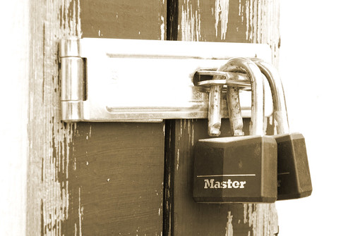
I like the choice of subject. I agree with you that the rust on the Master lock and the peeling paint give it character. However...
It is overexposed. Notice the blown highlights on the left (the side face of the post), on the face of the latch, and on the right side of the image (the background?). All of these bright areas serve to pull the eye away from what you pointed out as the interesting areas of the shot (the texture of the rust and peeling paint). I think the monochrome treatment could work here, though I'd go with black and white instead of sepia. Between the overexposure and the sepia treatment your tonal range is just a bit lacking, so you lose some of the contrast and hence the textures. I'd also be interested in seeing it in color - how does the rust pop against the steel?
Unfortunately I can't post my suggested quick edit from here, but you might want to try something along these lines. Using Photoshop Elements 7 (what I have here), I converted to black and white (urban/snapshots preset). I then added a brightness/contrast layer and dropped the brightness to -62 and increased the contrast to +69. Finally I cropped from the left just enough to remove the bright area, so that the peeling paint/visible wood grain goes all the way to the edge of the frame. You can also (instead of just converting to black and white in step 1), copy your background to a new image, convert that to B&W, and reduce the opacity as you see fit to bring back a bit of the sepia tone if you like that feel better than the straight B&W. Just a suggestion...