What's new

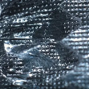
Metallic Frost

PixelRabbit

A naughty little bunny...
Joined
Nov 28, 2011
Messages
6,593
Reaction score
3,719
Location
Ontario
Can others edit my Photos
Photos NOT OK to edit
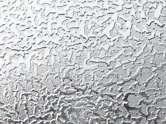
The frost on the window looked pretty cool so I took a shot.
I liked the "metallic" look of it.
Wish it was a tiny bit ... sharper?....

Thanks for taking a look!
 
run a highpass filter on it, just watch your threshold, and it will sharpen up nicely.
 
You have been busy ...even in the cold... interesting shot
 
Yeah...neat shot....this would look nifty with a gradient map applied, to give it some really weird colors!!!
 
Nice shot! I love the way ice can get metallic looking with light and post. Did you ever see my chrome icicle?
 
Nice. The uneven lighting bothers me a bit. A lot of the upper left should be darkened, imo.
 
run a highpass filter on it, just watch your threshold, and it will sharpen up nicely.
Thanks Pally, I'll give that a try.
You have been busy ...even in the cold... interesting shot
Thanks Mully, actually, I've felt rather uninspired lately and have taken very few shots, on the upside, I've been pleased with the shots I have taken :)
Yeah...neat shot....this would look nifty with a gradient map applied, to give it some really weird colors!!!
Thanks Derrel :) I'll give that a try when I'm tweaking the sharpness!
Nice shot! I love the way ice can get metallic looking with light and post. Did you ever see my chrome icicle?
Thanks Charlie :) I have a vague memory of it now that you mention it ... do you have a link handy?
Nice. The uneven lighting bothers me a bit. A lot of the upper left should be darkened, imo.
Thanks Ken, I lined up the treeline in the middle to try to create a gradient in this one so was kinda intentionally "uneven" ;)
 
KenC said:
Nice. The uneven lighting bothers me a bit. A lot of the upper left should be darkened, imo.

Disagree wholeheartedly. I like the way the light gradually fades out. If anything I'd darken the whole thing up a touch as the upper left seems on the edge of blown out. That being said if its darkened too much you'll lose the lower right corner so just a small tweak IMO.
 
I like this as is, no changes needed for me. But... TPF's sucky white background is not doing this image any favours so I suggest a black border.
 
Charlie, nice!

Invis, you would think that after having similar comments on other predominantly white shots I would remember to put a border on them..,. But nooooo....I still forget until someone mentions it, ugh!
 

Create an account or login to comment

You must be a member in order to leave a comment

Create account

Create an account on our community. It's easy!

Log in

Already have an account? Log in here.

Back
Top Bottom