What's new

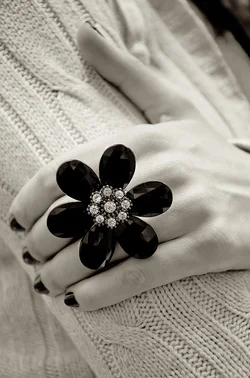
Miss Lydia Shows Off Her Newest Acquisition...an old image for fun.

ceeboy14

TPF Noob!
Joined
Dec 5, 2012
Messages
2,566
Reaction score
788
Location
Florida
Can others edit my Photos
Photos OK to edit
$Miss Lydia shows off her newest aquistion tpc.webp
 
Good contrast

Agree. And I also like the bokeh in this image too. I do really like this image, but would like it more if it was cropped differently. Perhaps the ring placed in the lower left of the frame, which I know would then bring the subject's face into the frame, so I little tighter crop too to avoid that. Otherwise, great shot. Keep it up ;)
 
In this instance, her face would have detracted from her jewelry. This was a student in my class and every day she came to class with a different ring or bangle, always matched to color by fingernail polish. I used this image as a teaching moment for exposure, bokeh, ambient lighting, etc. Since this particular piece of jewelry was black as were her nails, I kept it as a monochrome image and further used it to show how to make a monochromatic conversion in Photoshop.
 
I like the tint. Did you do it in the B&W conversion, or by some other technique (duotone, photo filter, etc.)?
 
In this instance, her face would have detracted from her jewelry.

Which I why I said I little tighter crop to avoid that. A tighter crop would have placed the jewelry away the centre of the frame and kept her face outside of the frame too.
 
Nice, there's a lot to like here. Great placement of lines and forms, wouldn't change a thing.

My only quibble is that a great deal of the blackness in the stones is coming up flat on my monitor. I'm willing to bet there's a little something in there in the print, though and in this case I think it's quite necessary. I am generally ok with flat blackness in shadows (shadows ARE holes, after all), but this is a Thing, and having the Thing look like a hole in space strikes me as uncomfortable.

 
Nice, there's a lot to like here. Great placement of lines and forms, wouldn't change a thing.

My only quibble is that a great deal of the blackness in the stones is coming up flat on my monitor. I'm willing to bet there's a little something in there in the print, though and in this case I think it's quite necessary. I am generally ok with flat blackness in shadows (shadows ARE holes, after all), but this is a Thing, and having the Thing look like a hole in space strikes me as uncomfortable.

I see what you are saying. I'll have to look at the print to see if this is more a tiff to jpeg compression issue or if they are indeed too flat.

Misunderstood the crop suggestion...not much image to work with and it was a Q&D for classroom use, but you are probably right as to placement.

I can't remember how it was toned but probably in SEP as we'd just gotten the classroom set and learning to use it.
 
This is a beautiful shot.


(I typoed "sh*t" instead of "shot" at first) I had to say it...im laughing on this end. haha
 

Create an account or login to comment

You must be a member in order to leave a comment

Create account

Create an account on our community. It's easy!

Log in

Already have an account? Log in here.

Back
Top Bottom