sparrowblue
TPF Noob!
- Joined
- Jan 27, 2011
- Messages
- 25
- Reaction score
- 2
- Can others edit my Photos
- Photos NOT OK to edit
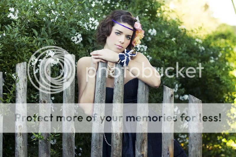
Thank you everyone. Also... some of these are super low res, because I uploaded them to my FB fan page. So... please don't critique that (unless you really feel the need). ")


![[No title]](/data/xfmg/thumbnail/35/35597-714b74cc48992e5353856abfe325df68.jpg?1619737065)


![[No title]](/data/xfmg/thumbnail/32/32636-5a159481dcab8aaf87f2d7b501496db1.jpg?1619735554)